PROCESS
Conversations about colour gradients have been ongoing between us for some time now. In fact the first conversations we had, about travelling to various places worldwide and creating colour palettes and gradients of the landscapes around us, happened during our last days in Thailand at the end of our BKK residency. Since then the thoughts of how we would execute the idea, what medium would best present the gradients, how we would present them, cropped up regularly as we worked on other projects. It wasn’t until we had the opportunity to use a printing press in Connemara, Galway, while in residency at Interface Inagh that we really got to really start experimenting and fully revolve our joined practice around blending colours. It was magical really. We were in such a wonderful part of the world with a great space to work out of and we were brimming with inspiration from the awe of the Inagh Valley and the Connemara coastline. A special mention and thanks to Clare Henderson, who was fundamental in us pursuing this avenue of creation with her press. She is the queen of colour gradients which can be seen in her work here.
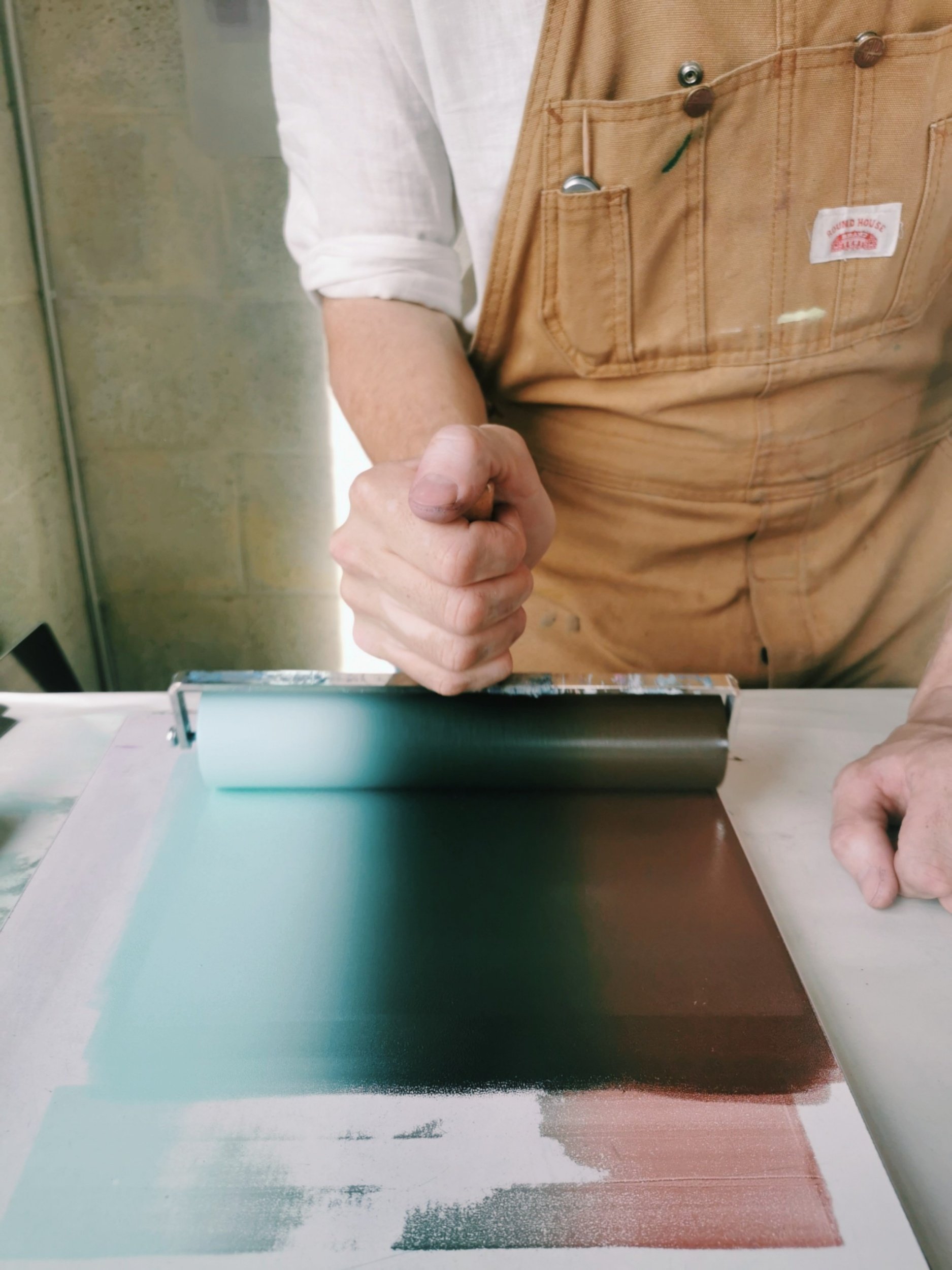
Each monoprint is comprised of multiple layers of the same blend of colours. Each blend begins with three dollops of ink laid out at the top of a glass slab. These dollops are the result of hours of mixing colour to match the exact hue we wanted to achieve. The lichen green couldn’t be too limey, nor too blue, but just the right shade of pale lemony mint. The rust brown and forest greens of the mountain blend needed to feel like it was veiled in mist rather than shining in sunlight. This process was very consuming, and it was so enjoyable to feel your eyes and brain start to speak to each other more keenly as they became more and more fluent in the language of colour.
Back on the glass slab, the colours are gently mixed together using a rubber roller, repeatedly rolled out until the individual colours begin to meld together. The trick is to not let the colours mix too much and end up murky, but to mix them enough that the point at which one colour ends and another begins starts to blur. From here they are transferred onto a perspex plate which are loaded into the press one at a time with handmade paper. Then they make their way through the heavy steel rollers so that the colours transfer from the plate to the paper.
The room for error is extremely high. One tiny piece of fluff can ruin a print, a rogue drop of ink can mean cleaning everything down and starting the whole process again from the start. As a result the process needs to be very well rehearsed and pretty meticulous in it’s planning and execution. This procedural attention to detail is very different to how we have previously worked together. With cyanotype there is a lot of intuition and allowing the process to emerge as the sun exposes the light sensitive solution. With printmaking it is all about testing your methods time and time again until you get that perfect print… then try to emulate that exact method of mixing ink, blending colour, rolling on, pressing through, and repeating… over and over again. The beauty of printmaking, however, is that there is always a makers-mark, that tiny blemish, the torn paper, the expressiveness that can only be achieved by the human hand.


