These galleries show all my series of paintings from 2018 - present along with details of when are how the pieces were created. Click through to see the entire series. Note that some pieces here are no longer for sale. If you would like to purchase a piece please head over to my shop to see my available work.
I characterise my paintings as site responsive and experimental. My work captures the essential aspects of colour, texture and emotions that I find rooted in landscapes. Imagery is not grounded in representation but rather a reimagining of the essence of a site. Visually, I create bold, visceral works that stretch between two and three dimensions. I drip, scrape, bruise and blush colour onto surfaces. Topographic and mineralogical connotations are present in the aesthetic of my work.
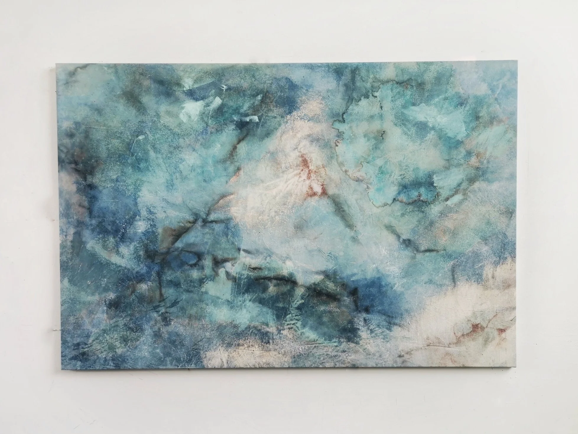
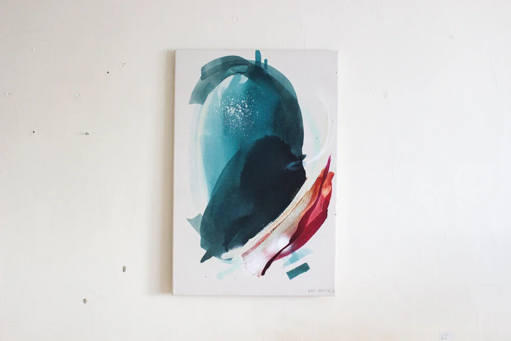
Azure Bloom
Cyano, Copper verdigris, soda on canvas
70 x 50cm
The resulting surface textures and colourations are borne from expansive experimentation with mineralogical reactions and oxidisation. The red and yellow tones seen in these works are created through the addition of alkali and base minerals. I further extend the aesthetic, expressive range of my practice through the addition of my handmade pigments and inks. I douse, drip, and submerge colour, tweaking ph levels, and allowing the surface to come alive. The surface of the works fissure, colour crystallizes and splinters into nucleated patterns creating exciting and visually stimulating images that engage viewers in both scientific and organic processes. Active mark-making acts as a vehicle to explore concepts of ‘mapping’ solar, tidal and elemental energy.
Suffused in Sun & Within a Hemic Afterburn
Cyano, copper verdigris, soda on canvas
63 x 43
These works were created in response to the work (specifically the background skies) of WM Turners work ahead of his exhibition ‘The Sun is God’ at the National Gallery of Ireland.
Beginning with the process of cyanotype painting (painting with sunlight) I exposed canvas material soaked in light sensitive liquid to UV rays, which initially turned the surface a deep Prussian blue. Inspired by Turner’s approach to building colour, his use of positive and negative space, and his unusual (often criticised) use of alternative methods of colour production I then explored further oxidisations, allowing colour to emerge and disappear depending on the mineralogical reactions occurring on the surface.
The resulting works evoke a fleeting yet energetic atmosphere which seems to move in and out of focus on the canvas.
Flume 2022
Flare 2022
Bathed in the Scatterlight i 2022
Bathed in the Scatterlight ii 2022
These work evoke the space between interior and exterior spaces. The canvas surface is folded in on itself. Once exposed to sunlight only the outer facing folds are oxidised by UV, leaving the interior sections blank. The deep Prussian blue form emerges from within the work.
I have expanded my process-led investigations through a deep material inquiry into the process of painting with sunlight. More specifically, through the use of cyanotype exposures. Cyanotype is a process whereby surfaces are oxidised by UVA radiation when exposed to sunlight, leaving behind a deep blue colour (literally painted by the sunlight). It is a sustainable, organic chemical mixture of ferric ammonium citrate and potassium ferricyanide commonly seen in architectural blueprints, though perhaps more commonly recognised as the process pioneered by botanist Anna Atkins to produce her 1894 images of algae specimens. The process of creating ecological ‘blueprints’ through painting with sunlight captures the photosynthetic agency of landscapes.
This commission was an exercise in alchemy. The commission brief was to create a large artwork that showcases chemical reactions, scientific processes and the colours they produce as they alchemise.
We began with experiments with iron tablets, copper sulphate permitabs. I created a spectrum of turquoise colours using pharmacy grade copper sulphate as well as my studio-extracted copper oxide and cupric oxide.
The inks are separated into two layers, a top dark blue transparent layer, and a heavier milky blue layer that sinks to the bottom. When mixed they produce a beautiful translucent ink that seems to bend and move with the light.
Then we employed the use of the cyanotype process whereby two metal salt chemicals are mixed producing a UV sensitive liquid. This is the exposed to sunlight which oxidises the mix and turns it cobalt blue.
The final canvas piece was the surface on which various chemicals were able to react and achemise, creating this energetic artwork.
To enquire about available works head to my works for sale page.
OF ELEMENTAL ENERGY
Cobalt (Ferric Ammonium Citrate, Potassium Ferricyanide, UV) Copper Sulphate, Cupric Oxide , Vinegar on Cotton Canvas
110 x 140cm
Candescence 2022
Cyanotype, copper verdigris, soda on canvas
45 x 45cm
Luminescence 2022
Cyanotype, copper verdigris, soda on canvas
46 x 40cm
I have expanded my process-led investigations through a deep material inquiry into the process of painting with sunlight. More specifically, through the use of cyanotype exposures. Cyanotype is a process whereby surfaces are oxidised by UVA radiation when exposed to sunlight, leaving behind a deep blue colour (literally painted by the sunlight). It is a sustainable, organic chemical mixture of ferric ammonium citrate and potassium ferricyanide commonly seen in architectural blueprints, though perhaps more commonly recognised as the process pioneered by botanist Anna Atkins to produce her 1894 images of algae specimens. The process of creating ecological ‘blueprints’ through painting with sunlight captures the photosynthetic agency of landscapes.
The resulting surface textures and colourations are borne from expansive experimentation with mineralogical reactions and oxidisation. The red and yellow tones seen in these works are created through the addition of alkali and base minerals. I further extend the aesthetic, expressive range of my practice through the addition of my handmade pigments and inks. I douse, drip, and submerge colour, tweaking ph levels, and allowing the surface to come alive. The surface of the works fissure, colour crystallizes and splinters into nucleated patterns creating exciting and visually stimulating images that engage viewers in both scientific and organic processes. Active mark-making acts as a vehicle to explore concepts of ‘mapping’ solar, tidal and elemental energy.
This works is alive. It captures the alchemic interactions of botanical inks, UV sensitive paint and copper oxide.
Firstly, a pallet of neutral tones was created from bluebell, nettle, wild sage and buttercup foraged from a farm in Cork. The pallet was brightened with the introduction of copper oxide, which brewed over months from copper scraps from the workshops on the farm. The deeper blue tones were achieved using a UV sensitive mixture (cyanotype) that reacted with sunlight to create a cobalt blue. Finally, the different elements coalesced on the canvas to produce stunning, energetic reactions.
There is a keen sense of alchemy occurring on the surface of this work. In Opalescence, I wanted the hues to blend in a gentle way. I dripped, poured and blushed the inks onto the canvas allowing the hues to soak and blend across the surface. As the colours seep into the textile they settle into their own rhythm, as they do in nature.
This work was commissioned and is unavailable to purchase. To enquire about available works head to my works for sale page
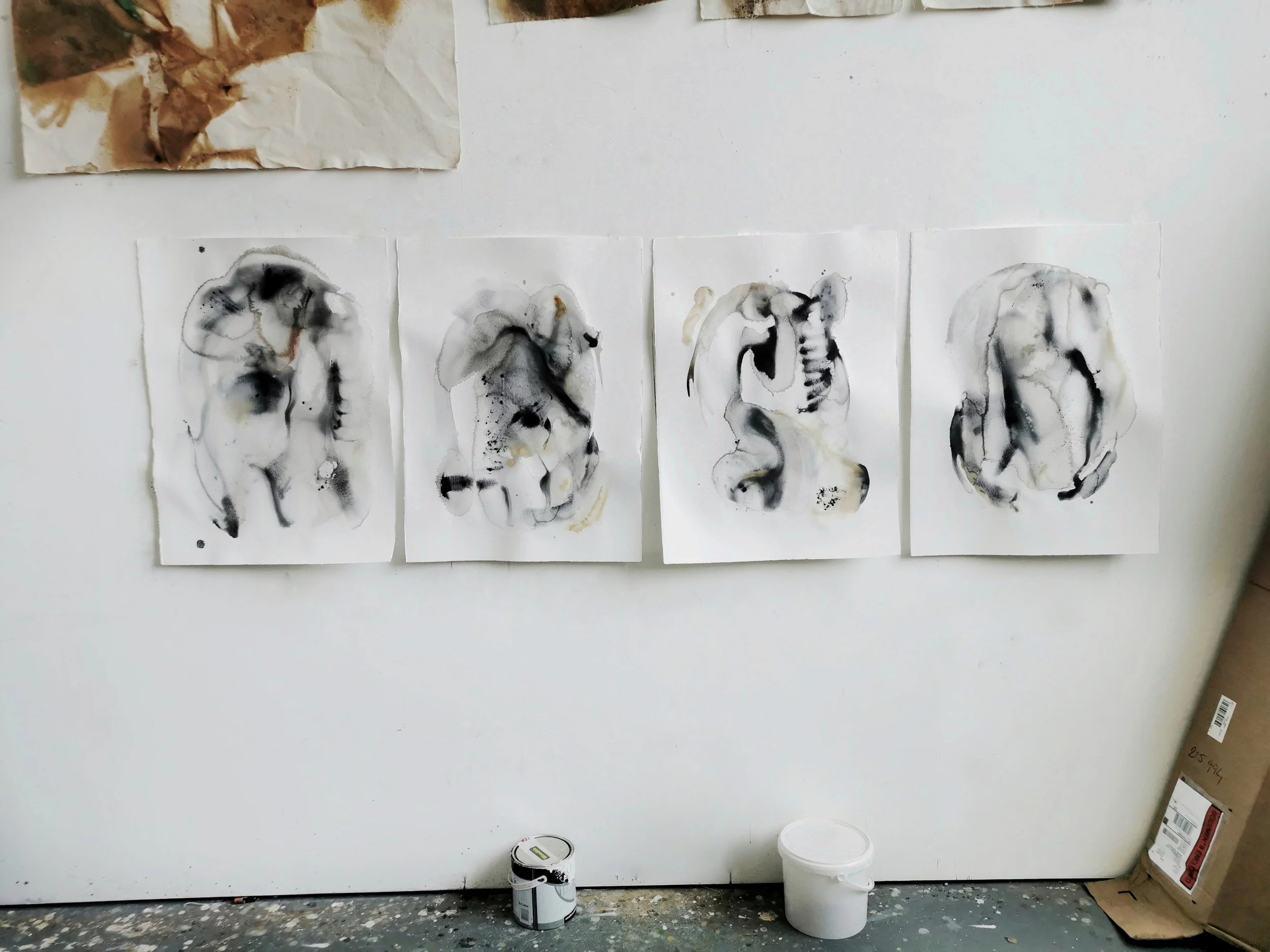
These works invite the viewer to explore the aesthetic of interior and exterior spaces through gentle, gestural strokes. The diptych evokes a breathing quality, inhaling and exhaling in place. There is a feeling of moving forward while ending backwards simultaneously, as in an echo. Ethereal hues are offset by monochromatic strokes and neutral colours. The use of positive and negative space has created a striking composition.
Cotton rag paper has been drenched in water. As the liquid soaked into the fibres it caused the paper to buckle and swell creating undulations across the surface. Charred kelp pigment was then washed onto the paper and sprayed with water which caused them to move across the surface leaving behind trails of pigment. Speckles and sprinkles of earth pigment, kelp and bladderwrack ink were then dropped onto the work. Depending on the viscosity of the drip, the saturation of the paper and the layers of pigment already on the page, each new drip reacted differently, often pooling in the troughs and dips or diffusing into specific areas. The works combine movement and stillness in how the pigment has been applied, allowing the eyes to travel across the terrain of the artwork.
To view available works or to purchase a piece head to my works for sale page .works for sale page
Cyanotype, copper verdigris, copper oxide, soda, citric acid on canvas
140 x 100cm
I have expanded my process-led investigations through a deep material inquiry into the process of painting with sunlight. More specifically, through the use of cyanotype exposures. Cyanotype is a process whereby surfaces are oxidised by UVA radiation when exposed to sunlight, leaving behind a deep blue colour (literally painted by the sunlight). It is a sustainable, organic chemical mixture of ferric ammonium citrate and potassium ferricyanide commonly seen in architectural blueprints, though perhaps more commonly recognised as the process pioneered by botanist Anna Atkins to produce her 1894 images of algae specimens. The process of creating ecological ‘blueprints’ through painting with sunlight captures the photosynthetic agency of landscapes.
The resulting surface textures and colourations are borne from expansive experimentation with mineralogical reactions and oxidisation. The red and yellow tones seen in these works are created through the addition of alkali and base minerals. I further extend the aesthetic, expressive range of my practice through the addition of my handmade pigments and inks. I douse, drip, and submerge colour, tweaking ph levels, and allowing the surface to come alive. The surface of the works fissure, colour crystallizes and splinters into nucleated patterns creating exciting and visually stimulating images that engage viewers in both scientific and organic processes. Active mark-making acts as a vehicle to explore concepts of ‘mapping’ solar, tidal and elemental energy.
These works trace the landscape of North Sligo through the pigments and inks derived from natural materials at Raghly, Lissadell, Ballyconnel, Benbulben. There is a contrast between the ancient geological fossils and formations and the slippery soft organic terrains found at rock pools and shorelines. Colour is used as a marker of terrain. Each work responds to the idiosyncrasies of specific colours derived from the landscape as well as the surface it is applied to.
Colour is created through the process of crushing, grinding, charring and boiling natural materials. The works feature a spectrum of hues from iron rich yellow/orange ochres to a pale pallet derived from limestone, urchins and limpets to monochromatic charred kelp. Bladder wrack and kelp are synthesised into inks which allow a contrast in viscosity on the page.
Colour is applied to the page by drowning the surfaces in ink and paint. The surface is Yupo Paper, an interesting synthetic recyclable material that is completely waterproof. Without the ability to absorb into the surface the pigment is left behind after the evaporation process. This creates thin veil-like layers which can blend and bend across the page, gathering and depositing hues and tones as it rolls. The hues find their way around the page settling into their own rhythm as water does in the natural environment. The final drying process appears to suspend the colour between solid and liquid revealing distinct vistas.
Exhibited at The Hyde Bridge, Sligo and The Glucksman Gallery, UCC, Cork.
To enquire if these works are available visit my works for sale page
This piece looks at the tension that occurs between elements. It was painted in response to a swim through a kelp forest during a storm on the equinox in Port, Donegal. The eye is drawn to the movement across the paper where colour and form are contrasted against each other. The physical application of colour onto the page in quick energetic motions echo the haphazard energy of the storm ravaged kelp forest, pulling and pushing against the swell. Ink pools are apparent on the paper, tracing the motion of liquid as it was painted. Quick spritzed pigment captures the feeling of dancing fractures where light succeeds and fails to permeate.
There is a keen sense of the underwater quality of a rockpool in these works. Colours appear to dance beneath the shimmering surface water. The alchemic reactions of the natural pigment mirror that of the ecosystem of the pool; spotted, dappled textures rising forward, scratched pollups contrasted against layers of sea-slime. The textures draw you in, inviting you to run your hand along the painting.
To see if these works are available to purchase, head over to my available works.
These pieces are created using the same gestures seen in the process of working with pigments. Pigment and binder are mixed together by moving a glass muller over a glass slab, working the pigment in circular motions. The pigment is then scraped off the slab, ready to be used.
These works trace the landscape of North Sligo through the pigments and inks derived from natural materials at Raghly, Lissadell, Ballyconnel, Benbulben. There is a contrast between the ancient geological fossils and formations and the slippery soft organic terrains found at rock pools and shorelines. Colour is used as a marker of terrain. Each work responds to the idiosyncrasies of specific colours derived from the landscape as well as the surface it is applied to.
Colour is created through the process of crushing, grinding, charring and boiling natural materials. The works feature a spectrum of hues from iron rich yellow/orange ochres to a pale pallet derived from limestone, urchins and limpets to monochromatic charred kelp. Bladder wrack and kelp are synthesised into inks which allow a contrast in viscosity on the page.
To view or purchase available works go to my works for sale page.
These works were created in response to the changing colours of the hedgerows in Autumn. Slow berries burst with ripeness along country roads, hawthorn berries can be seen lighting up the boundary lines between fields, and dock leaves stand tall as their chlorophyll fades and they turn a beautiful rusty colour. These three natural materials were synthesised into ink, creating a warm spectrum of colours which were then modified using iron oxide and aluminium sulphate directly on the surface of the painting.
Sable On A Shield Of Sky 2020 - Hawthorn, Docktips, Sloe, Soda and Alum on Cotton Canvas - 40 x 30cm
Flared And Roared 2020 - Hawthorn Sloe, Liquid Iron. Soda, Dock Tips and Alum on Cotton Canvas - 24 x 30cm
To check if these works are available to purchase, go to my works for sale page.
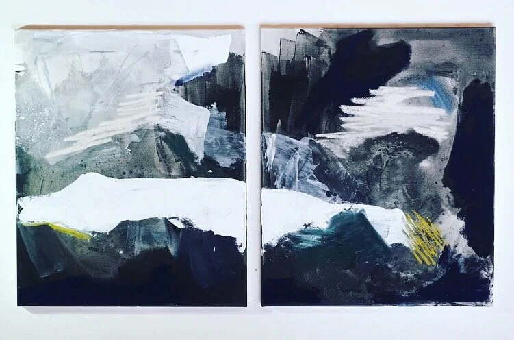
These pieces look at the tension that occurs between elements. They were painted n response to a swim through a kelp forest during equinox in Port, Donegal. The eye is drawn to the distinct line across the canvas where colour and form are pushed against each other, as if from different vistas. The use of negative space adds to a sense of blurring between plains. Water and air pull together at the submerging horizon. Quick blended brushstrokes in oil capture the feeling of dancing fractures where light succeeds and fails to permeate.
These colours were foraged from the area surrounding a Hawthorn Tree which sat in a Ring Fort in Portmarnock.
The colour locked within the haws, nettles, dock leaf tips, ivy and lichen was extracted through the process of soaking and reducing. The hawthorn twigs were charred in an open fire and then ground down into charcoal.
All in all, I harnessed 15 colours from the hawthorn and its surroundings. The palette contained deep autumnal hues from muted greens to deep oranges. Interestingly the dock leaf and hawthorn gave off similar colours. The charred hawthorn branches seemed similar to that of oak trees, but perhaps harder to grind into a fine dust.
The interaction of live colour is emphasised as I tweak ph levels and modify the vibrancy using oxides. Iron generally darkens the colour, especially where there is a large amount of tannin in the material. Alum creates a more chalky appearance. The hawthorn ink reacts with the soda and iron to make a plum colour that looks almost blushed onto the surface. The dock and hawthorn are similar when raw, but oxidised the dock turns almost purple to the red of the hawthorn.
As I test each colour solution on paper the drying process often appears to suspend the works between solid and liquid. This connects my work with the ephemeral nature of the landscape.
This series was created hawthorn, walnut, ivy and docktip ink which was modified using soda and iron which allowed a density of colour to bend and meld on the page. The overlapping layers appear to intertwine, gradients coming in and out of focus. Up close detailed alchemic processes are frozen on the page. Iron, Hawthorn and walnut misted together, dappled and speckled. Soft ivy tones dropped into pools. The hawthorn ink reacts with the soda and iron to make a plum colour that looks almost blushed onto the surface. The dock and hawthorn are similar when raw, but oxidised the dock turns almost purple to the red of the hawthorn.
The surface is Yupo Paper, an interesting synthetic recyclable material that is completely waterproof. Without the ability to absorb into the surface the pigment is left behind after evaporation. This creates thin veil-like layers that can blend and bend across the paper, gathering and depositing hues and tones as it rolls. The final drying process appears to suspend the colour between solid and liquid.
To see if these works are available to purchase, head over to my available works.
These works are experimentations in oil; exploring consistencies, stroke and the unintuitive mark making that emerges when oil and spirits meld. Pouring liquid, stretching surfaces around pooling pigment. The surface is Yupo Paper, an interesting synthetic recyclable material which is completely waterproof. Without the ability to absorb into the surface the pigment is left behind after the evaporation process. This creates thin veil like layers which can blend and bend across the page, gathering and depositing hues and tones as it rolls. The final drying process appears to suspend the colour between solid and liquid revealing four distinct vistas.
These works trace the undulations of specific walks/ways through the bogland and hillsides of the North West Irish landscape, specifically at Glanmore Lake, Donegal. The earth sways underfoot, wind trembles through soft bog cotton, and vistas stretch out in vast panoramas. There is a contrast between the ragged cliff faces that crash down into surging Atlantic waves to the west, and the soft rolling mammoth hills stretching back towards the east. Colour is used as a marker of terrain and responds to light and shadow. The use of negative space allows the eye to travel around the painting, reading each gesture on its own, and then as part of a whole.
The works are created using oil paints, both thickly applied and watered down into transparent washes. As the colours blend, new hues emerge adding to the sense of layering.
To see if these works are available to purchase, head over to my available works page.
Oak, taking various forms, is the primary ingredient of this series. First as bark, scorched by fire to make charcoal black, then as ash deposited below the flames, which makes a light cream hue. Oak galls are taken from the young Oak trees and after soaking for months results in a golden brown tint, which, modified with iron, and exposed to oxygen, turns an indelible green black. Tying these together is a deep luscious brown created from walnut husks collected from the forest floor in late autumn.
Sizes range from 28.5 x 38.5cm to 41.5 x 42.5cm.
To purchase these works head over to my available works.
Over three weeks in Floripa I produced a body of work that investigates “the landscape of experience” of the East Coast of Brazil through the lens of how the Atlantic Ocean has shaped and moulded both the physical topography and the human experience of the land. The work that examined the differences and similarities of two distinct locations, who share an ocean.
The series of paintings I created combined colours, textures and marks to formed a vocabulary which expressed my discovery of the geography and perspectives of Brazil. The residency gave me time to critically engage with artists pursuing work that pushes the boundaries of how we perceive our landscapes.
These works vary is size from 100 x 100 cm to a5.
To purchase this work, and for more details, head over to my shop
The process of creating paints and pigments from materials gathered throughout the landscape has allowed me to contrast factory produced colours with a more sustainably centred approach to making. From discarded urban remnants to wild foraged materials I have built up a unique paintbox of colours.
The act of searching for the colours forces me to approach the environment with a bold investigation, and is as much part of the process as the resulting palette.
These shades and hues are drawn from the landscape of Ireland at Arranmore Island and Port in Donegal, Hazelwood Forest in Sligo, Mizen Peninsula in West Cork, Ballingskelligs in Kerry, and the grounds of Killyon Manor, Westmeath.
Sizes range between 26 x 17.5cm and 35.5 x 26cm.
To purchase these works head over to my available works.
The deep, luscious colours seen throughout my work further the evocation of the landscape, allowing the viewer to join me on a journey through an experience. By pulling and dragging colour and texture across the canvas with the same energy felt from the crashing rain, or by manipulating the visceral medium of paint to create a balance of motion, each piece gestures to the presence of a fleeting moment.
This piece is unavailable to purchase. To see more available works head over to my shop.
Time in rural surrounds, isolated to the edge of the Atlantic, allows a deeper experience of the season’s elements. Kari’s most recent series of works are a visual interpretation of these experiences; the winter light’s stark shadows which linger, fading low on the mountainside; the pure vast darkness of an overcast night on the peninsula; wild winds howling through the wet winter grasses.
To purchase this work, and for more details about availability, head over to my shop
My paintings do not focus on a specific site, but rather the experience of a place. They capture a moment marked by a gesture. This direct and intuitive process of energetic mark making allows me to better understand the both the physical vistas of the natural environment as well as the essence of these environments. Through my mark making I have built up a visual vocabulary.
To purchase available work, and for more details, head over to my shop
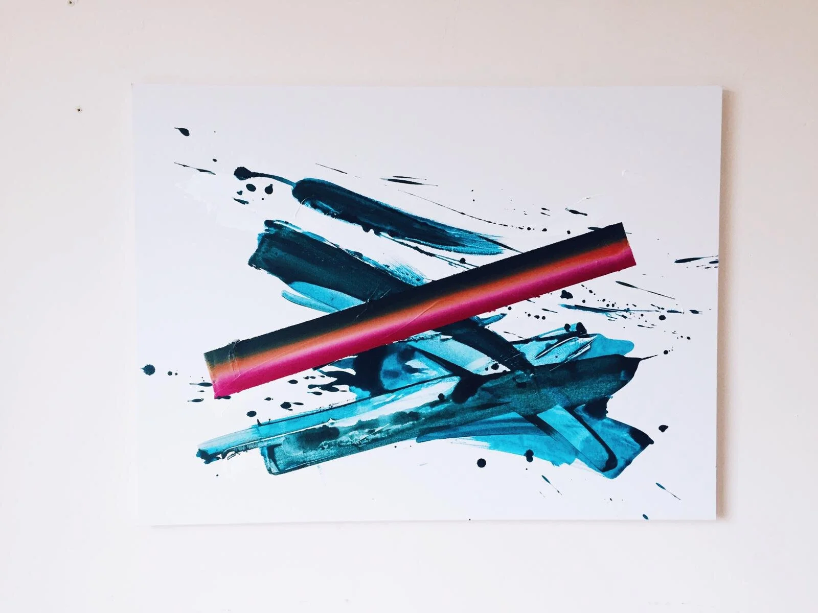
This is one of a series of works on paper that highlighted specific colours thrown by light across the landscape of Sligo in mid-summer. I approached this as an exercise in exploring a technique. I wanted to fully engage in the process of applying three distinct layers in various colour combinations.
The works are made up of three components; the white texture background, followed by the messy spirited splash, and finally the slow strong gradient stroke. The gradient colours were chosen by identifying the brightest colour against the deepest colour of the environment at a specific time of day. The slow steady application of the stoke, after the uninhibited gestural splash forces me to shift my thinking, and my hand-eye coordination. Each component is intuitive - moving between complete abandon and frenzied focus.
Works are sold unframed and measure 29.7 x 42 cm
To purchase this work, and for more details, head over to my shop
The energy of the ocean impresses itself against the shore, engraving out its own shape. These work reflect the mapping of places where the ocean has carved itself out of the coast.
Created using carborundum, etching and monoprint printmaking techniques on paper.
16.5 x 14.5cm
To purchase these works head over to my available works.
This is one of a series of works on canvas that highlighted specific colours thrown by light across the landscape of Sligo in mid-summer. I approached this as an exercise in exploring a technique. I wanted to fully engage in the process of applying three distinct layers in various colour combinations.
The works are made up of three components; the white texture background, followed by the messy spirited splash, and finally the slow strong gradient stroke. The gradient colours were chosen by identifying the brightest colour against the deepest colour of the environment at a specific time of day. The slow steady application of the stoke, after the uninhibited gestural splash forces me to shift my thinking, and my hand-eye co-ordination. Each component is intuitive - moving between complete abandon and frenzied focus.
Canvas size ranges from 120 x 80cm to 16 x 22cm.
To purchase this work, and for more details, head over to my shop
Brazil opened a huge amount of questions about my role as an artist, and my responsibility to create work that challenges my audience to change their perspectives. This led to a deep reflection of the sustainability of my work. On a practical level I was forced to examine the tools and materials I use to create my work. Nogalina is a dry mixture of ground walnut shell and is a material which is used through indigenous populations and body paint, and as a wood preservative. It is extracted from between the top two layers of the Walnut. It is water soluble, and is easily prepared. The simplicity of this material juxtaposed against acrylic marked a moment of clarity. I continued to explore this material, which informed the work I was making in response to the landscape of Brazil. The works the emerged from this new exploration were specific to that moment, and that place.
These works are sold unframed. For more information and to purchase please head over to my shop
The colours reflect the coming of spring, and the emerging of colour; both which are mirrored in the landscape surrounding the space they were created for.
I poured liquid pigment onto hand-stretched canvas, pooling and dragging the colour across the surface of the painting. By building layers on top of layers the pieces embody the curves and currents of moving water. The work ‘Congress of Substances’ hints to the abundance of colour and texture found in the natural landscape by deconstructing the marks I use to create paintings. The title of the largest piece ‘Im Waiting At The Weather Window’ evokes a feeling of anticipation for the season to come.
These works are the beginnings of a larger series investigating the physical manifestation of “wild inks”. Ink is living, and when different material mix they cause reactions, oxidisation, and often a shift in colour.
Oak galls are formed when a wasp lays it’s eggs on the branch of an oak sapling. The tree responds to the wash larvae by creating a protective orb or “gall” around the was babies. Eventually the wasp bores a tiny, perfectly circular tunnel out of the gall and flies off, leaving it’s gall haven behind.
I crush and soak the galls for between a week and 18 months depending on how rich I would like the colour. After straining the liquid, I add FeS04 (Liquid Iron) which reacts with the tannic acid to turn the ink from orange brown, to black brown. After brushing the ink on the page the ink deepens further appearing as a rich, indelible black.
Oak Gall is the quintessential calligraphers ink and has been used since the middle ages. the Book of Kells contains oak gall ink, and until recent technology took over, oak gall was the official registrars ink for signing legal documents.
These works are sold with handmade frames.
To purchase this work, and for more details, head over to my shop
I was introduced to a beautiful material while living and working in NaCasa. Diego de los Campos, an Uruguayan artist at the house showed me how to slowly mix Nogalina into a fine liquid paste.
Nogalina is the dried husks of walnuts that is soaked and processed into ink which moves in a deliciously smooth way. Mixed with acrylic paint the colour takes on a new life, rolling around the paper like ink, before soaking into the pages.
There is something quite extraordinary yet simple about using colour found in nature.
These are the paintings which came from the experiments with Nogalina while trying to capture the essence of the Florianopolis landscape.
These works are sold unframed and are all a5 size.
To purchase this work, and for more details, head over to my shop
Charred oak from the stove ground down into a smooth silvery dust led to beautiful strokes in monochrome. The dense clay gathered from beneath the rocks at Baile na Sceilg beach created a pale purple chalky ink and dried opaque.
Each pigment was ground down from solid to a pigment rich dust during a residency at Cill Rialaig, Kerry in January 2020.
Sizes range between a5 (148x 210mm) and a3 (297 x 420), and are priced between €45 and €90 ex. shipping.
If you would like to purchase simply get in touch via email.
These works are a visual interpretation of the interplay of light and colour across landscapes. By pulling and dragging colour and texture across the canvas or by manipulating the visceral medium of paint to create a balance of motion, each piece gestures to presence in a fleeting moment. This series pushes the viewpoint away from specifics and expresses the whole, the essence of the landscapes.
These works are sold framed and measure between 11 x 16cm and 21 x 29.7cm
To purchase this work, and for more details, head over to my shop