• ABOUT
  • PROJECTS
  • Portfolio
  • COMMISSIONS
  • Store
  • WORKSHOPS
  • The Earth Spun Light
  • Journal
Menu

KARI CAHILL

Site-Responsive Visual Artist
  • ABOUT
  • PROJECTS
  • Portfolio
  • COMMISSIONS
  • Store
  • WORKSHOPS
  • The Earth Spun Light
  • Journal

Cyanotype Experiments

March 10, 2022

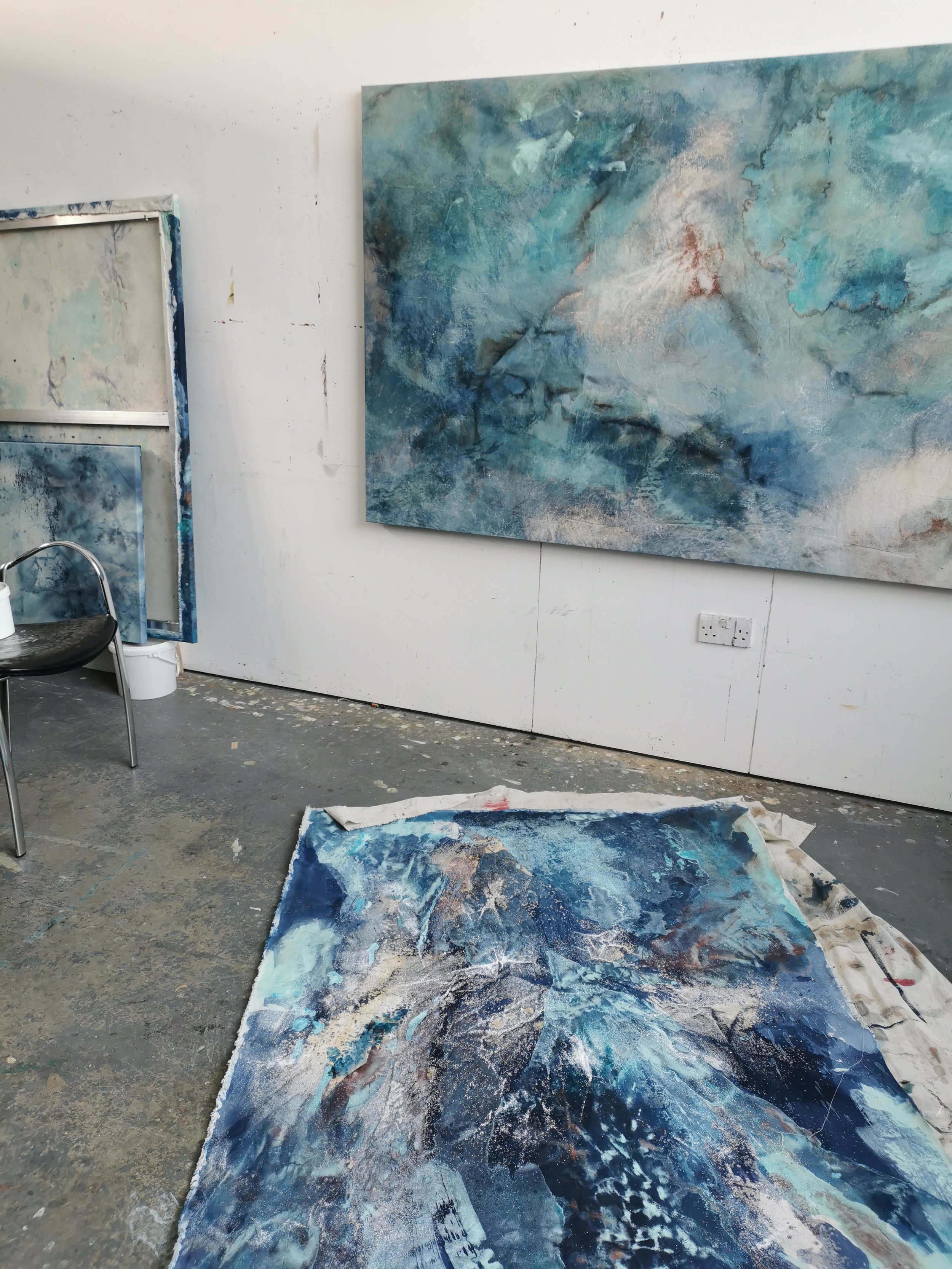
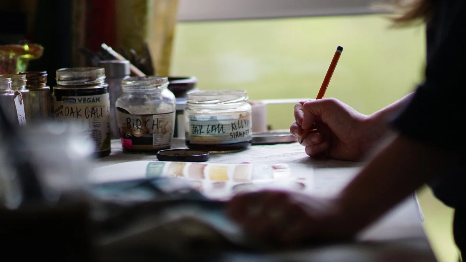
The past year I have been working on two commissions which, over time, began to explore a similar process - using UV to oxidise cyanotype chemicals. While the two commissions had very different starting and end points they both allowed me to delve into the varied outcomes that result from tinkering with exposure times, weather conditions and surface. Below are some images and descriptions that explain the process.

Process Kari Cahill - Cyanptype Process 2022 - irish Artist12.jpg
Process Kari Cahill - Cyanptype Process 2022 - irish Artist7.jpeg

Cyanotype is a process whereby a chemical mixture is oxidised by UV light to produce a deep blue colour. Literally painted by the sunlight.

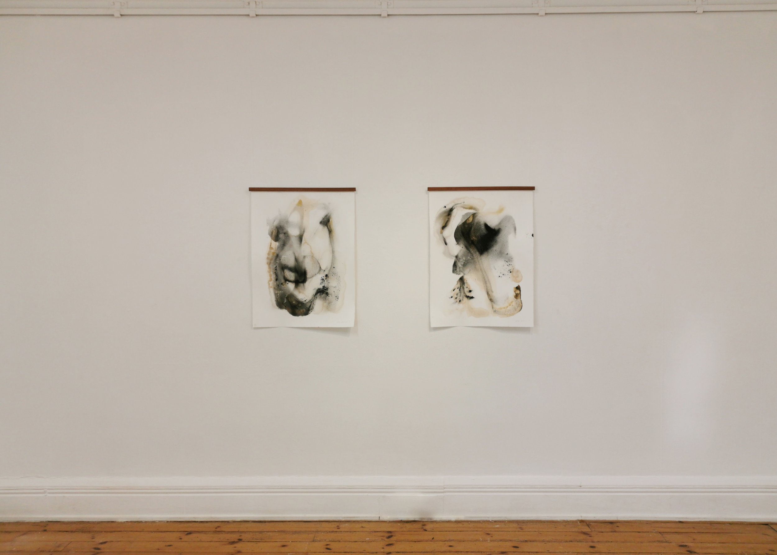
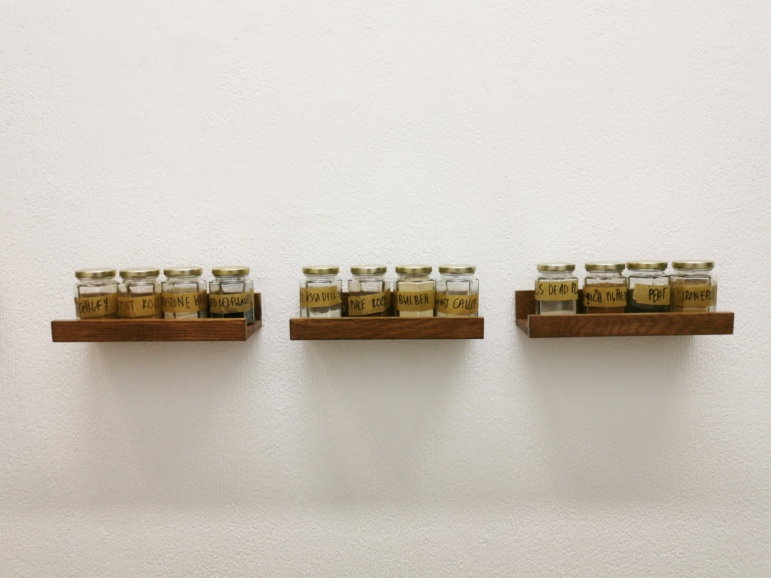
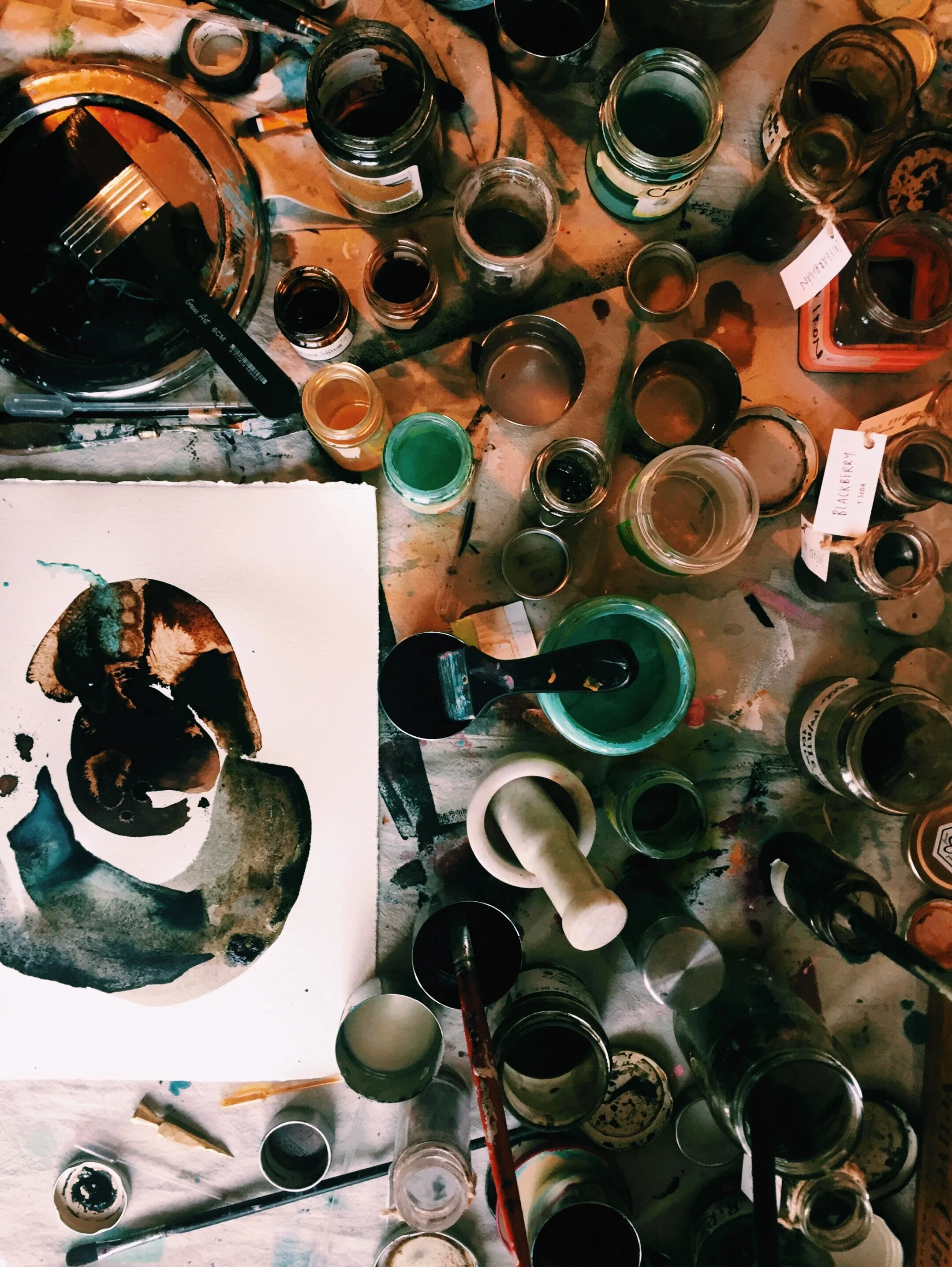
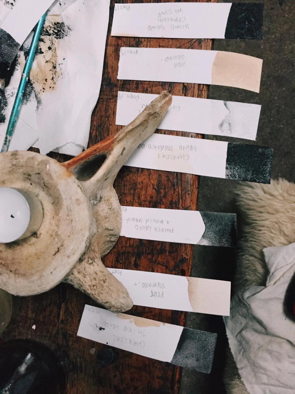
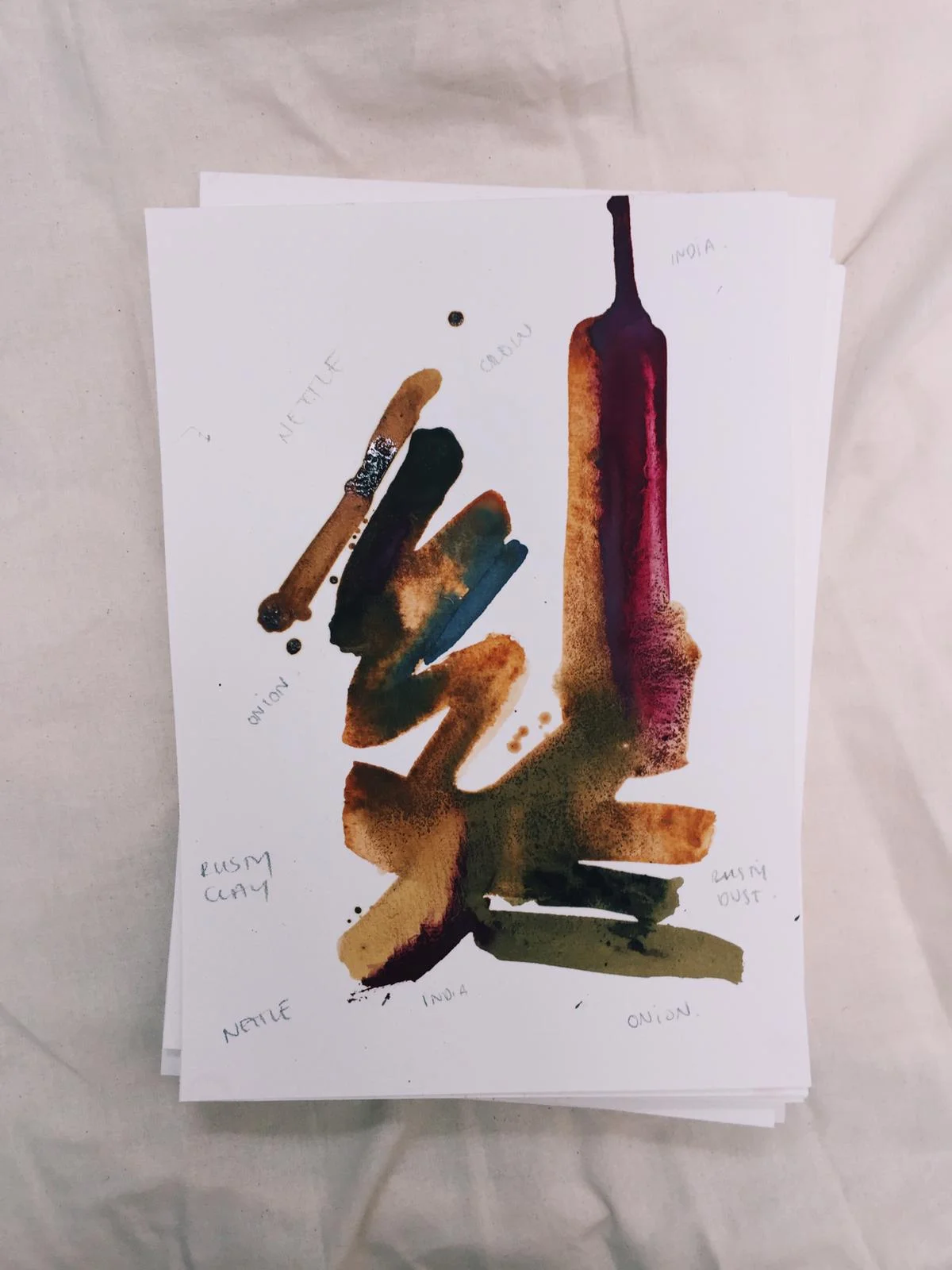
Ferric ammonium citrate and potassium ferricyanide are mixed together (in the dark away from UV light) to make a yellow liquid. This is painted onto paper and left to dry and then stored in the dark. 

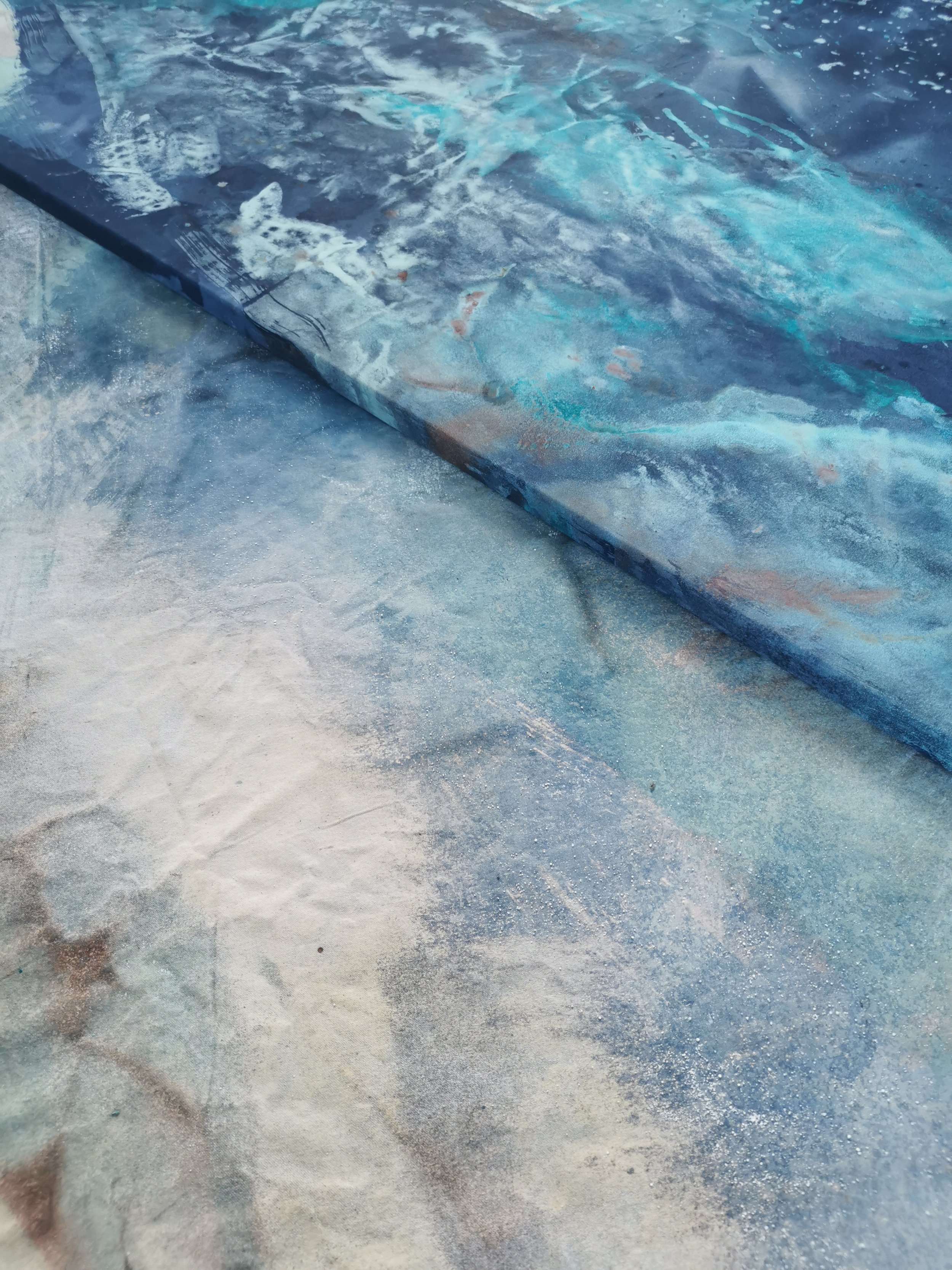
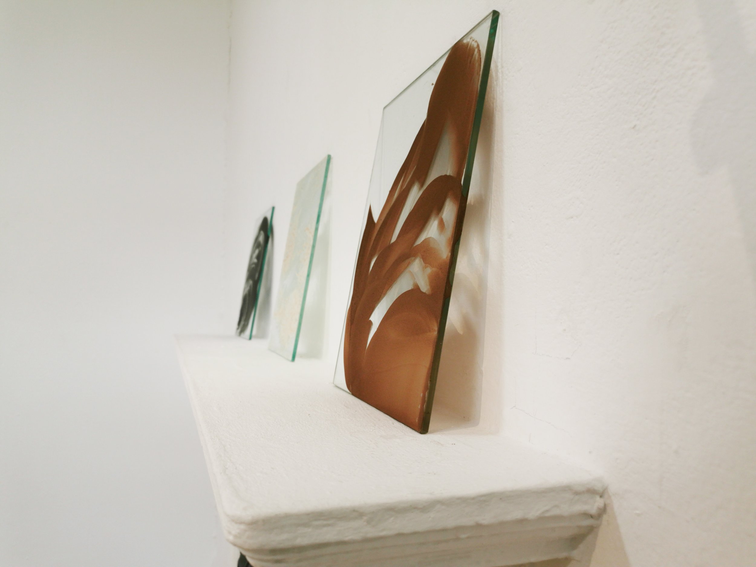
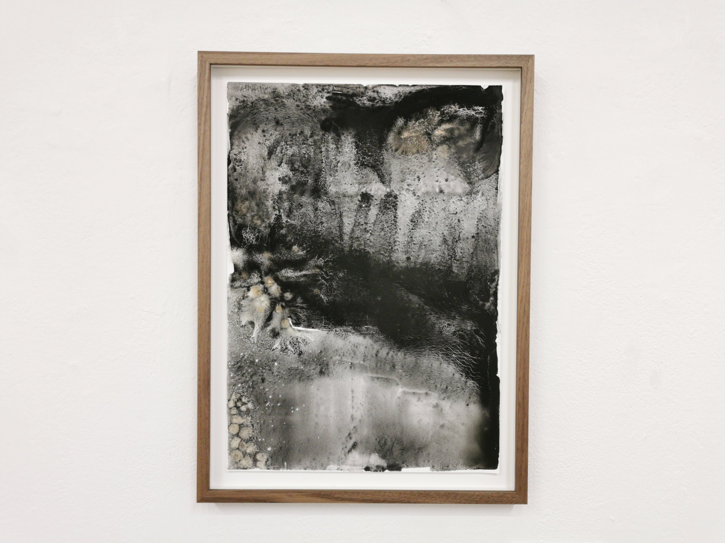
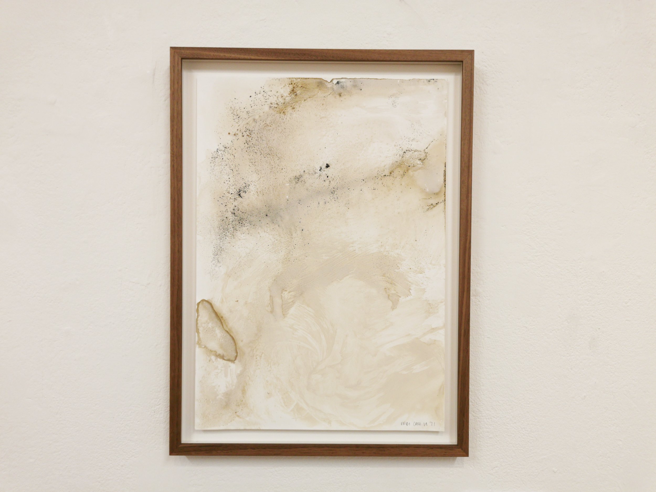
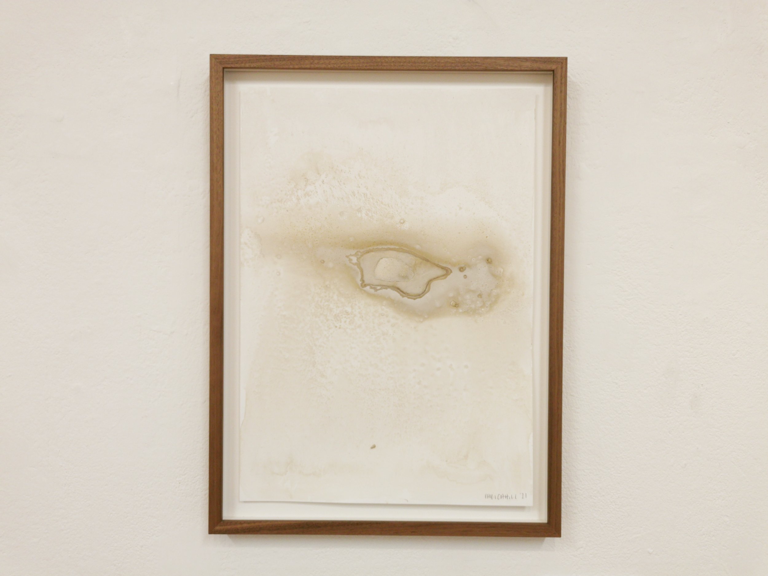
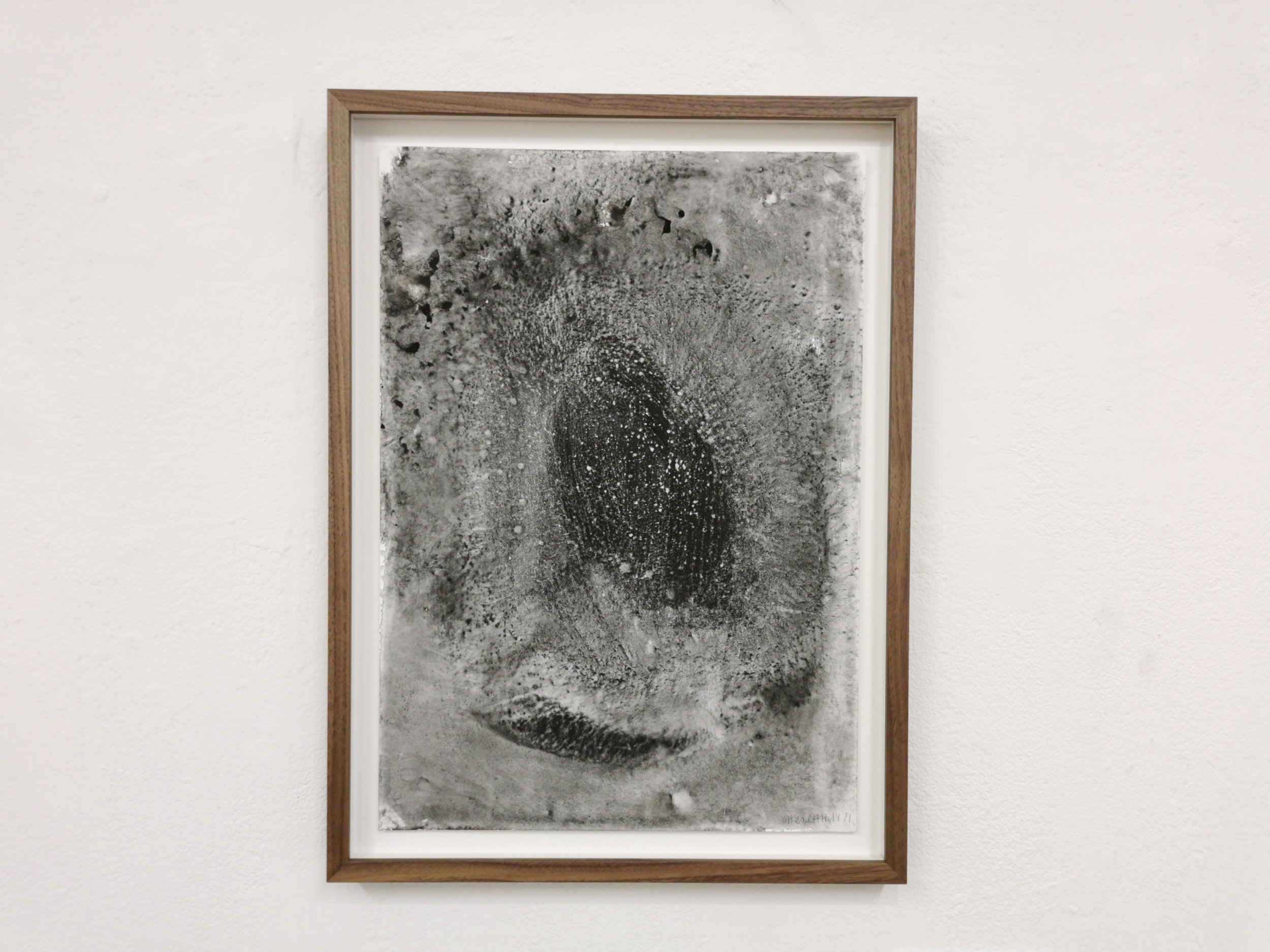
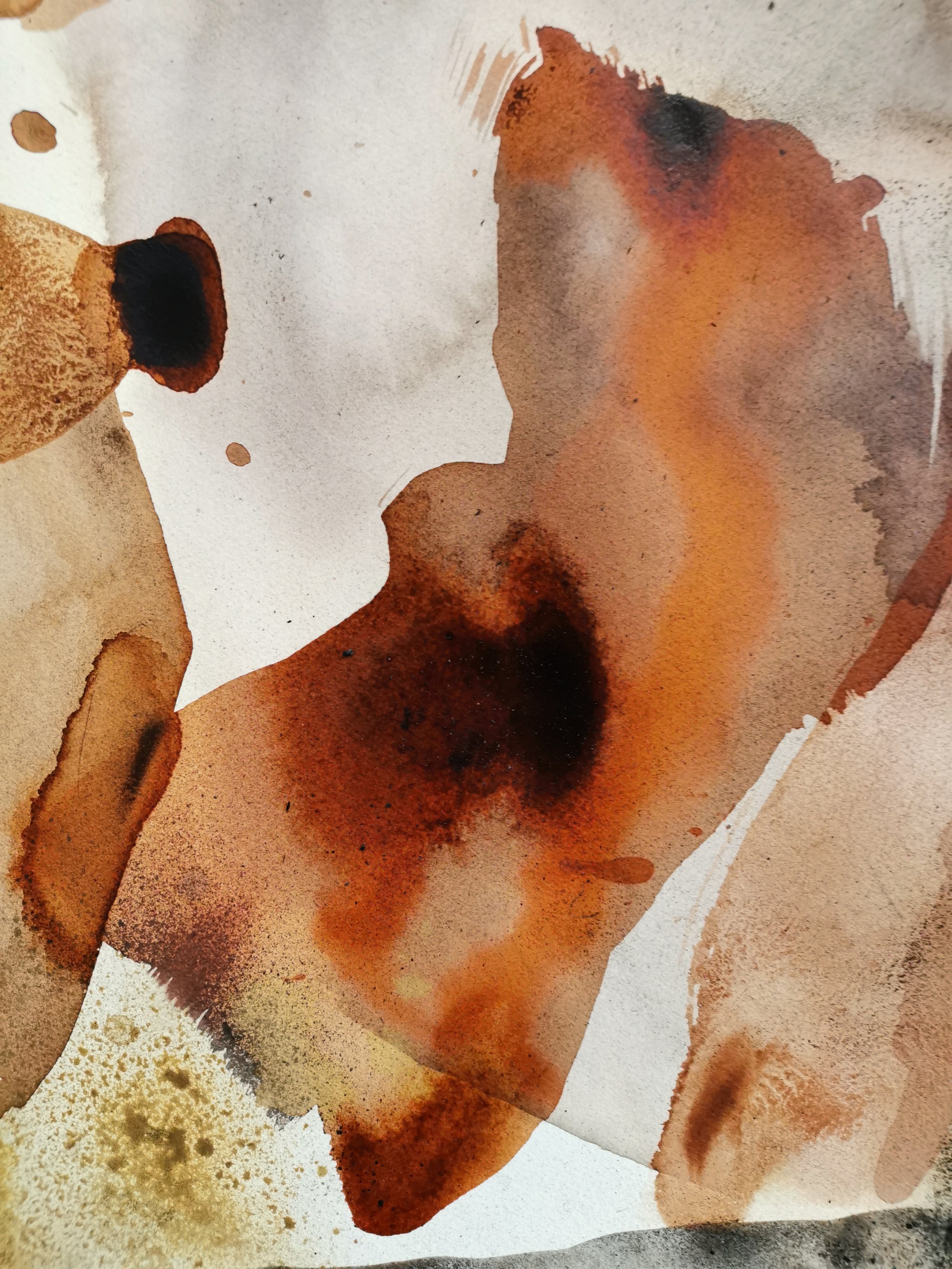
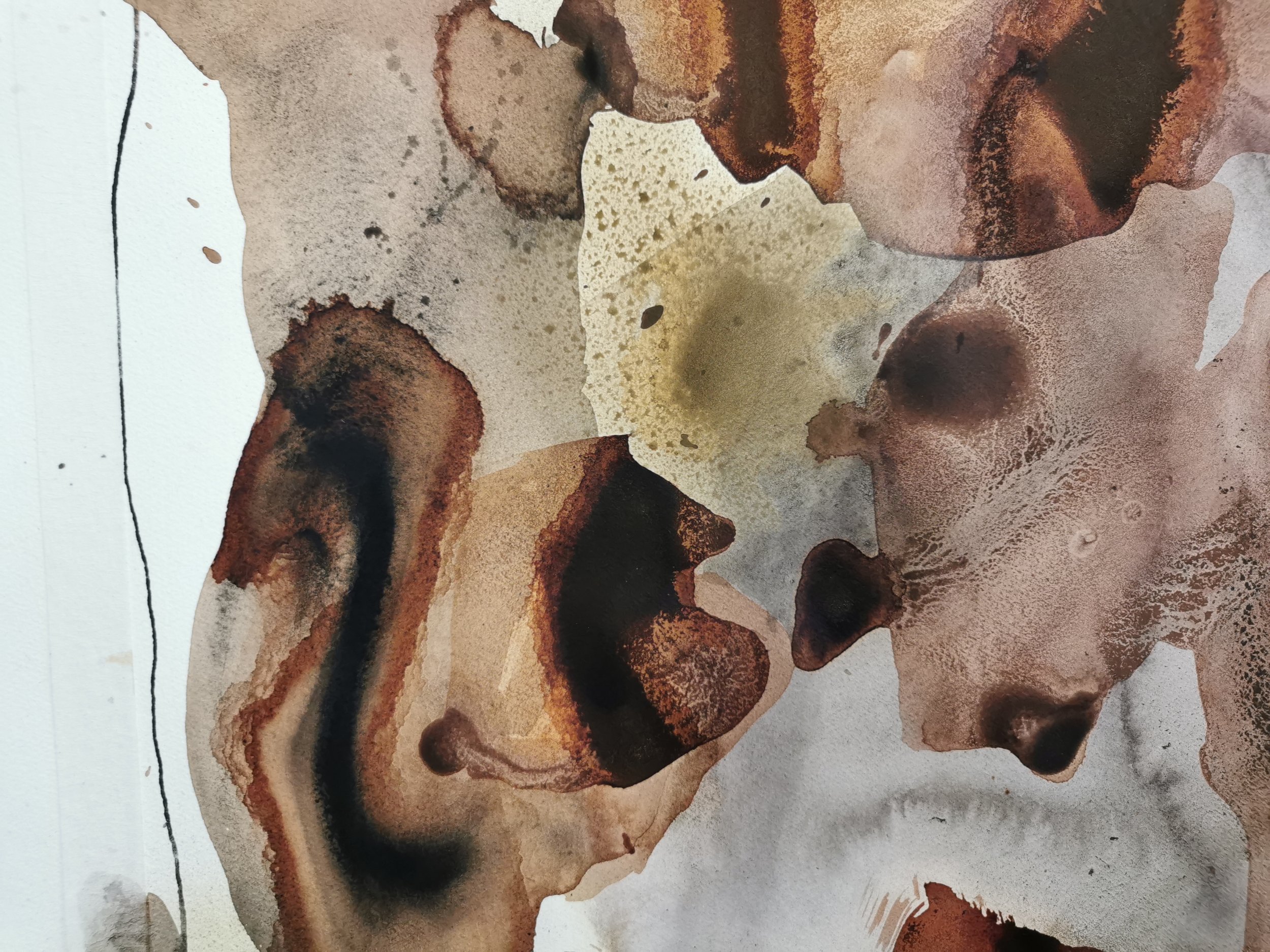
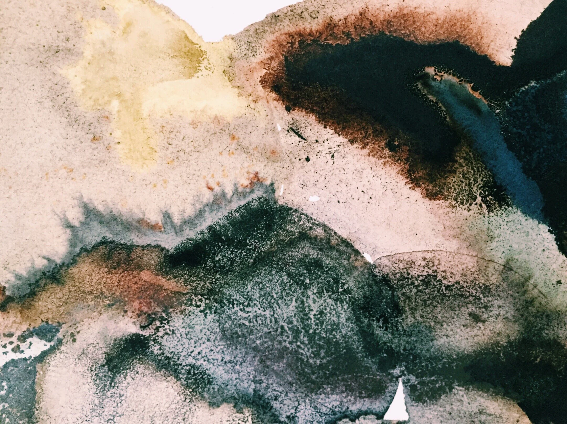
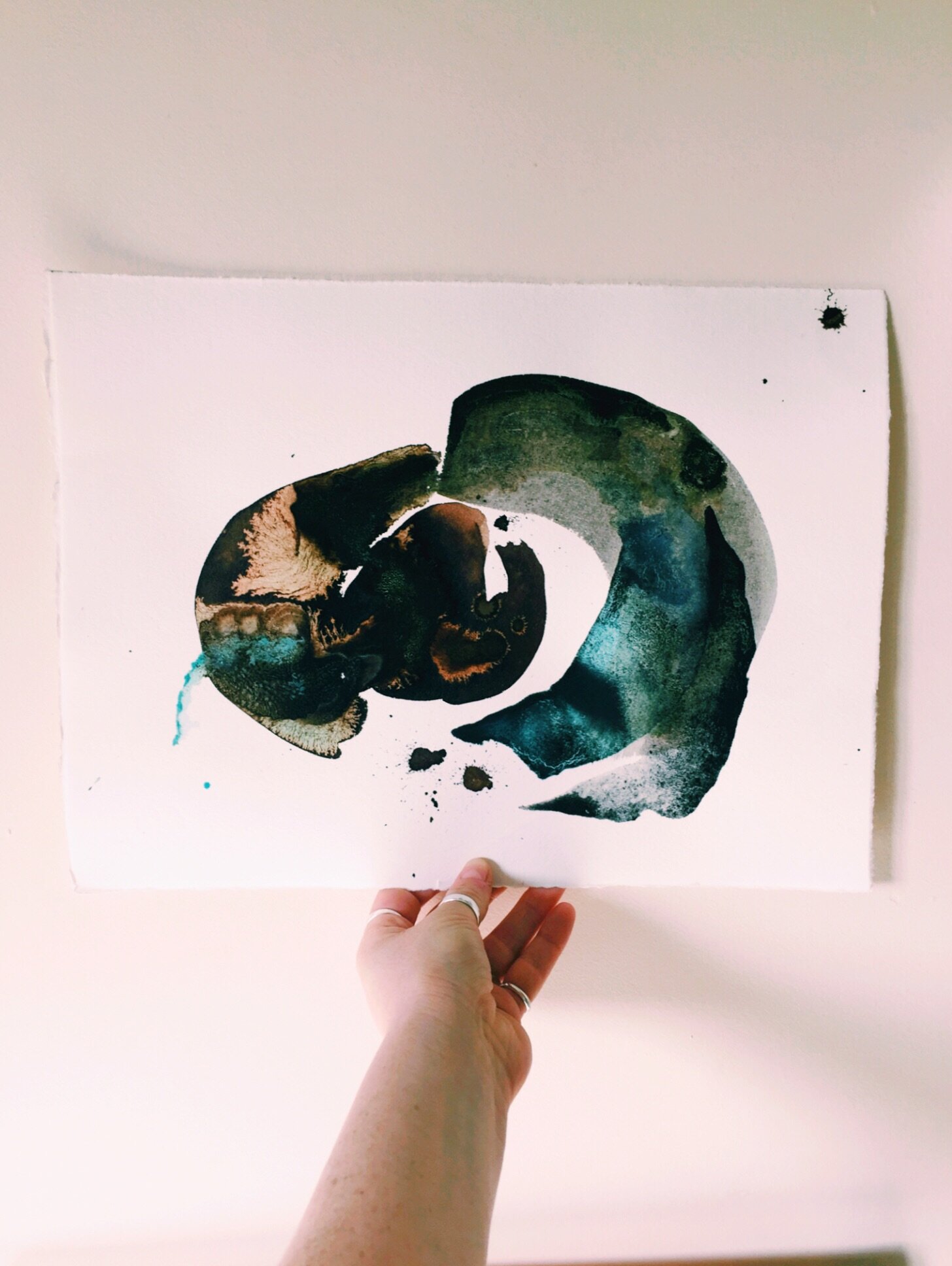
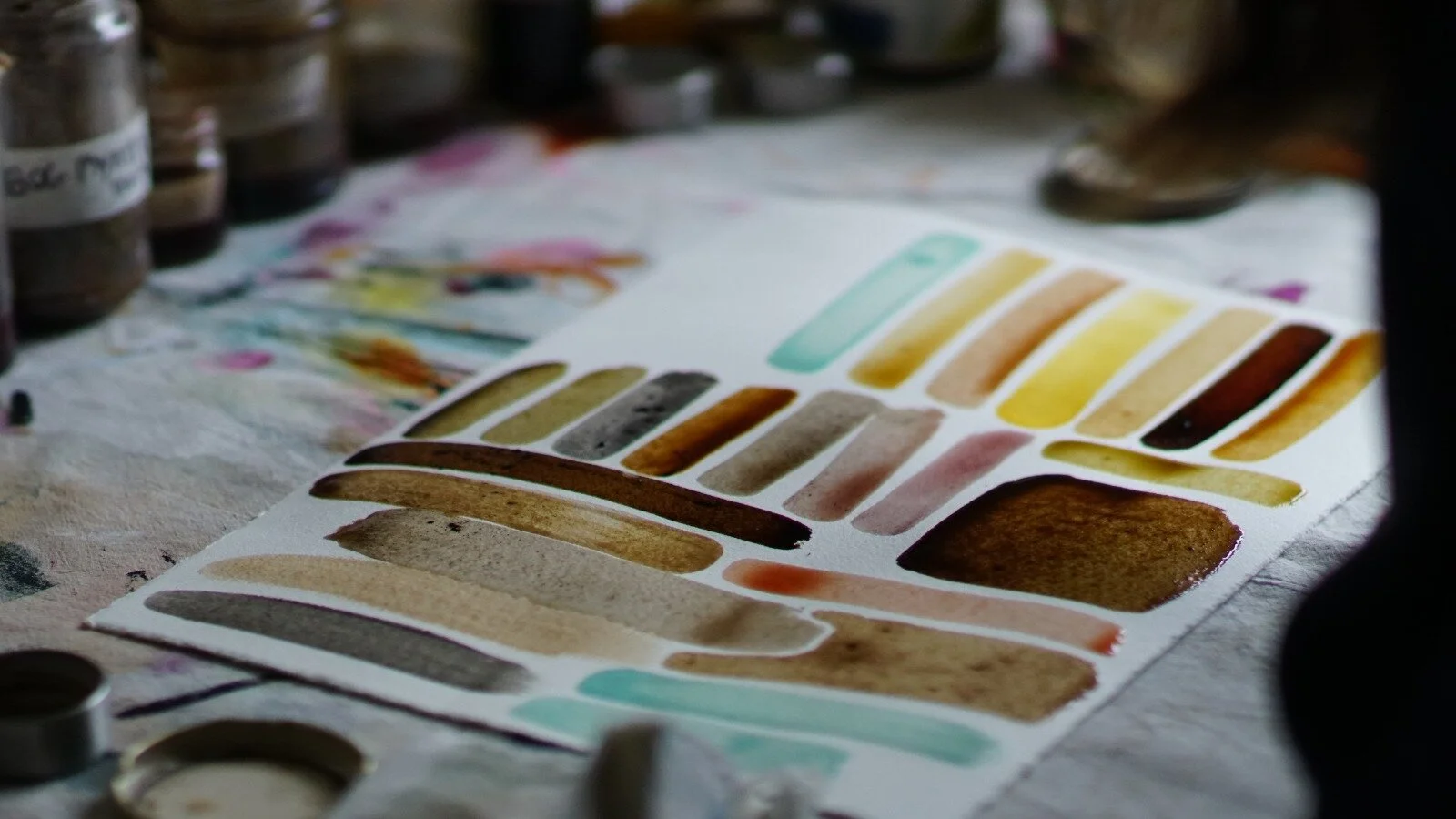
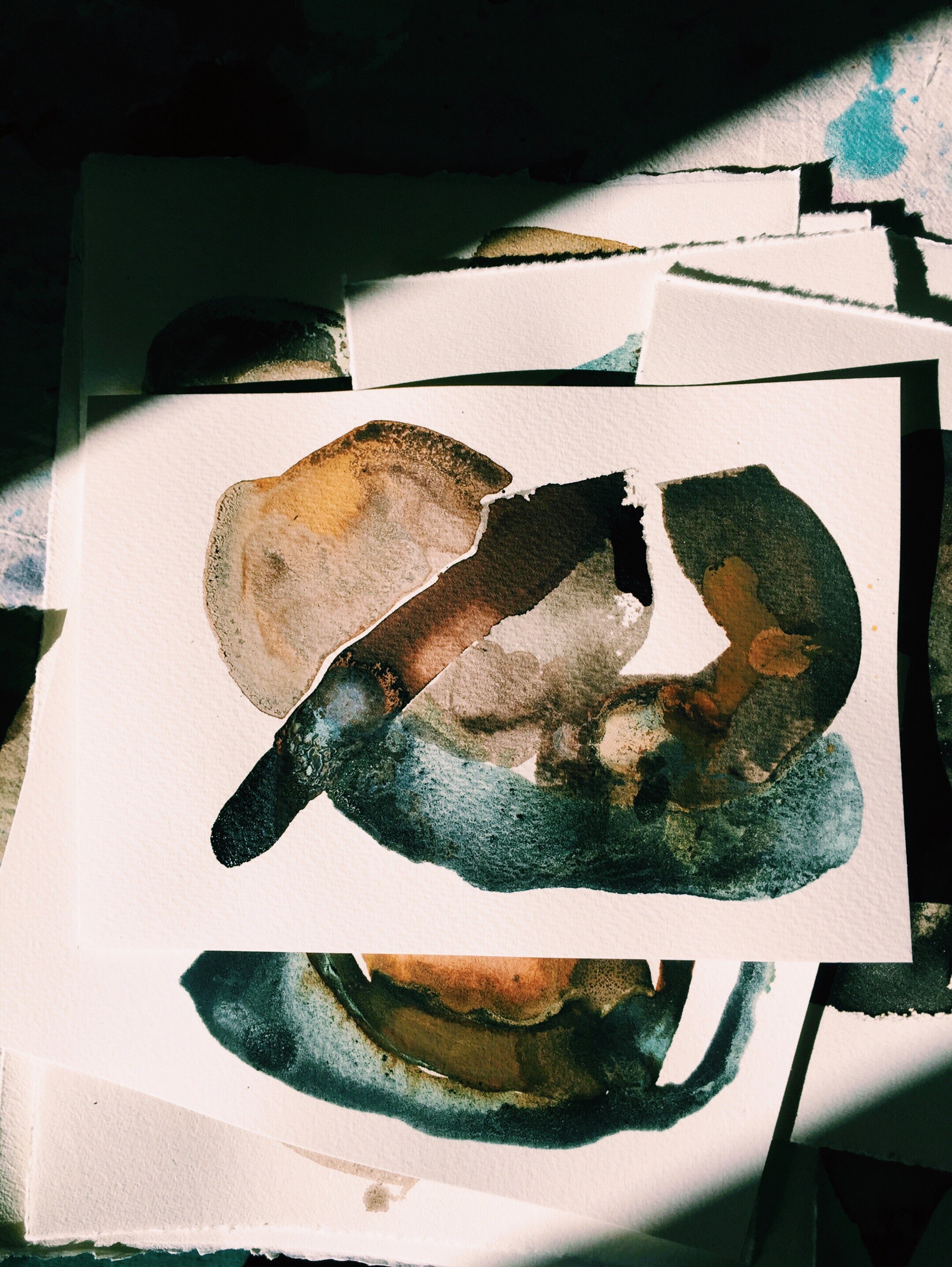
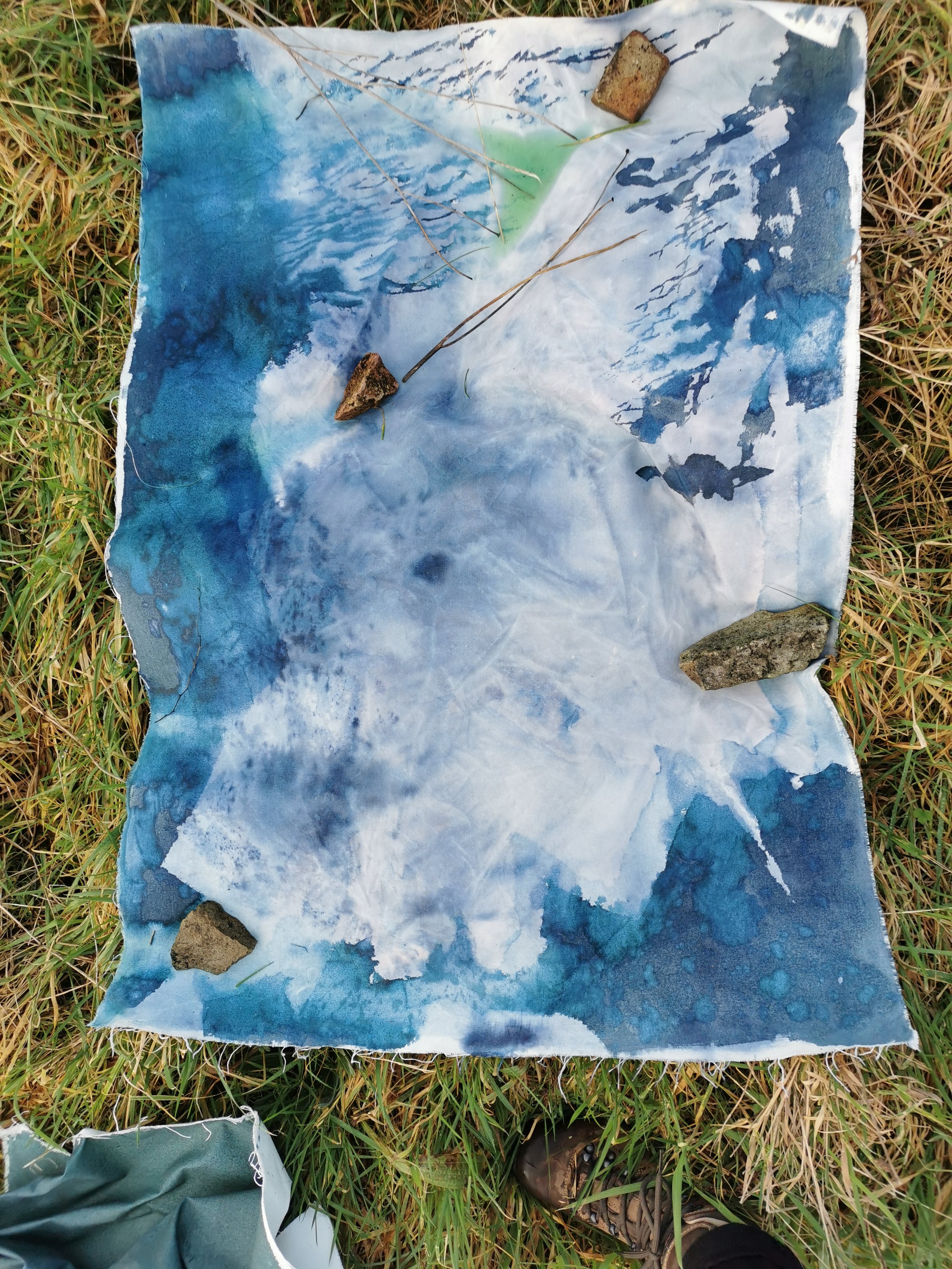
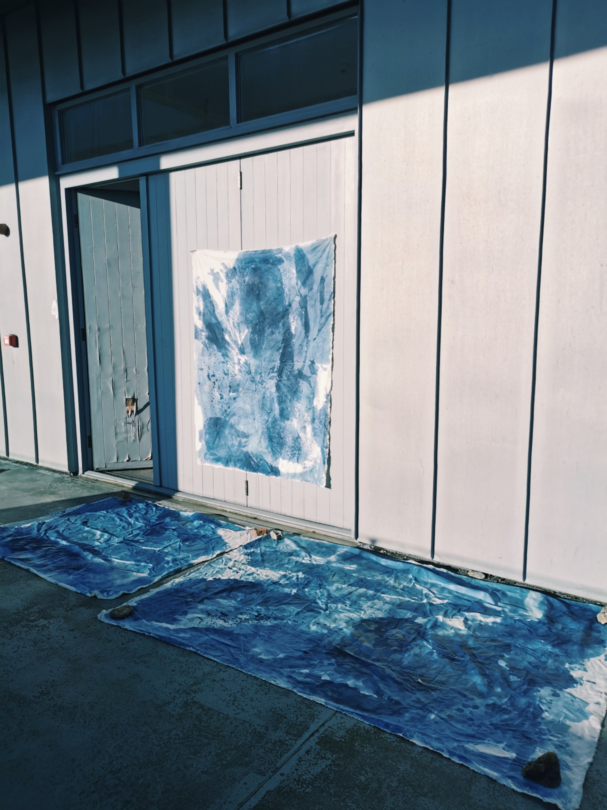
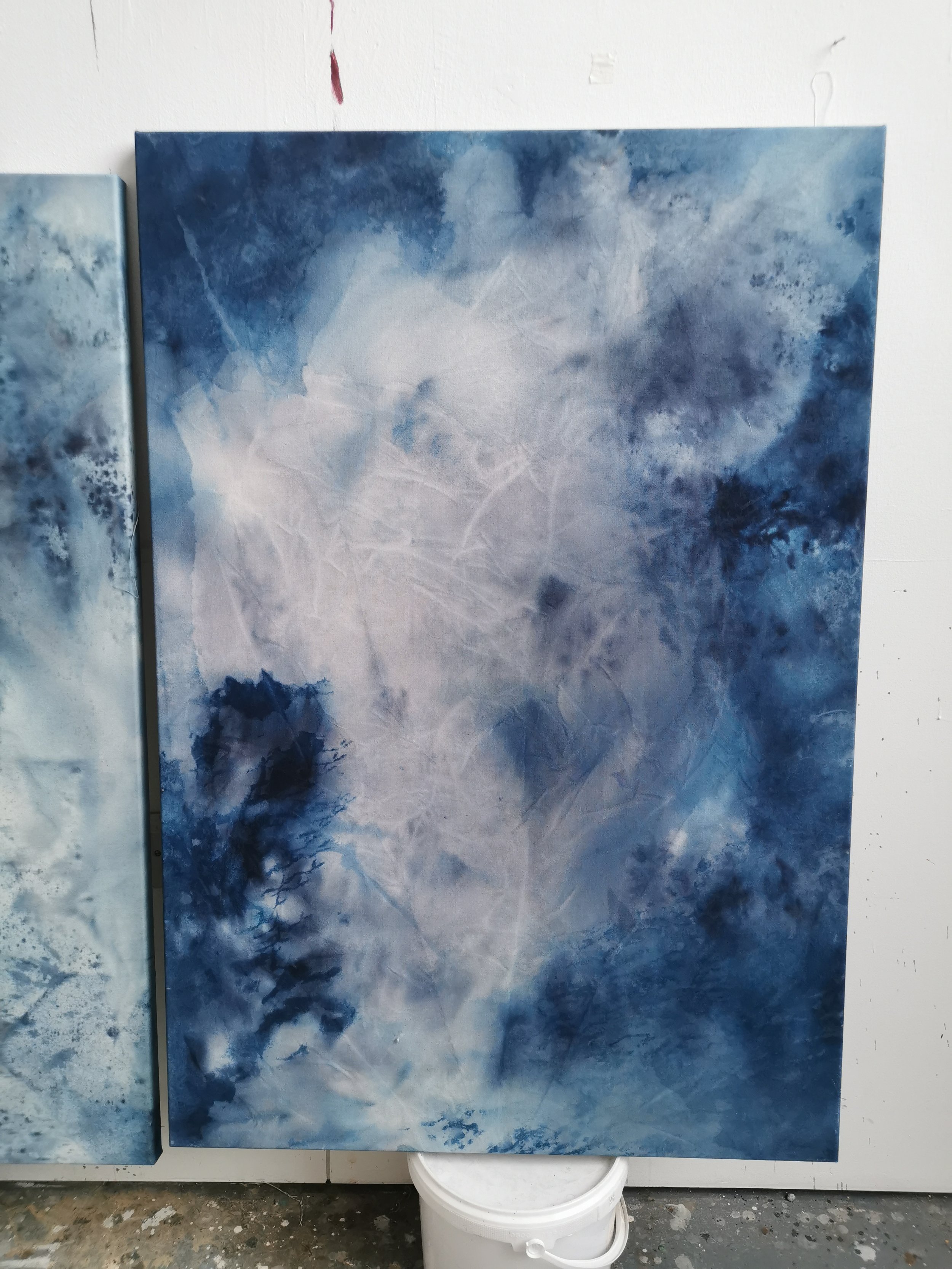
When exposed to UV light (sunlight) the mix undergoes an oxidisation process and turns from yellow to green to blue. After exposure the remaining mix is washed off leaving behind a beautiful prussian blue. Various shades of blue can be achieved by tweaking exposure times. Water is added at various moments which causes interesting colouration patterns and lends itself beautifully to my practice.

Process Kari Cahill - Cyanptype Process 2022 - irish Artist8.jpeg
Process Kari Cahill - Cyanptype Process 2022 - irish Artist3.jpeg

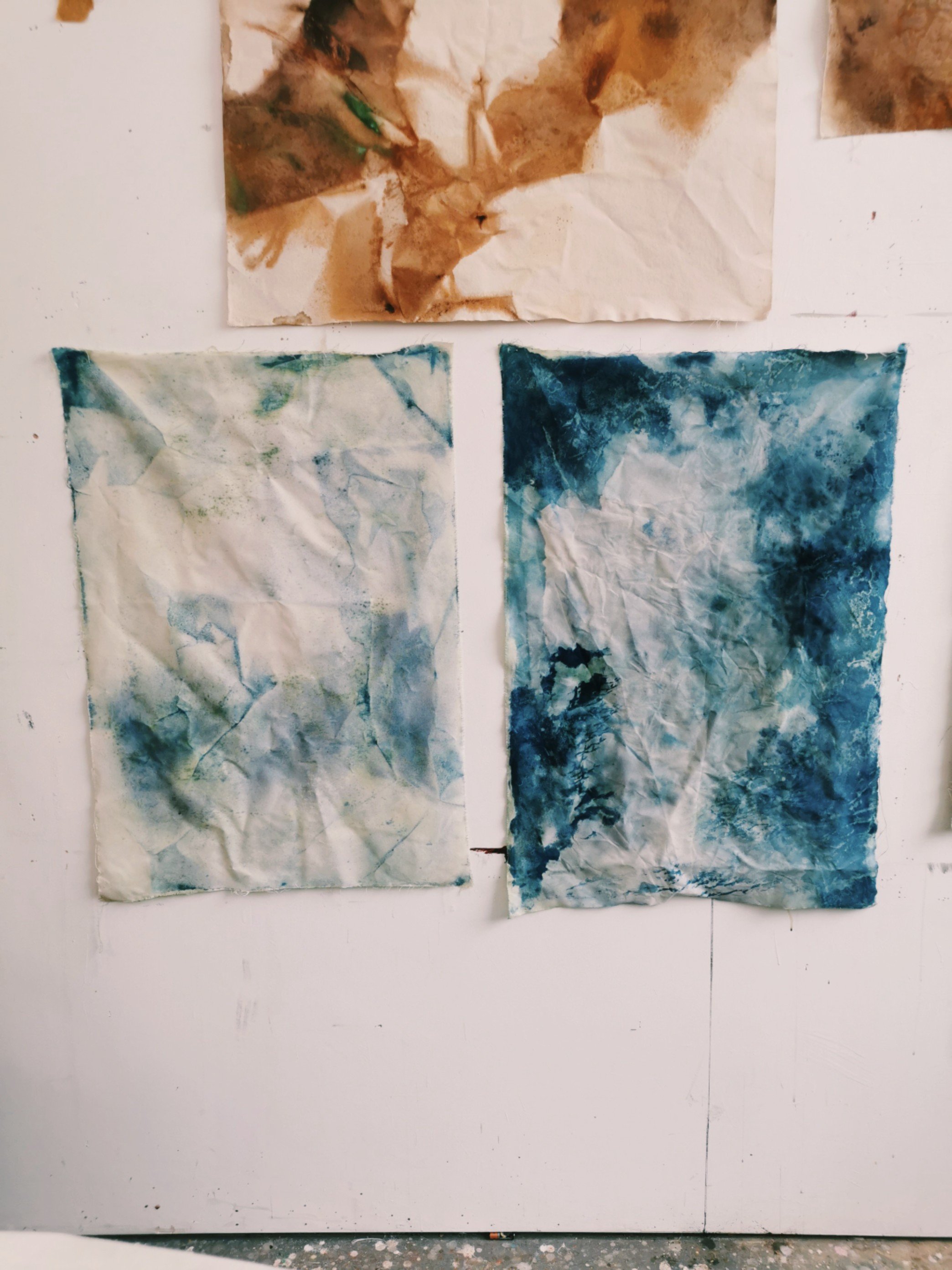
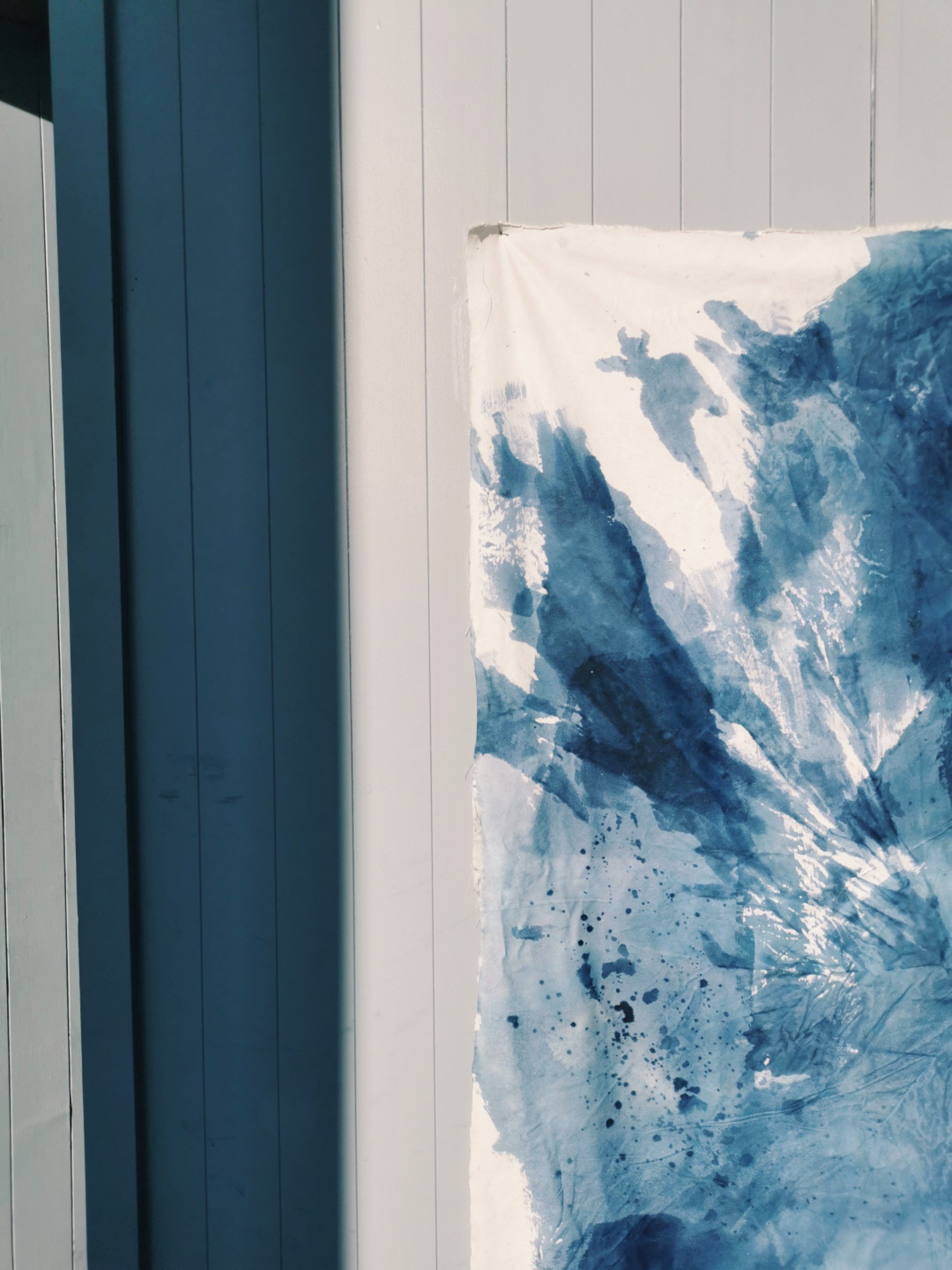
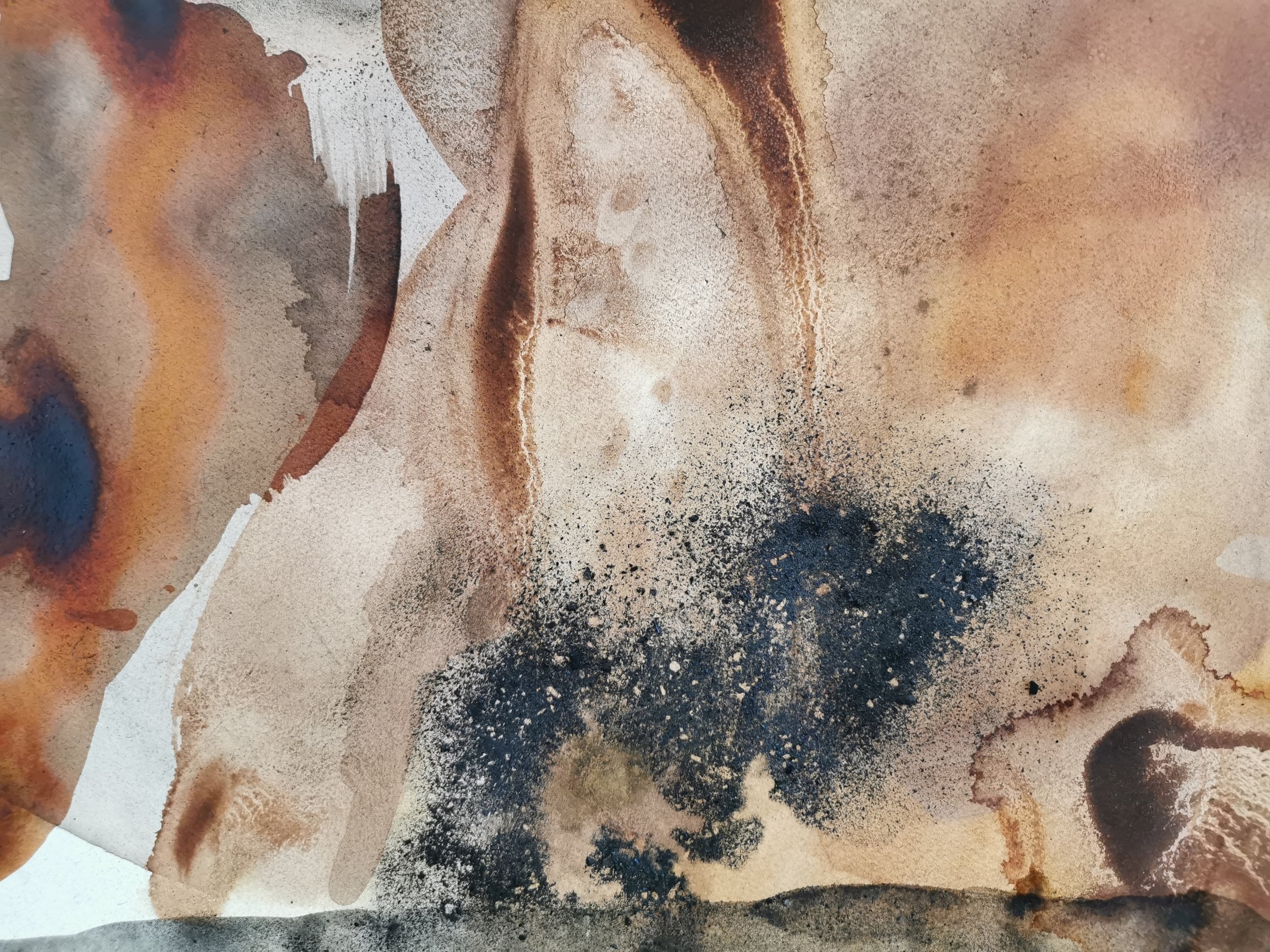
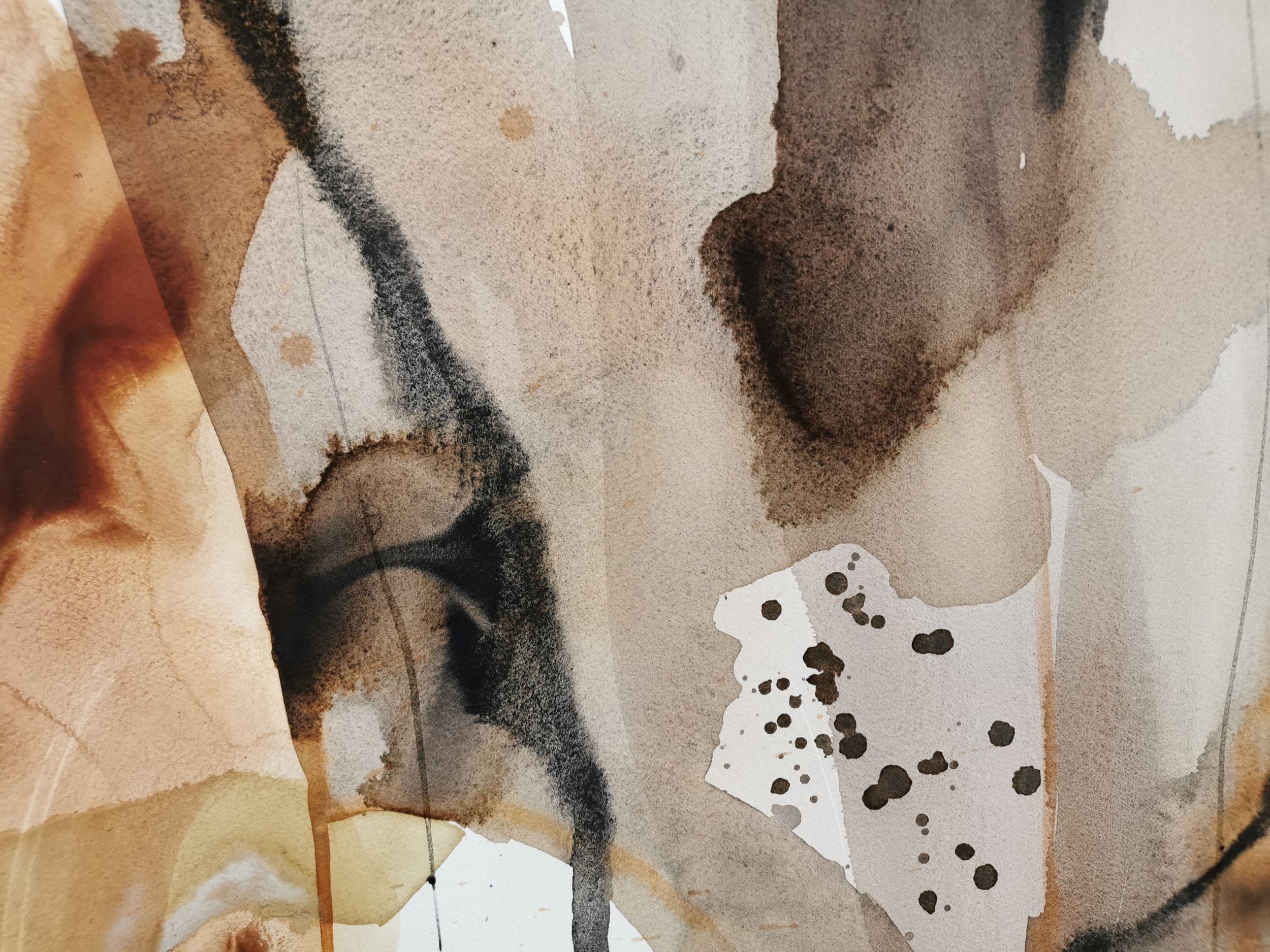
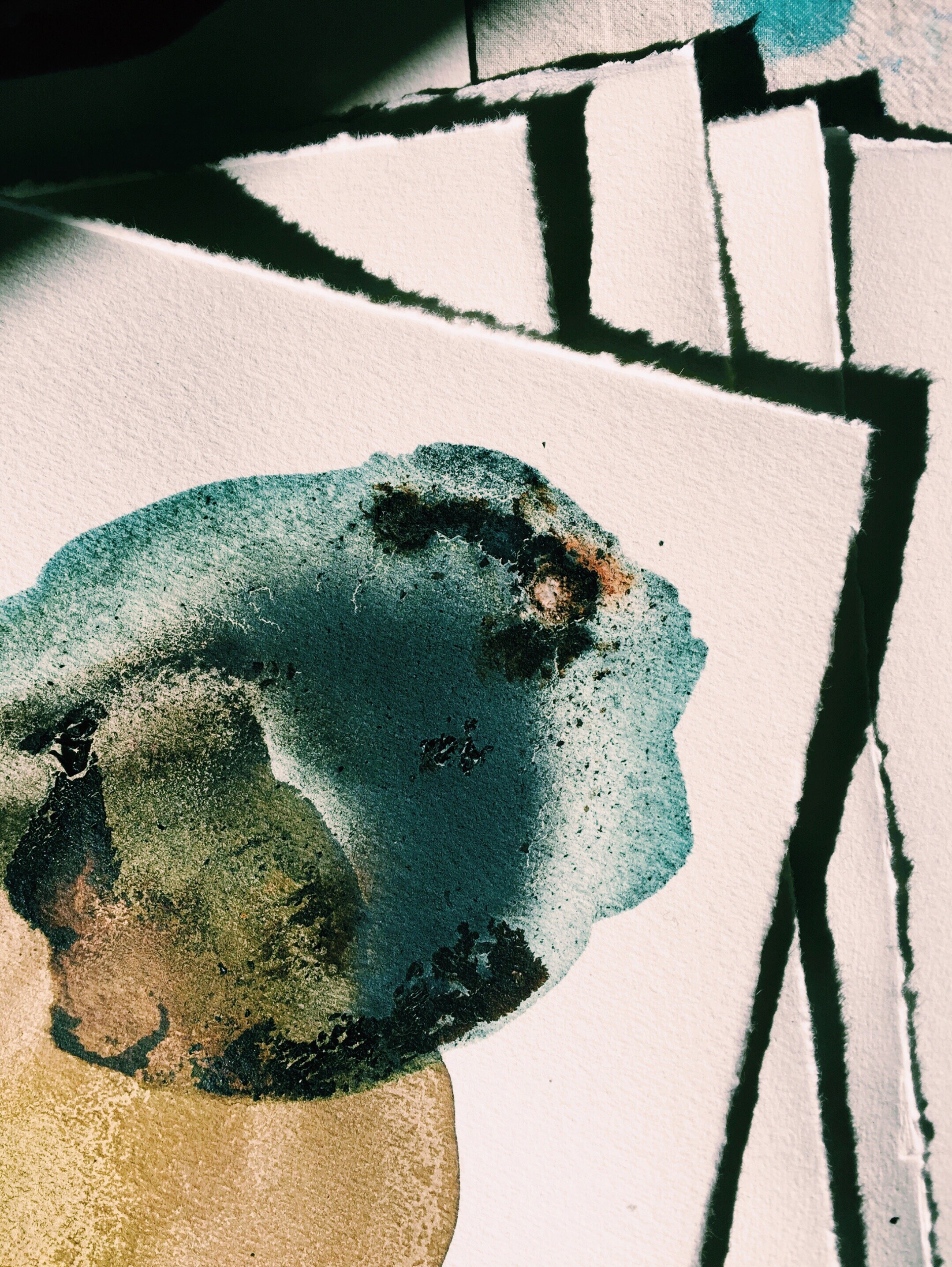
The cyanotype mixture contains iron salts which are washed off with the addition of water, however, while they remain on the page they can be mixed with copper ink, which reacts by turning from bright turquoise into a deep rust colour. Alternatively, the copper can be added after the cyanotype has been washed and in this case the copper oxide ink dries in it’s own crystallisation patterns across the page. 

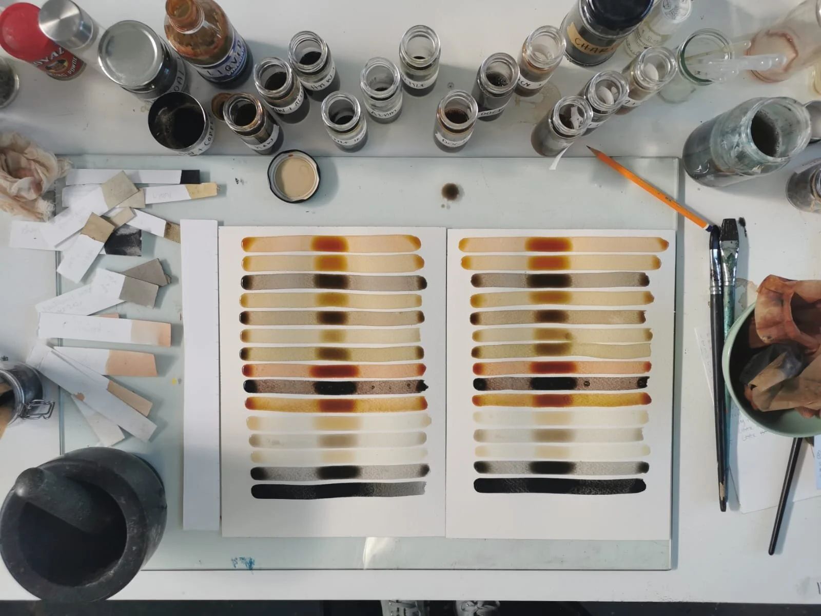
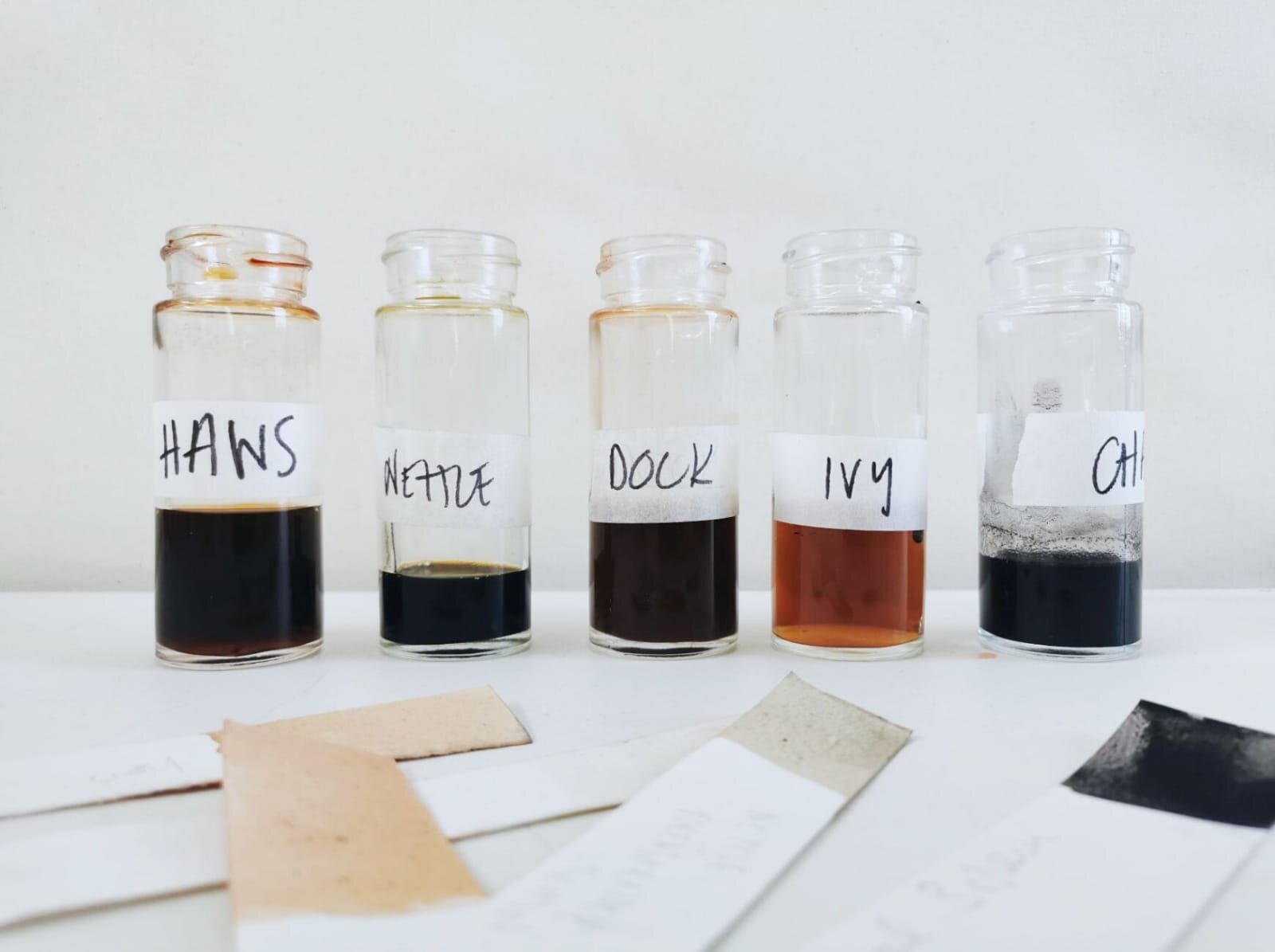
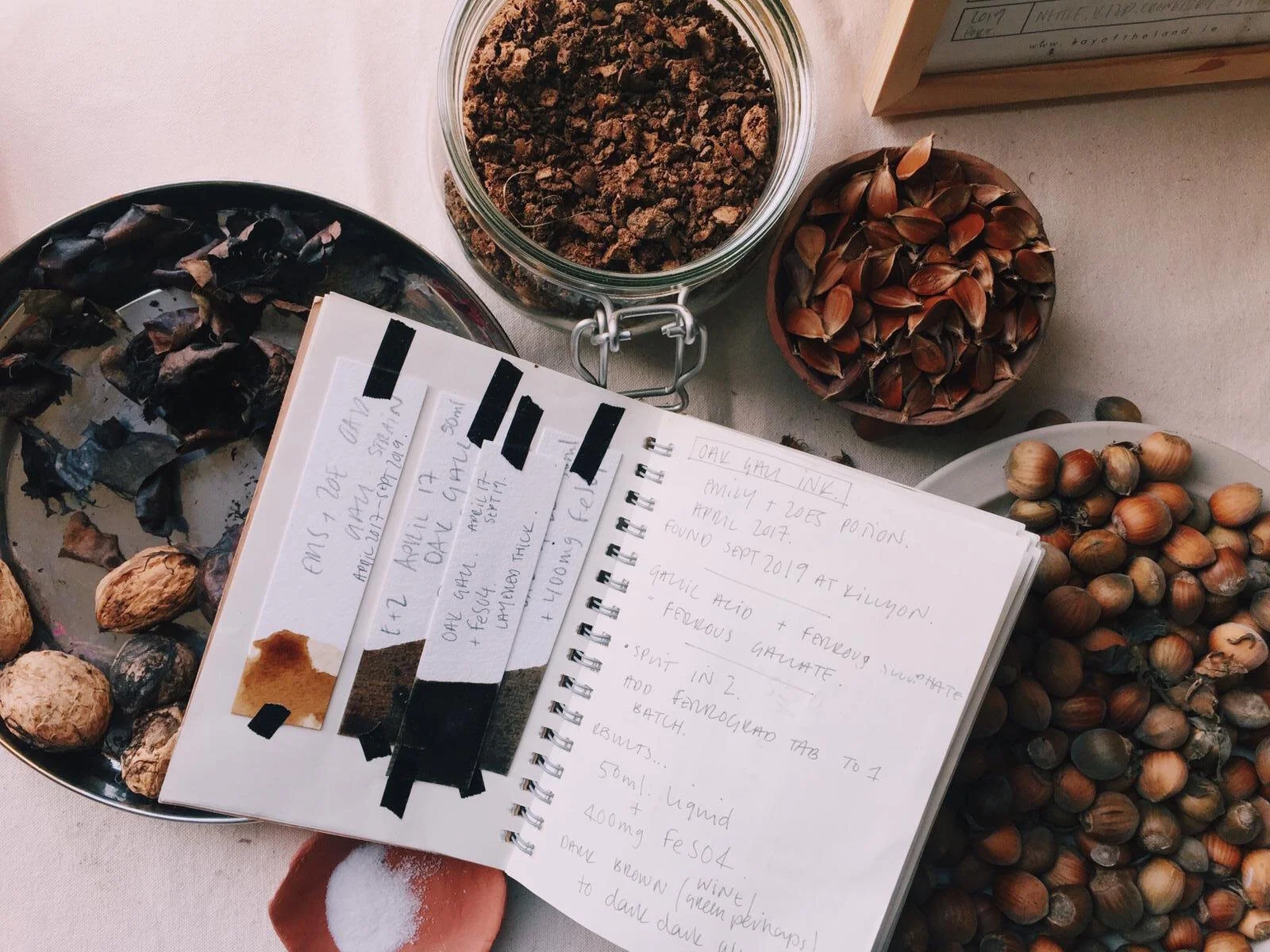
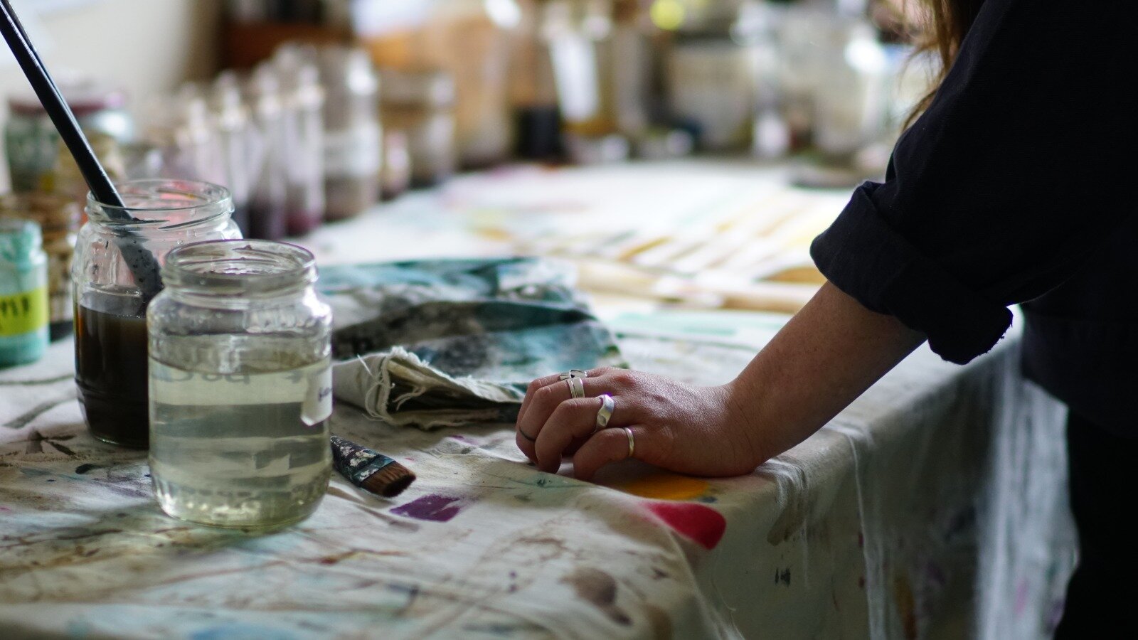
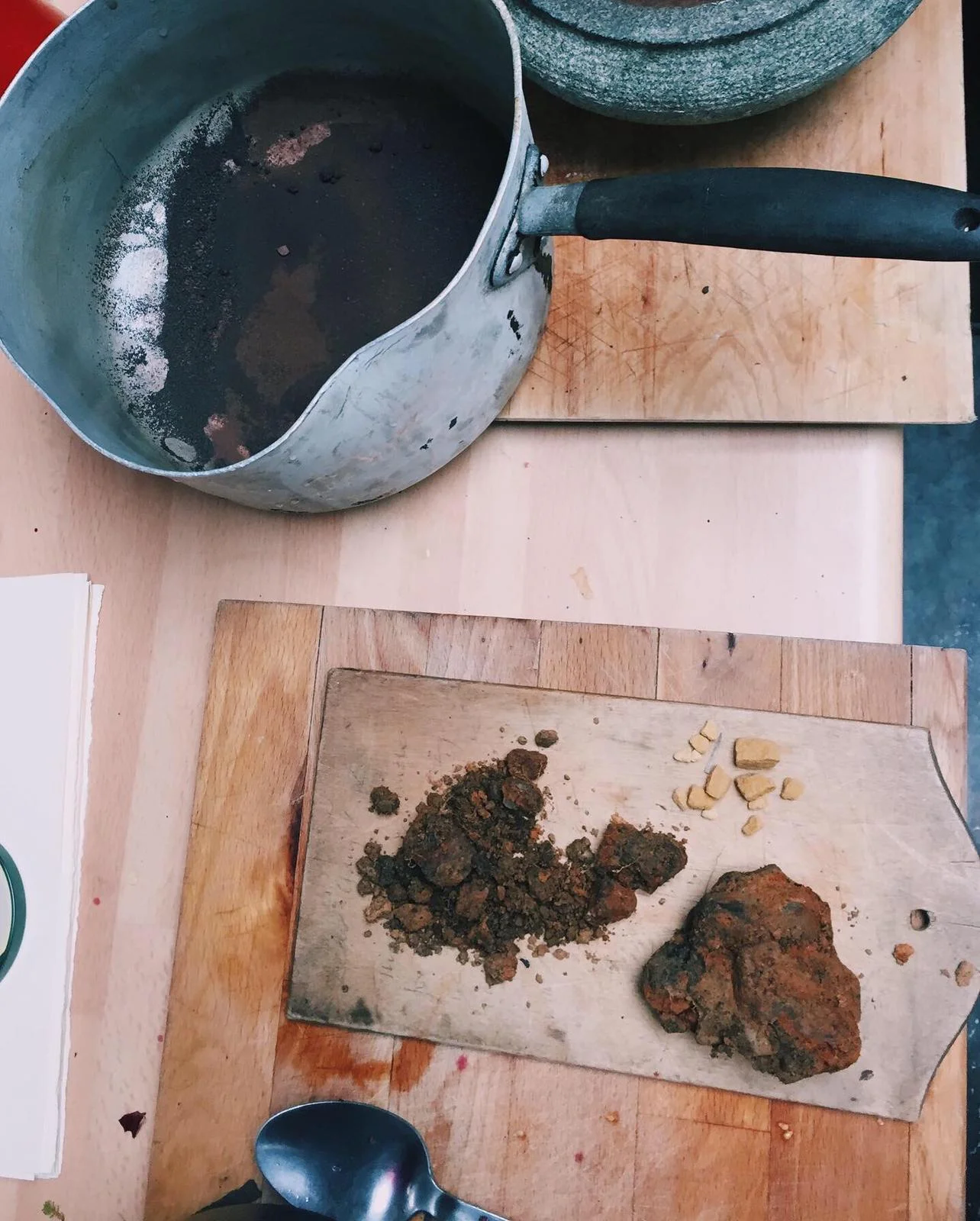
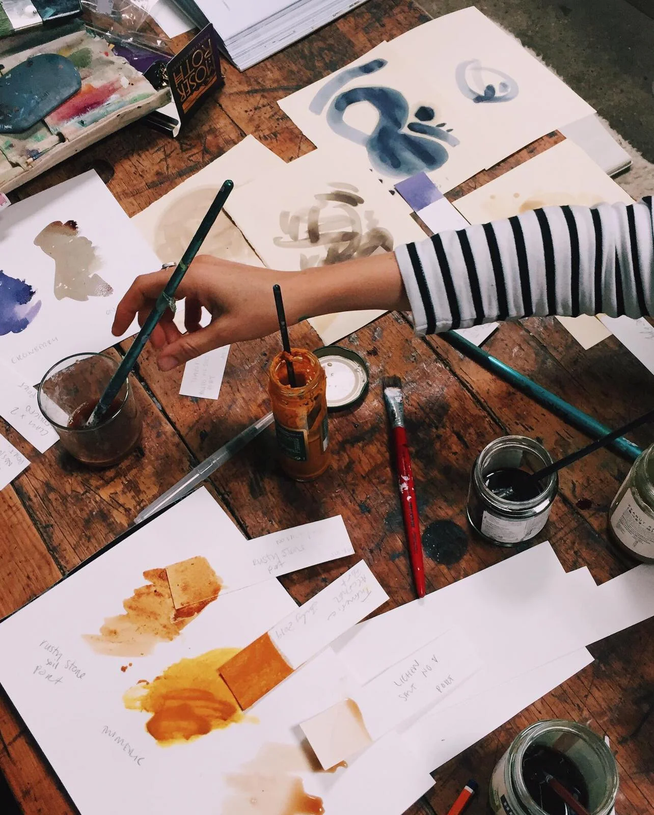
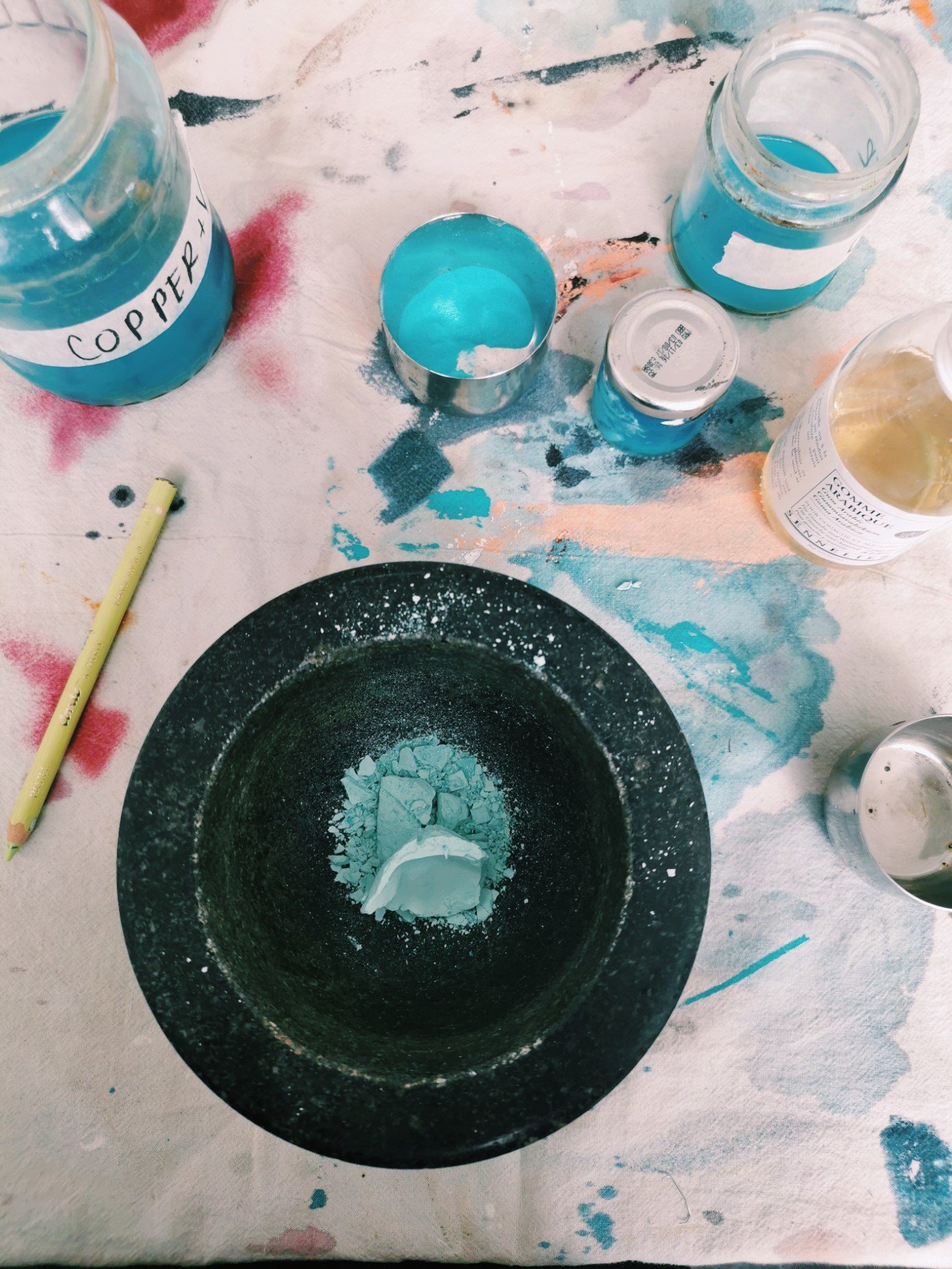
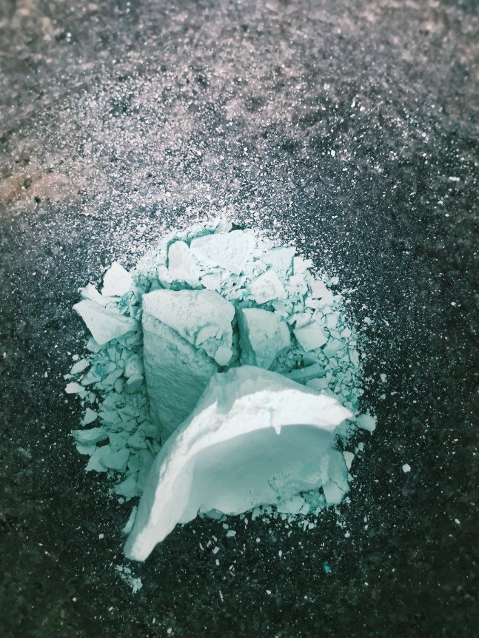
Copper ink is an exercise in alchemy. I began by submerging copper scraps in vinegar and iodized salt for two months, stirring the ink daily to allow air and vinegar to oxidise the copper, producing a deep turquoise colour. The colour deepens over time as more of the copper is eaten away through the oxidisation process. 

The ink is separated into two layers, a top dark blue transparent layer, and a heavier milky blue layer that sinks to the bottom. When mixed they produce a beautiful translucent ink that seems to bend and move with the light. 

Process Kari Cahill - Cyanptype Process 2022 - irish Artist1.jpeg
Process Kari Cahill - Cyanptype Process 2022 - irish Artist2.jpeg

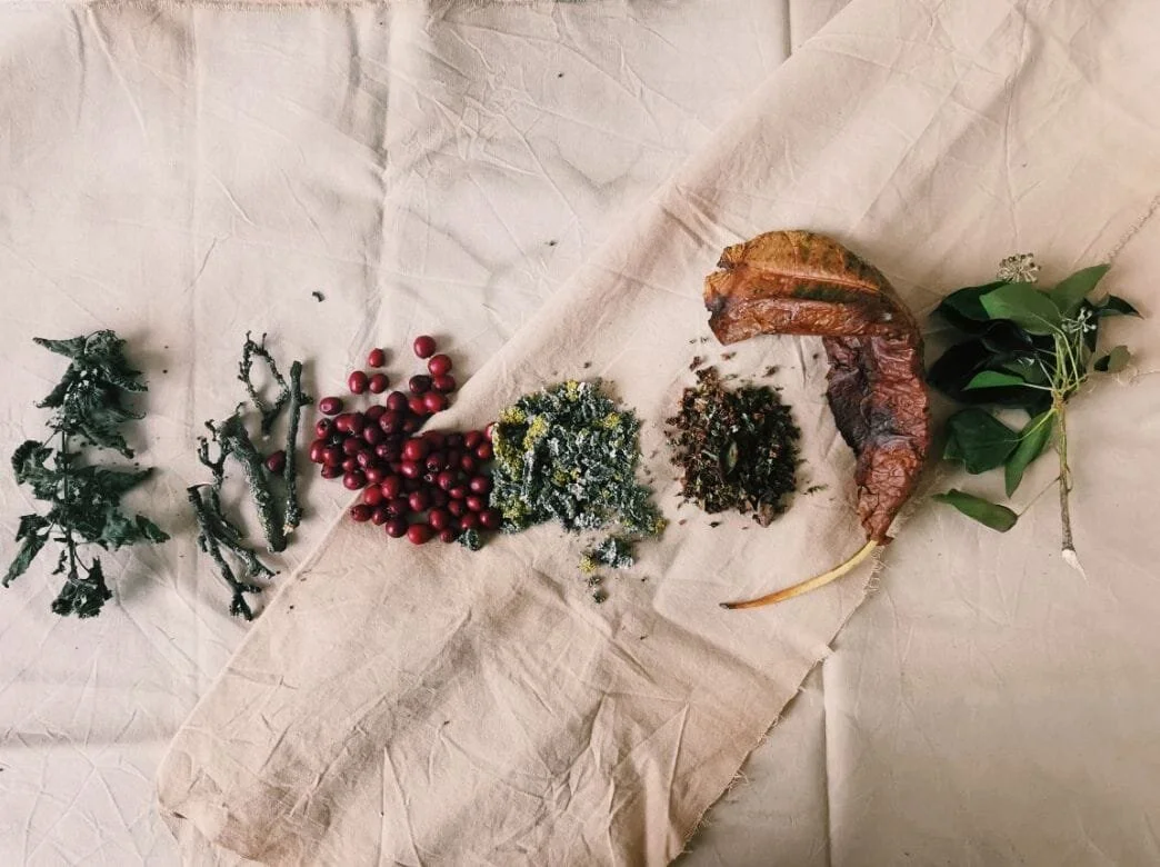
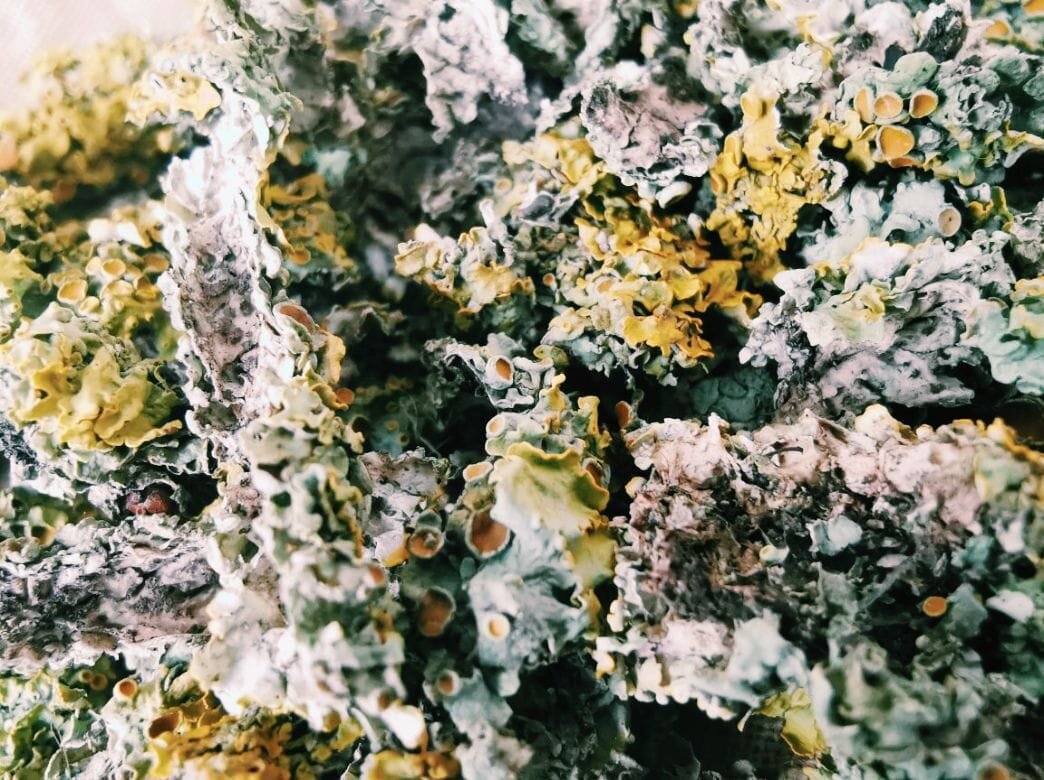
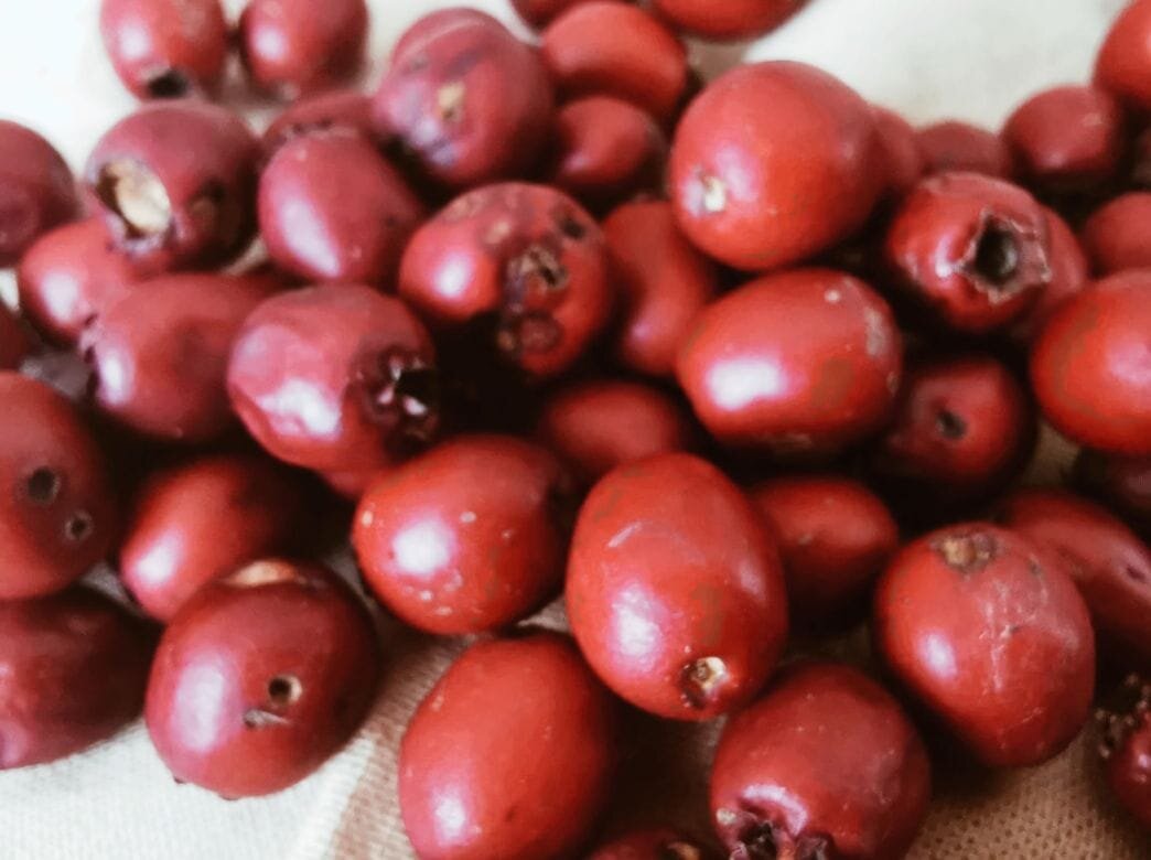
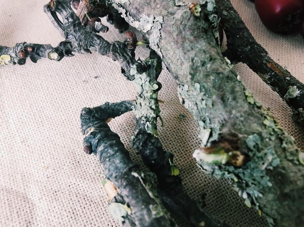
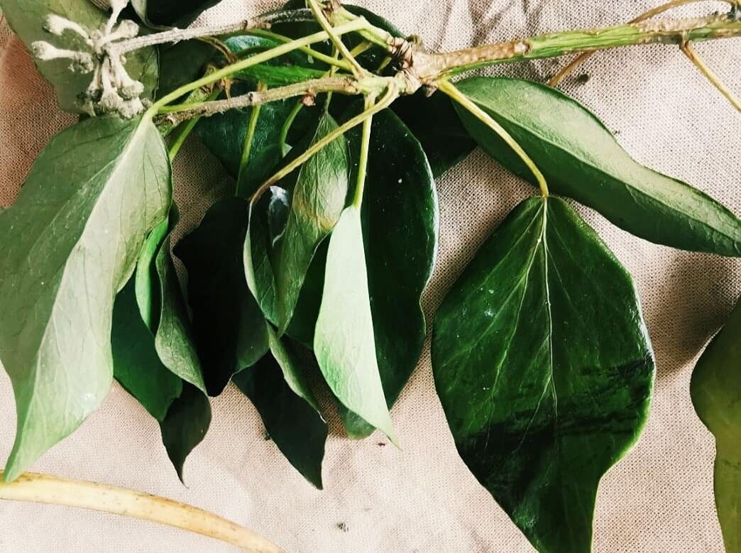
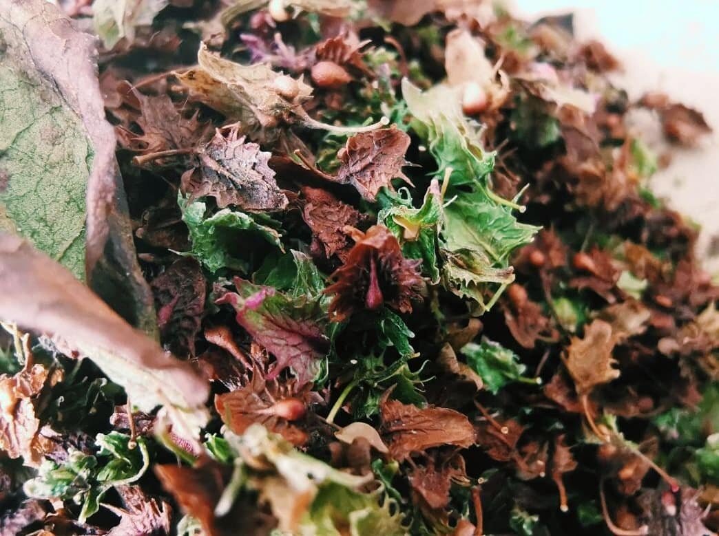
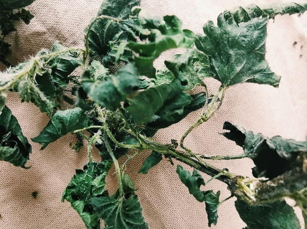
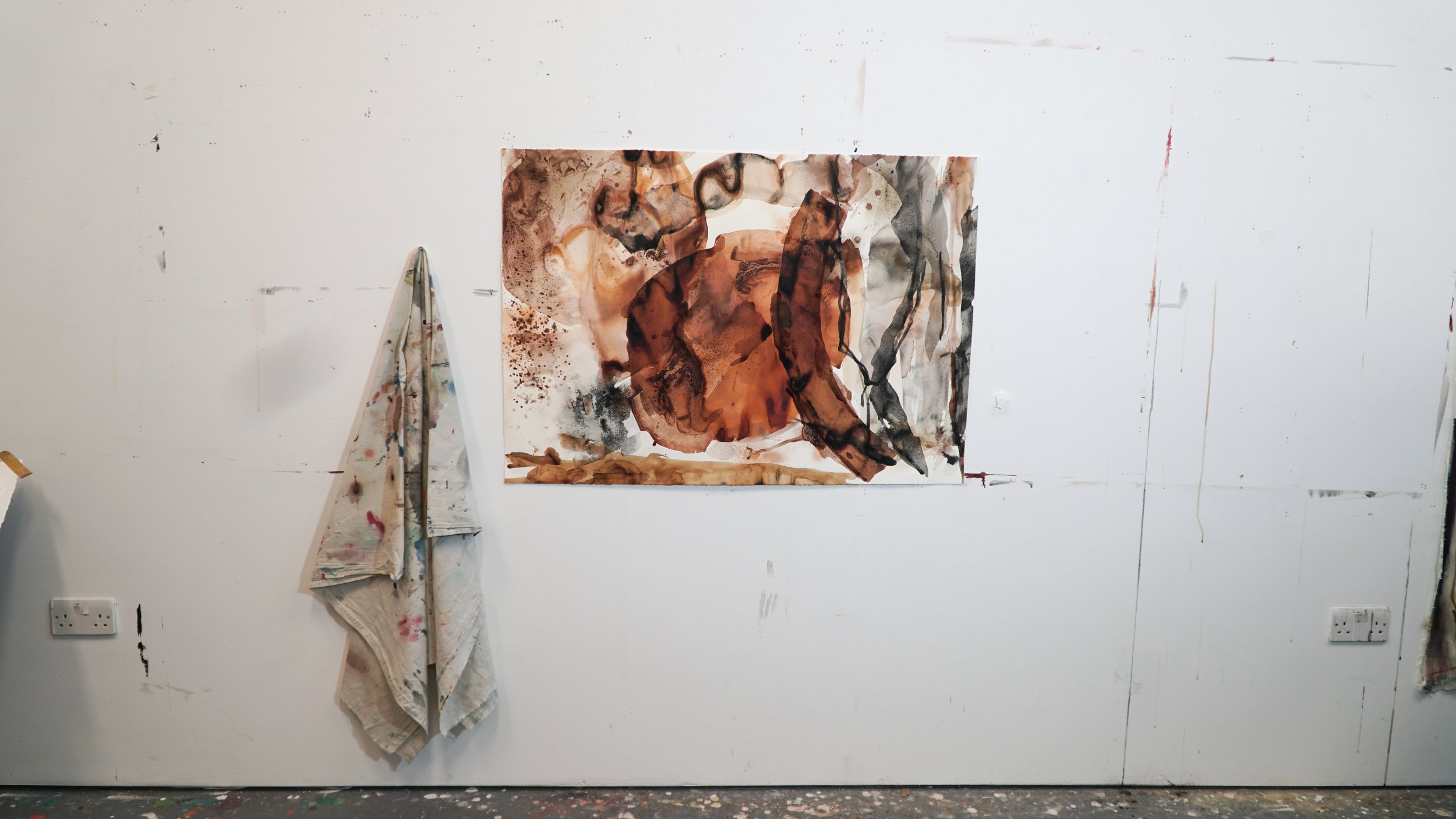
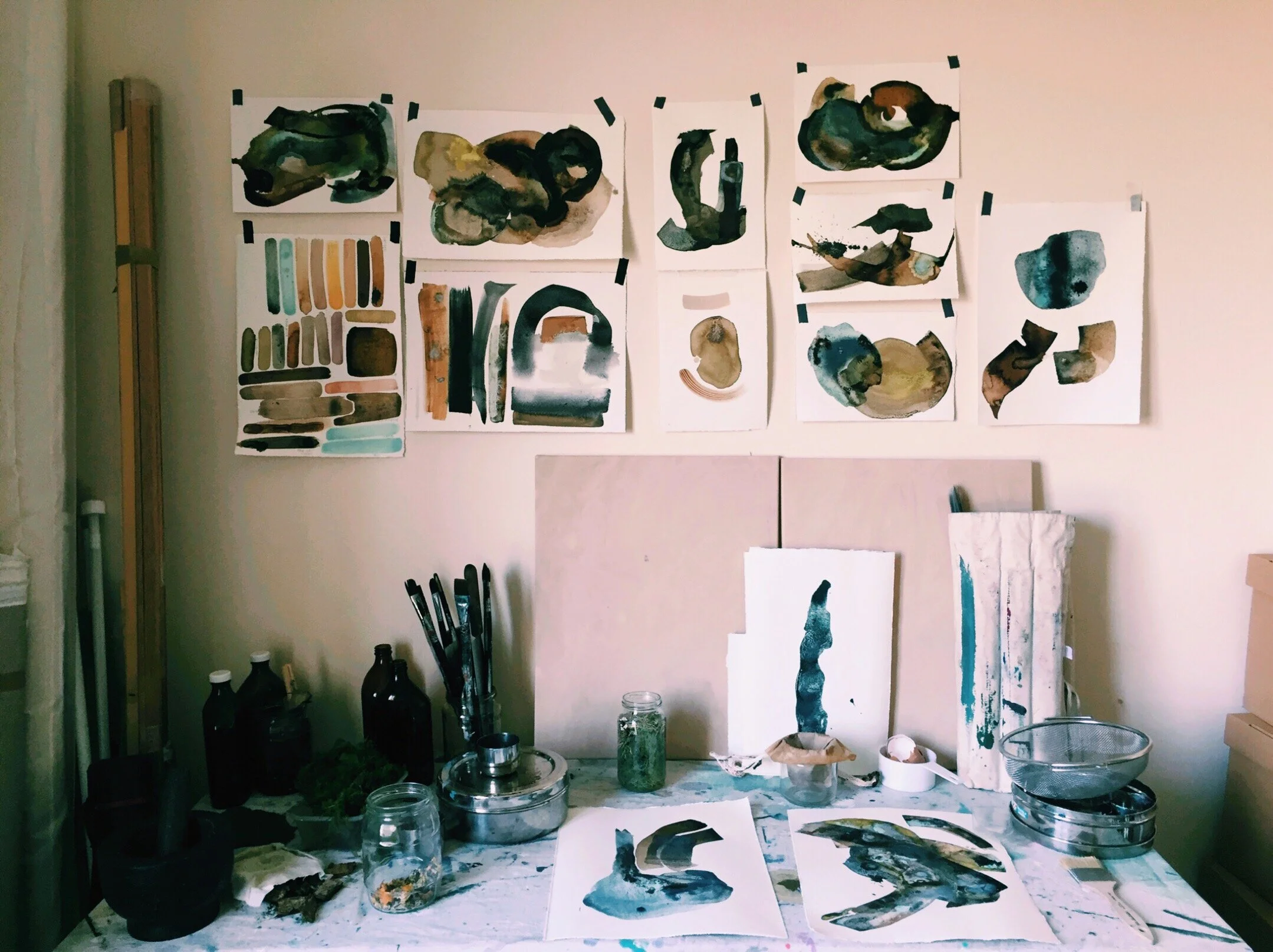
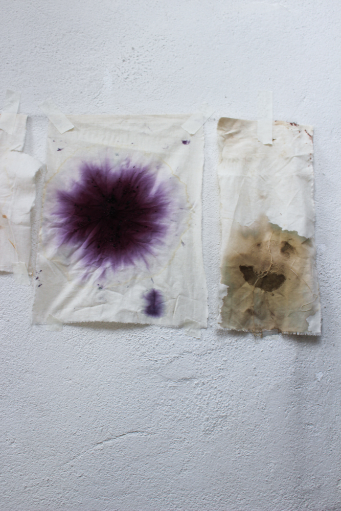
There is a keen sense of alchemy occurring on the surface of these works. While each used similar same colours, I have approached the canvas, and the application of colour quite differently in both. In Opalescence, I wanted the hues to blend in a gentle way. The commission called for the use of botanical inks foraged from a farm in Cork; a pallet of neutral tones was created from bluebell, nettle, wild sage and buttercup. I dripped, poured and blushed the inks onto the unprimed canvas allowing the hues to soak and blend across the surface. As the colours seep into the textile they settled into their own rhythm, as they do in nature. 

Kari Cahill - Cyanptype Process 2022 - irish Artist4.jpeg
Kari Cahill - Cyanptype Process 2022 - irish Artist1.jpeg
Kari Cahill - Cyanptype Process 2022 - irish Artist7.jpg
Kari Cahill - Cyanptype Process 2022 - irish Artist8.jpg

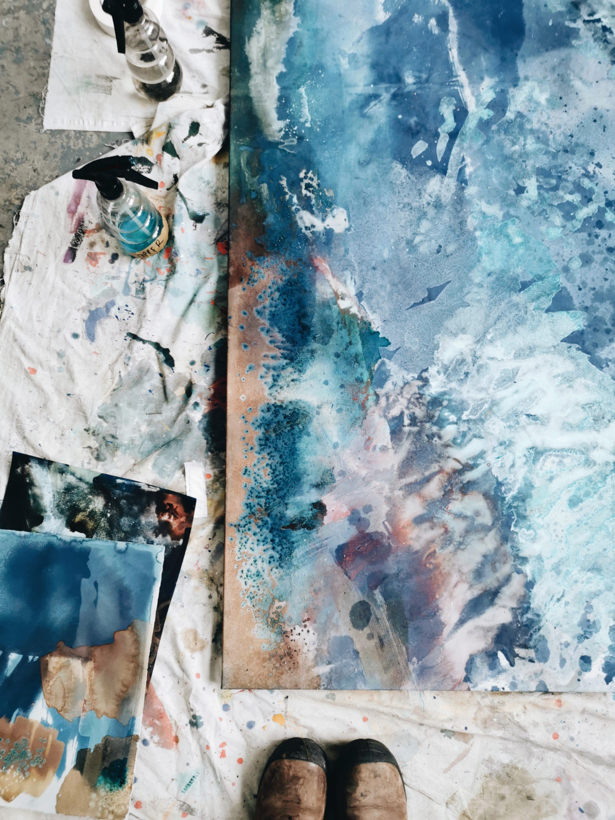
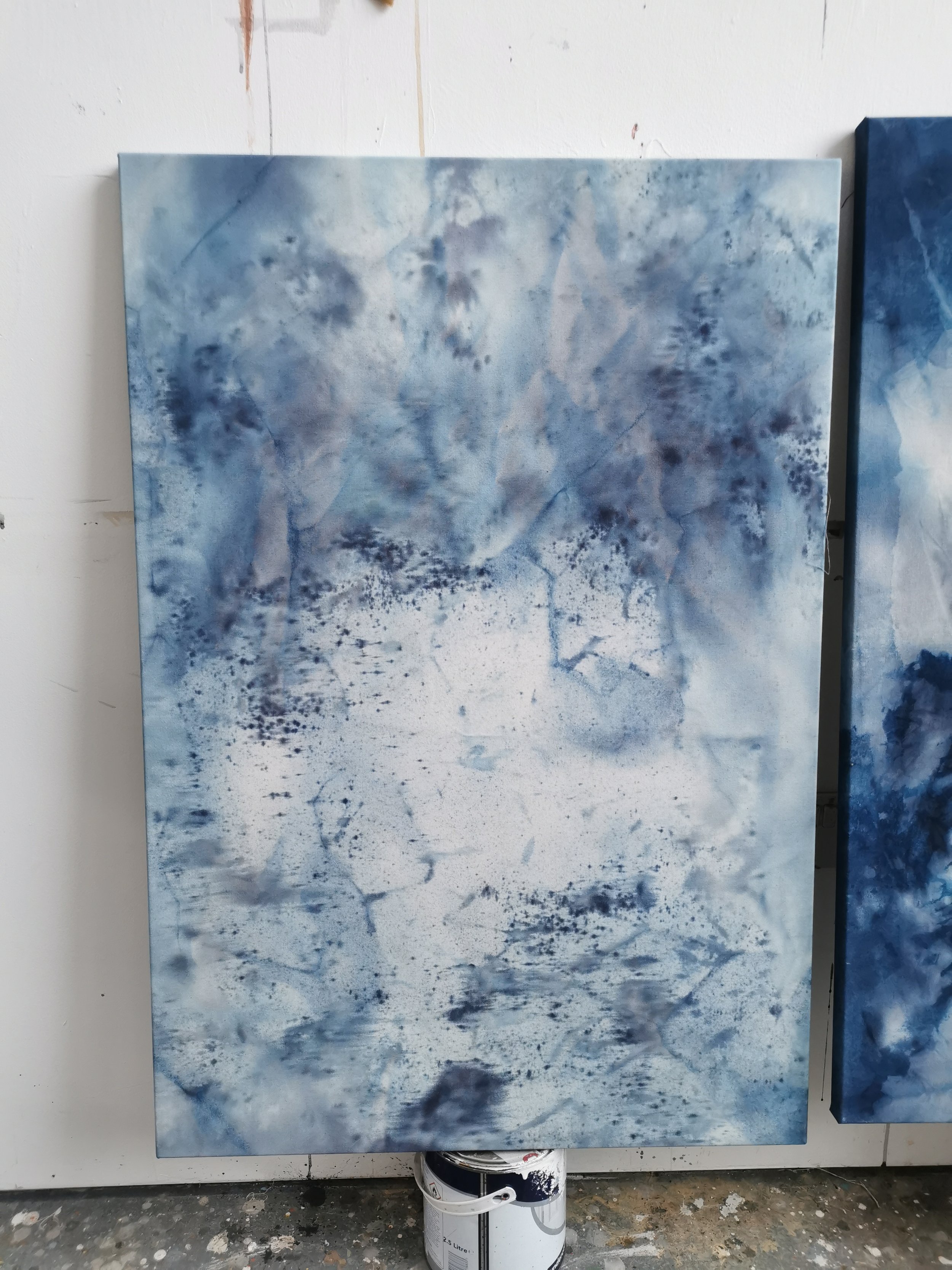
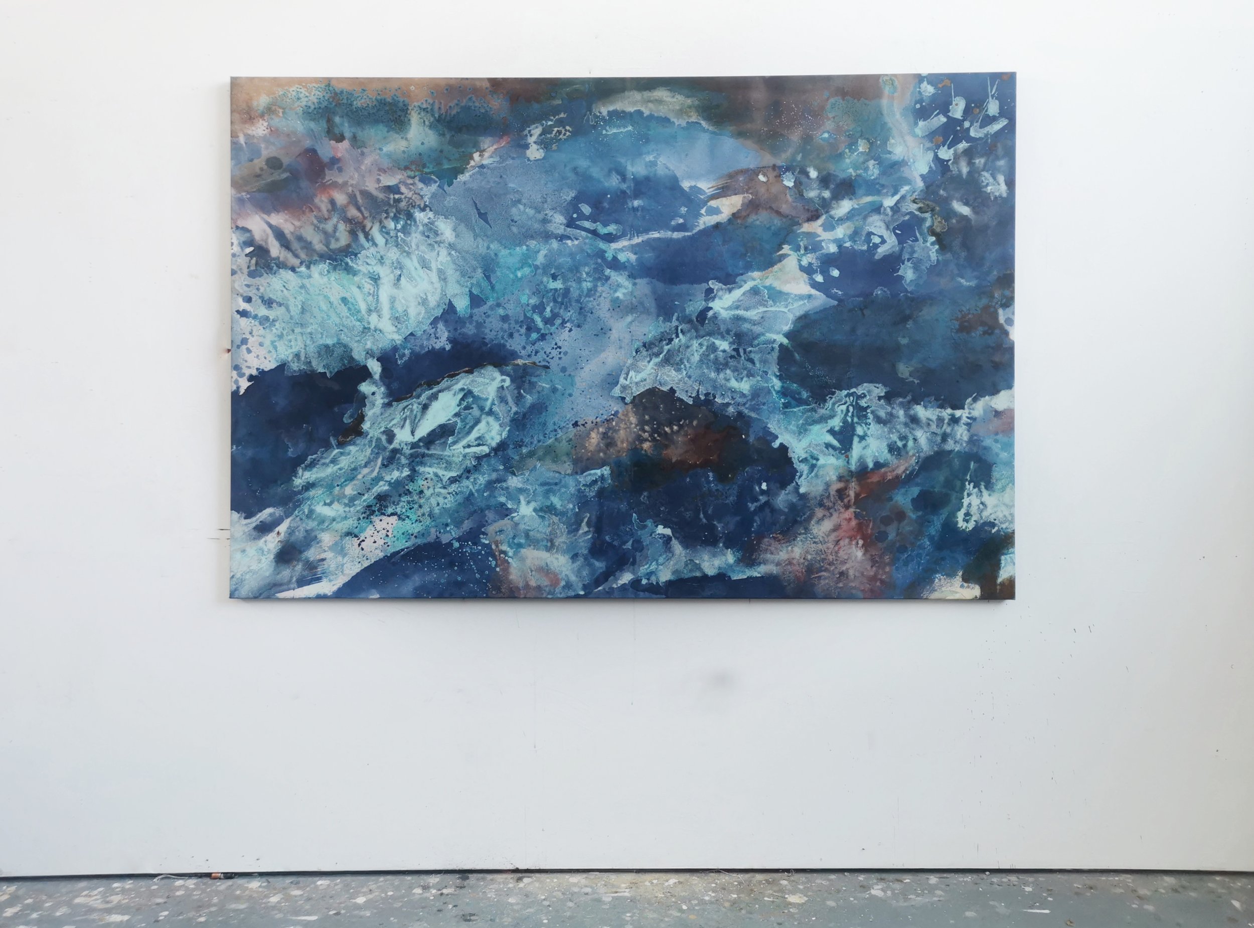
In Elemental Energy I wanted to create stronger contrasts between areas.  I layered colour atop colour, allowing chemical reactions between copper oxides and cyanotype minerals to occur on the surface of the work. There is intense contrast between shapes and textures which draws the eyes across the canvas settling on each distinct area. I tweaked ph levels using basic and acidic materials, which stretched the colours across the spectrum, and in some cases resulted in new colours emerging. 

Kari Cahill - Cyanptype Process 2022 - irish Artist14.jpg
Kari Cahill - Cyanptype Process 2022 - irish Artist21.jpg
Kari Cahill - Cyanptype Process 2022 - irish Artist5.jpeg
Kari Cahill - Cyanptype Process 2022 - irish Artist16.jpeg
Opalesence - 2022 - Cyanotype (cobalt), Cork Inks - Nettle, Bluebell, soda on canvas - 180 x 120cm - Kari Cahill - .jpeg
In Available Work, Comissions, New Work, Bio Colour
Comment

Where We Collide Exhibition

November 10, 2021

These works trace the landscape of North Sligo through the pigments and inks derived from natural materials at Raghly, Lissadell, Ballyconnel, Benbulben.  There is a contrast between the ancient geological fossils and formations and the slippery soft organic terrains found at rock pools and shorelines.  Colour is used as a marker of terrain. Each work responds to the idiosyncrasies of specific colours derived from the landscape as well as the surface it is applied to. 

Colour is created through the process of crushing, grinding, charring and boiling natural materials. The works feature a spectrum of hues from iron rich yellow/orange ochres to a pale pallet derived from limestone, urchins and limpets to monochromatic charred kelp. Bladder wrack and kelp are synthesised into inks which allow a contrast in viscosity on the page. 

For more information and to view availabel works please head over to my Works For Sale page or email me at karcahill@gmail.com.

04 - trio glass on mantlepiece - wide Kari Cahill artist.jpg
04 - trio glass  Kari Cahill artist.jpg

These pieces are created using the same gestures seen in the process of working with pigments. Pigment and binder are mixed together by moving a glass muller over a glass slab, working the pigment in circular motions. The pigment is then scraped off the slab, ready to be used. 

Inhale Exhale  Kari Cahill artist.jpg
03 - jars Kari Cahill artist.jpg

Cotton rag paper has been drenched in water. As the liquid soaks into the fibres it buckles and swells creating undulations across its surface. Layers of earth pigment are then applied to the surface, deepening is hues as it builds up in the troughs and dips. The pieces, seen as a whole, create a river-like map of the movement of colour, tracing how the different densities of pigment from different landscapes react to the surface of the paper. The works combine movement and stillness in how the pigment has been applied, allowing the eyes to travel across the terrain of the artwork. 

Colour is applied to the page by drowning the surfaces in ink and paint. The surface is Yupo Paper, an interesting synthetic recyclable material that is completely waterproof. Without the ability to absorb into the surface the pigment is left behind after the evaporation process. This creates thin veil-like layers which can blend and bend across the page, gathering and depositing hues and tones as it rolls. The hues find their way around the page settling into their own rhythm as water does in the natural environment. The final drying process appears to suspend the colour between solid and liquid revealing distinct vistas.  

Scorched Shore - Charred Kelp, Kelp on Yupo - 30 x 42cm Exhibition close- Kari Cahill.jpg
Rock As Tide - Limestone, Urchin, Shells, Charred Kelp, Gum arabic on Yupo - Exhibition close -  30 x 42cm - Kari Cahill .jpg
Entrusted Things - Limestone, Urchin, Holdfast Calcite on Yupo - 42 x 30cm - Kari Cahill close.jpg
Stone Pulses - Charred Kelp, Gum arabic on Yupo - 30 x 42cm - exhibition close - Kari Cahill.jpg
In Exhibition, Bio Colour, Available Work Tags #biocolour #botanicalink #foragedink #colourfromthelandscape #naturalpigment #colourmaking #naturalinks #abstractexpression #artinspiration #irishart #artsale #contemporaryart #dailyart #painting #instaartist #contemporaryirishartist #irishartist #visualart #artforwalls #sligoartists #supportlocal #earthpigments #geologyinart #handmade #artoftheday #artistsofinstagram #soloexhibition #artiststudiosustainablepractice, biocolour, botanicalink, foragedink, colourfromthelandscape, naturalpigment, colourmaking, naturalinks, abstractexpression, artinspiration, irishart, artsale, contemporaryart, dailyart, painting, instaartist, contemporaryirishartist, irishartist, visualart, artforwalls, sligoartists, supportlocal, earthpigments, geologyinart, handmade, artoftheday, artistsofinstagram, soloexhibition, artiststudio, sustainablepractice
Comment
hawthron ink wild forage

Hawthorn Hues

October 17, 2020

I have been using the landscape as the source of ‘bio colour’ to create artworks that respond to that specific landscape; gathering materials such as rocks, seaweed, lichen, berries, industrial scraps, seawater, and bark and processing it into live inks and pigments. A couple of months ago I was commissioned to make colour from a Hawthorn Tree in Portmarnock, by a couple who had recently moved house and looked out at the tree daily. I hadn't gleaned colour from the Hawthorn before so it was really cool to research the role of the hawthorn through history. I found a lot of information surrounding its medicinal value, and local lore surrounding it's use since pagan times, but not so much about the colours we might get. I was rooting for something peachy and had an inkling it would react with iron to make a grey colour. 

WhatsApp Image 2020-10-14 at 14.44.38 (3).jpeg
WhatsApp Image 2020-10-14 at 14.44.38 (1).jpeg
WhatsApp Image 2020-10-14 at 14.44.38 (4).jpeg
WhatsApp Image 2020-10-14 at 14.44.38 (7).jpeg
WhatsApp Image 2020-10-14 at 14.44.38 (8).jpeg
WhatsApp Image 2020-10-14 at 14.44.38 (9).jpeg

We waited until the hawthorn berries, also known as 'haws' had ripened (the texture on the inside of the berry is cream and dry rather than green and pasty) and then collected a jar. The Hawthorn tree sat in front of a small Neolithic ring fort and was surrounded by a whole ecosystem of plant life. There were, of course, a lot of nettles, dock leaves, and ivy had wrung itself around the entire backside of the trunk up into the gnarled branches. The branches themselves were home to sunburst lichen, also known as Xanthoria Polycarpa. I gathered small amounts of each, making sure not to take more than 10% from any one plant or branch, as well as a bunch of fallen branches. I brought them back to my studio where I processed them over a couple of weeks. 

WhatsApp Image 2020-10-14 at 13.45.31 (7).jpeg

The colour locked within the haws, nettles, dock leaf tips, ivy and lichen was extracted through the process of soaking and reducing. The hawthorn twigs were charred in an open fire and then ground down into charcoal. The interaction of live colour is emphasised as I tweak ph levels and modify the vibrancy using oxides. Iron generally darkens the colour, especially where there is a large amount of tannin in the material. Alum creates a more chalky appearance. As I test each colour solution on paper the drying process often appears to suspends the works between solid and liquid. This tinkering connects my work with the ephemeral nature of the landscape.

All in all, I harnessed 15 colours from the hawthorn and it's surrounds. The palette contained deep autumnal hues from muted greens to deep oranges. Interestingly the dock leaf and hawthorn gave off similar colours. The charred hawthorn branches seemed similar to that of oak trees, but perhaps harder to grind into a fine dust. 

WhatsApp Image 2020-10-14 at 15.03.08.jpeg
WhatsApp Image 2020-10-14 at 14.54.05.jpeg

The process of harnessing colour from the environment acts as an invitation to explore landscape.  I am shifting my work towards more sustainably-centered approaches, both ecologically and economically. The act of searching for colour forces me to address environments with a bold investigation and is as much part of my process as the resulting palette.

Content To Stand Alone - 2020 -  Haw berries, nettle, charred hawthorn, Ivy, docktips, iron, soda, alum, gum arabic - 80 x 120cm walljpg.jpg
A Stubborn Tree That Speaks - 2020 - Haw berries, nettle, charred Hawthorn, Ivy, Docktips, iron, soda, gum arabic - 80 x 120cm wall.jpg

The inks pooled and soaked into the paper causing ripples and dips which directed the flow of the colour across the page. This was reminiscent of the ripples left on the beach after the tide has gone out which connected the piece to the sandy shore of Portmarnock.

The overlapping layers appear to dance across the page; intertwining gradients coming in and out of focus, mirroring the thorny branches of the tree. Up close detailed alchemic processes are frozen on the page. nettle, iron, dock tips and charcoal dripped together, splashed across the paper. Soft ivy tones misted atop each. Usually one piece emerges as the clear finished work, and the other sheets simply as a place to test colour and layering, but this time there are two successful works. They're both exciting to look at, and successful in their own ways. There are similar strokes but the density of colour bounces across the page differently in each.

A Stubborn Tree That Speaks - 2020 - Haw berries, nettle, charred Hawthorn, Ivy, Docktips, iron, soda, gum arabic - 80 x 120cm detail 4.jpg
A Stubborn Tree That Speaks - 2020 - Haw berries, nettle, charred Hawthorn, Ivy, Docktips, iron, soda, gum arabic - 80 x 120cm detail.jpg
IMG_20201203_124334.jpg
IMG_20201203_124344.jpg

Colour commissions are something I would love to explore more. The resulting paint and inks can be used in a finished work on canvas or paper. It is a unique way of preserving landscapes and the special moments that occur within them. If you’re interesting in commissioning a specific landscape or plant get in touch, i’d love to hear from you!

Tabhair Aire
Kari 

In Bio Colour, Comissions
Comment
Silk And Subterranea - Walnut, Oak Gall, Iron, Ash, Charred Oak, Rusty Dust - 41.5 x 42.5 - Detail.jpg

Arboreal Bind - New Works

May 30, 2020

For this series I focussed my colour pallet on hues and tones created primarily from Oak. As the pieces developed I added Walnut bio colour for it’s deep brown shade, which set off the lighter golden hues of the Oak Gall Ink.

I used oak in various forms; charred bark which resulted in charcoal black as, well as the ash from an oak fire which gave me pale cream chalk. The mid-tones were created using oak gall ink. Each ingredient had fulfilled it’s environmental role, discarded and burnt. Through the process of colour making I was able to prolong the life-span of these arboreal materials.

I employed the use of broad brush strokes that appear to continue past the parameter of the page. The colours pooled on the surface of the paper, melding and infusing together, as if alive. As the paint dried, this blending of organic matter was captured.

Of Wind Blown Husks Of Wind Blown Husks
Sold Out
Of Wind Blown Husks
€380.00
Fissure Glitter
Sold Out
Fissure Glitter
€190.00

Oak galls ink is one of my favourte to make - the galls are formed when a wasp lays its eggs on the branch of an oak sapling. The tree responds to the wasp larvae by creating a protective orb or “gall” around the wasp babies. Eventually, the wasp bores a tiny, perfectly circular, tunnel out of the gall and flies off, leaving its gall haven behind. I collect the galls from the low lying branches of young oak trees. (If you ever come across galls in abundance please let me know)

I crush and soak the galls for between 3 weeks and a year depending on how rich I would like the colour. After straining the liquid, I add FeS04 (Liquid Iron) which reacts with the tannic acid to turn the ink from golden brown to black/green brown. After brushing the ink on the page the ink deepens through oxidization, further appearing as a rich, indelible black.

Oak Gall is the quintessential calligrapher’s ink and has been used since the middle ages. the Book of Kells contains oak gall ink, and until recent technology took over, oak gall was the official registrar’s ink for signing legal documents.  

oak gall.jpeg
WhatsApp Image 2020-05-30 at 11.37.40.jpeg
Silk & Subterranea Silk & Subterranea
Sold Out
Silk & Subterranea
€380.00

The full series can be viewed through my online store. If you have any questions please get in touch.
Tabhair Aire
Kari x


In Available Work, Bio Colour, New Work Tags natural pigments, landscape foraging, foraging for colour, earth pigments, site responsive artist, irish artist, contemporary irish artist, emerging artist, bio colour, environmental art, environmental artist, ecoart
1 Comment

BIO COLOUR

April 19, 2020

The process of creating paints and pigments from materials gathered at specific locations has allowed me to contrast factory produced colours with a more sustainably centred approach to making. From discarded urban remnants to wild foraged materials I have built up a unique paintbox of colours.

The act of searching for these colours forces me to approach the environment with a bold investigation, and is as much part of the process as the resulting palette.

Special thanks to Fellipe Lopes for creating this video. It’s always a pleasure collaborating.
Check out his website to his documentary journalism.

IMG_1907.JPG
Kari Cahill - Glencarrig Studio4.jpeg
Kari Cahill - Glencarrig Studio7.jpeg

If f you are interested in purchasing or commissioning a piece for yourself get in touch, I would love to hear from you! In the meantime join my mailing list to see new works as they emerge.

IMG_1848.JPG
IMG_1813.JPG
IMG_1906.JPG
6a7665ca-80a3-4051-93be-f4ce7574c13c.JPG
Kari Cahill - Glencarrig Studio1.jpeg
IMG_1847.JPG
In Bio Colour Tags biocolour, process, foraged colour, foraging for colour, ink making, sustainable art practices, colour from the landscape
Comment
IMG_9952.jpg

Port Inks - An exploration

July 23, 2019

Cloud footed findings,
Harboured in slumbering sludge,
reveals alchemy.

Port, Donegal. Lay of the Land Residency. 2019.

For two weeks we rooted down in Port, Donegal. The off grid stone cottage was the backdrop to our investgations into the landscape. Immersing ourselves in the flora, fauna and bogland for a fortnight gave space to the beginnings of an exporation that I believe has sparked a limitless direction.

View fullsize IMG_9919.jpg
View fullsize IMG_9968.jpg

Starting out I had no idea what to expect from the roots, leaves, and shoots of plants. I gathered rust and stones in hopes of pigment and hues. I ground charcoal and ash from the well used fireplace, and foraged from the shores of the harbour. The experiments were a catayst for conversations around colour theory and nature based creativity, with close attention paid to the processes we were undertaking.

View fullsize WhatsApp Image 2019-07-23 at 14.09.34.jpeg
View fullsize WhatsApp Image 2019-07-23 at 14.09.35(1).jpeg
View fullsize WhatsApp Image 2019-07-23 at 14.09.37.jpeg

Two hours passed since beginning the first boil. The ingredient was crowberries, foraged from the top of the bog behind the house on the Slieve League Peninsula. The berries, we believe, were those lucky to be missed by flying Chough birds, and the grazing of sheep. The haul was just over a handful but the hue was deep and luscious.

View fullsize IMG_0056.jpg
View fullsize WhatsApp Image 2019-07-23 at 14.09.36.jpeg
View fullsize WhatsApp Image 2019-07-23 at 14.09.35.jpeg

Deep purple in colour, we dipped our brushes in and began teating the ink. The purple ink glistened on the paper and as it began to dry the colour transformed to a steady blue. Nettles, kelp and lichen followed. And over the course of the residency we created blacks from the charcoal, dusty beige from ash, orange from seaweed and pretty much all the variations of brown you can imagine.

IMG_9965.jpg
IMG_9967.jpg
IMG_0052.jpg
IMG_9958.jpg
IMG_9960.jpg


In Artist Residency, Lay of the Land, Bio Colour Tags Ink makingAcrylic paint, Mixed Media, Unique, Original, Recycled Paper, Artists Choice, One of a Kind, Limited edition, walnut shell ink, natural pigments, nogalina, irish artist, artist in residence, artist residency, organic paint, abstract expression, landscape painter, abstract paint, natural ink, ink making, diy ink, landscpae ink, slumbering sludge, inked alchemy, west coast of ireland
1 Comment

Latest Posts

Featured
Kari Cahill Solstice Open Studio1.jpeg
Jun 9, 2024
SOLSTICE OPEN STUDIO INVITE - FRIDAY 21st JUNE
Jun 9, 2024
Jun 9, 2024
BKK 222 - Images - 2022 - The Earth Spun Light61.jpg
Oct 8, 2022
BKK 222
Oct 8, 2022
Oct 8, 2022
Kari Cahill - Cyanptype Process 2022 - irish Artist3.jpeg
Mar 10, 2022
Cyanotype Experiments
Mar 10, 2022
Mar 10, 2022
Where We Collide Exhibition
Nov 10, 2021
Where We Collide Exhibition
Nov 10, 2021
Nov 10, 2021
Kari Cahill - Hyde Bridge - Sligo - exhibition - model studio2.jpeg
Oct 13, 2021
Upcoming Exhibition
Oct 13, 2021
Oct 13, 2021
IN THE VICINITY OF TENSION
Apr 17, 2021
IN THE VICINITY OF TENSION
Apr 17, 2021
Apr 17, 2021
Hawthorn Hues
Oct 17, 2020
Hawthorn Hues
Oct 17, 2020
Oct 17, 2020
rialaig series
Oct 2, 2020
RIALAIG SERIES - NEW WORKS
Oct 2, 2020
Oct 2, 2020
Arboreal Bind - New Works
May 30, 2020
Arboreal Bind - New Works
May 30, 2020
May 30, 2020
IMG_1907.JPG
Apr 19, 2020
BIO COLOUR
Apr 19, 2020
Apr 19, 2020
Engraving Lithic Coasts - 16.5x14.5.JPG
Apr 6, 2020
Lithic Coasts
Apr 6, 2020
Apr 6, 2020
Waiting At The Weather Window
Mar 31, 2020
Waiting At The Weather Window
Mar 31, 2020
Mar 31, 2020
Kari Cahill. Cill Rialaig AIR. 16.JPG
Feb 18, 2020
Cill Rialaig AIR
Feb 18, 2020
Feb 18, 2020
Kari Cahill open Studio.jpg
Dec 3, 2019
OPEN STUDIO 14 December
Dec 3, 2019
Dec 3, 2019
_V0A2491.jpg
Nov 22, 2019
Red Canopy X ALS
Nov 22, 2019
Nov 22, 2019
G&C455.jpg
Nov 15, 2019
Colour X Wedding Comission
Nov 15, 2019
Nov 15, 2019
karicahillpinknewsletter
Nov 12, 2019
Colour News!
Nov 12, 2019
Nov 12, 2019
Spectrum
Jul 26, 2019
Spectrum Series
Jul 26, 2019
Jul 26, 2019
IMG_9952.jpg
Jul 23, 2019
Port Inks - An exploration
Jul 23, 2019
Jul 23, 2019
DSC07537.jpg
Feb 28, 2019
Reflections on land.
Feb 28, 2019
Feb 28, 2019
DSC01801.jpg
Jan 31, 2019
SELVAGEM (Fíadh) - Exhibition at NaCasa, Florianopolis.
Jan 31, 2019
Jan 31, 2019
The pink landscapes of Brazil.
Jan 22, 2019
The pink landscapes of Brazil.
Jan 22, 2019
Jan 22, 2019
WhatsApp Image 2019-06-18 at 12.43.14(1).jpeg
Jan 20, 2019
Experiments in Light and Colour - From the East Coast of Brazil
Jan 20, 2019
Jan 20, 2019
NaCasa - Collectivo Artistica Florianopolis
Jan 16, 2019
NaCasa - Collectivo Artistica Florianopolis
Jan 16, 2019
Jan 16, 2019

Colour News

Sign up for COLOUR NEWS — my newsletter sharing glimpses into my evolving practice, updates about new projects and workshops, and where I release my paintings and commissions.

It’s the best way to make sure you hear my studio news.

New Collections // Commission Openings // Workshops // The Earth Spun Light // Project News

Thanks for signing up and supporting my practice. Can’t wait to tell you my news!

Shipping | Returns | Privacy

Email: karcahill@gmail.com
Phone: 0857799171