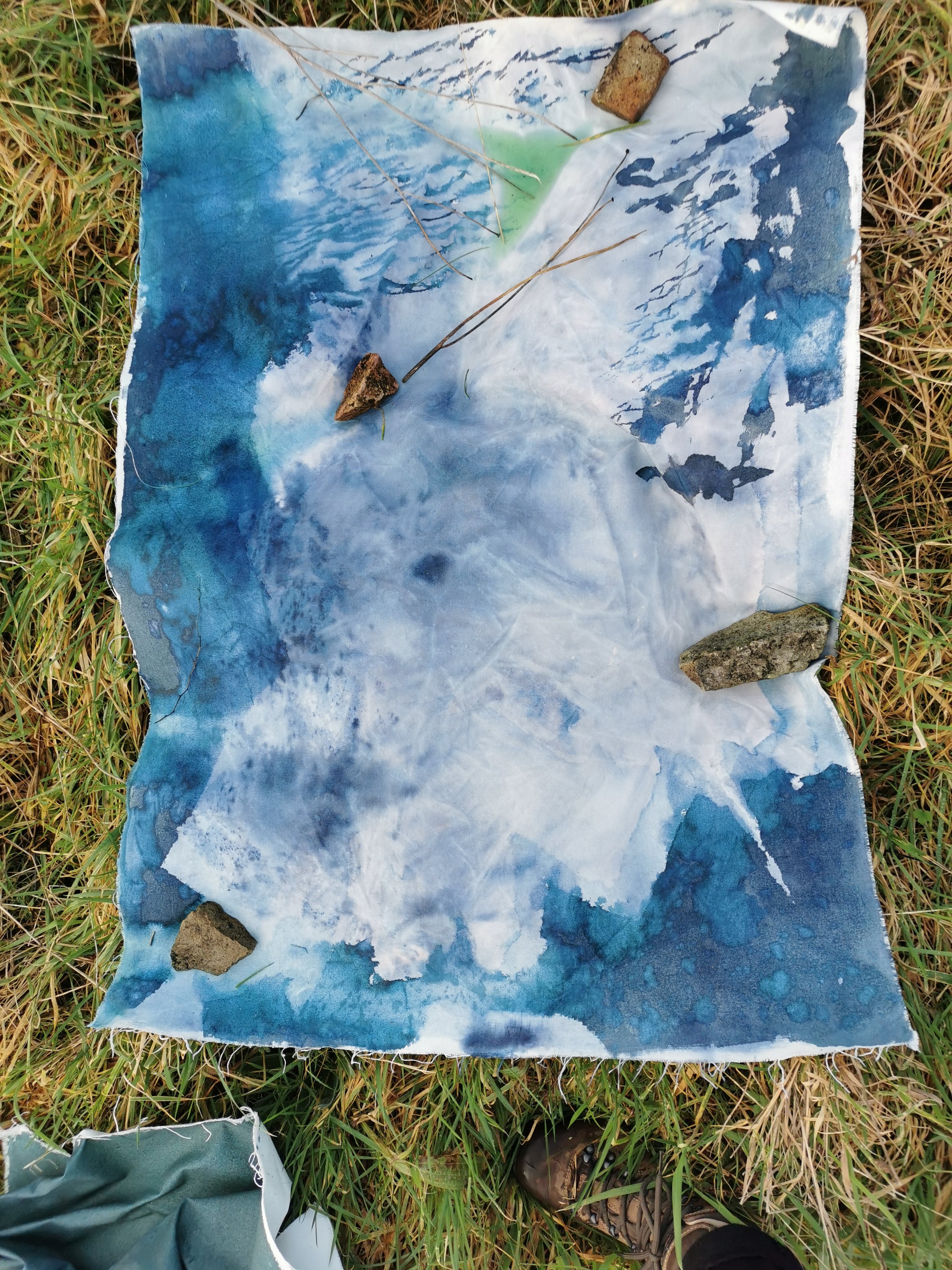
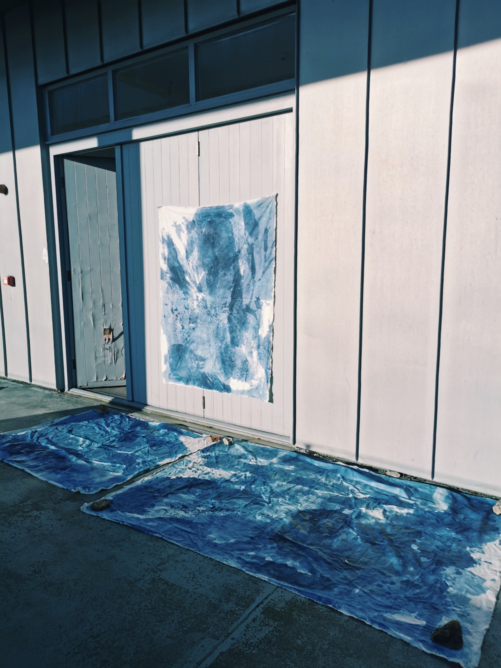
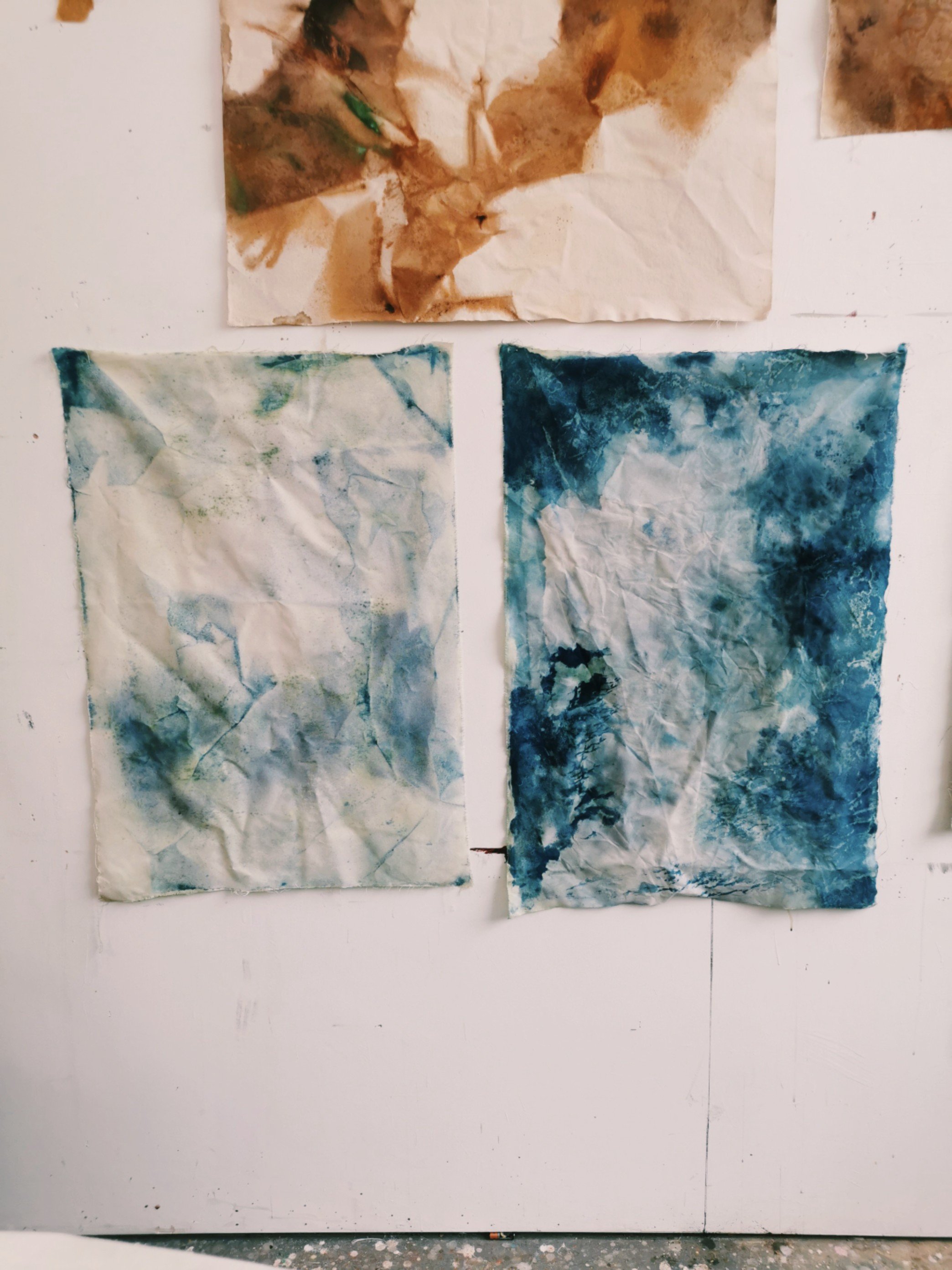
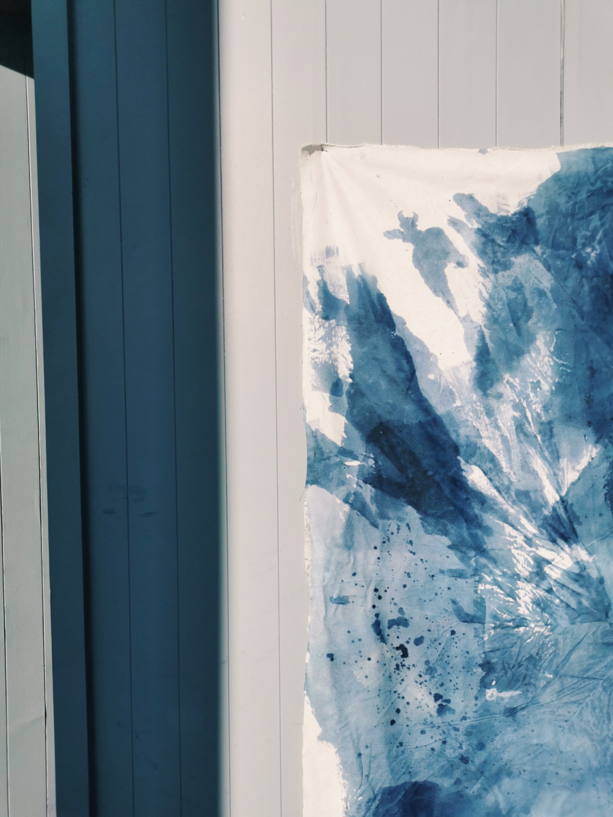
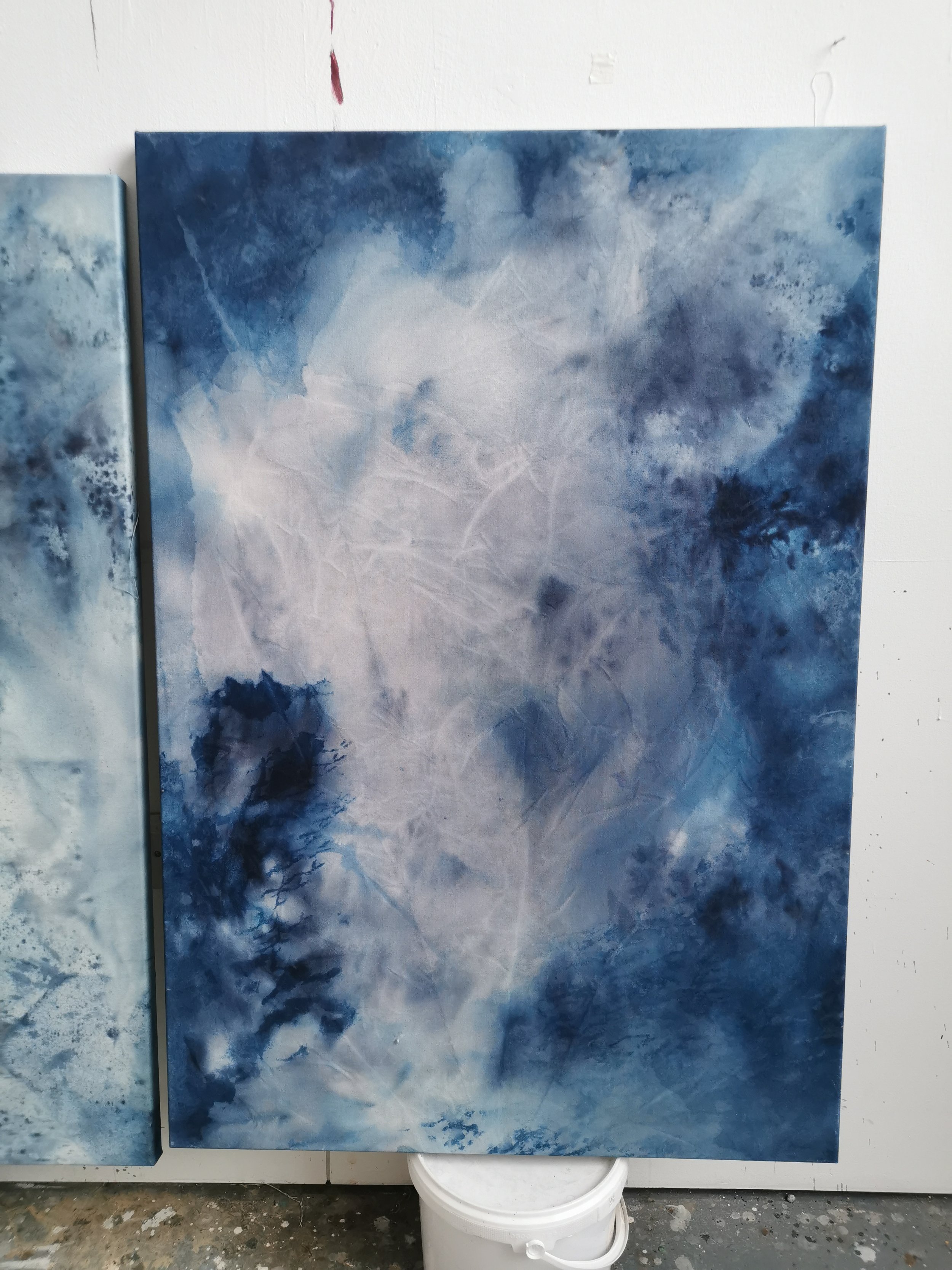
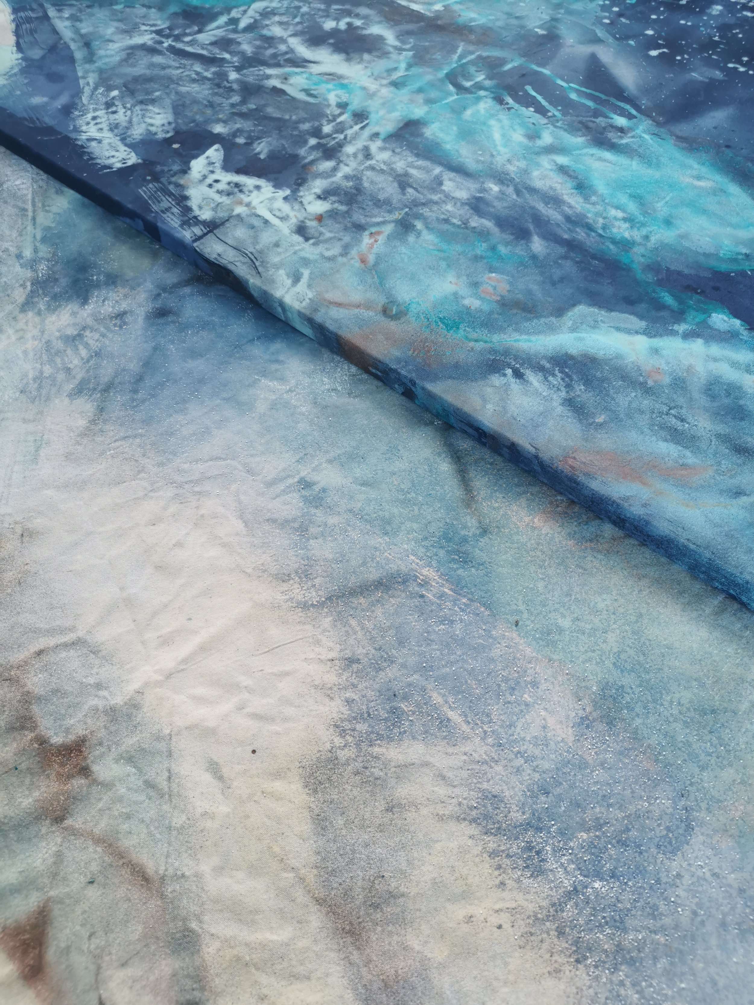
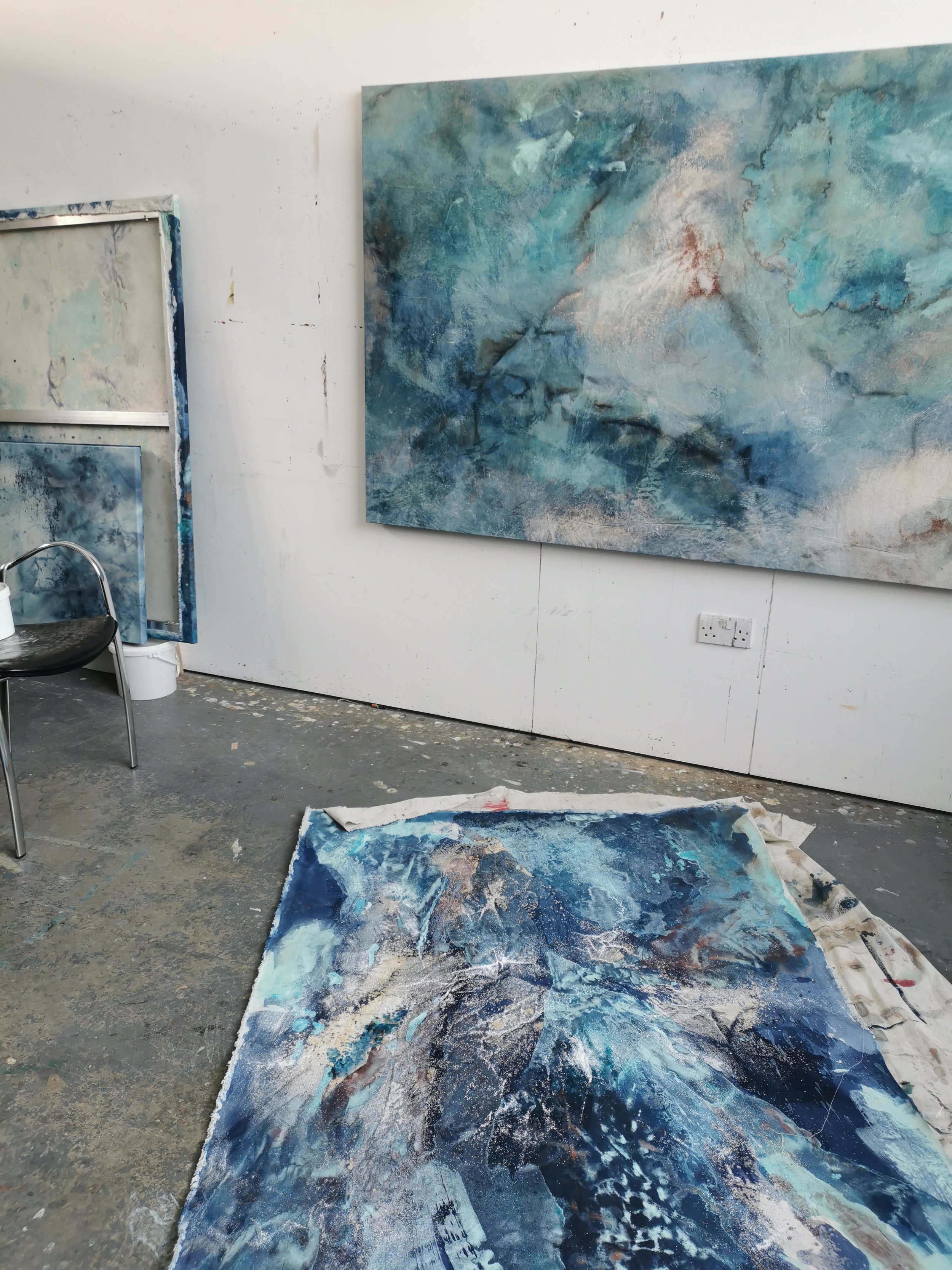
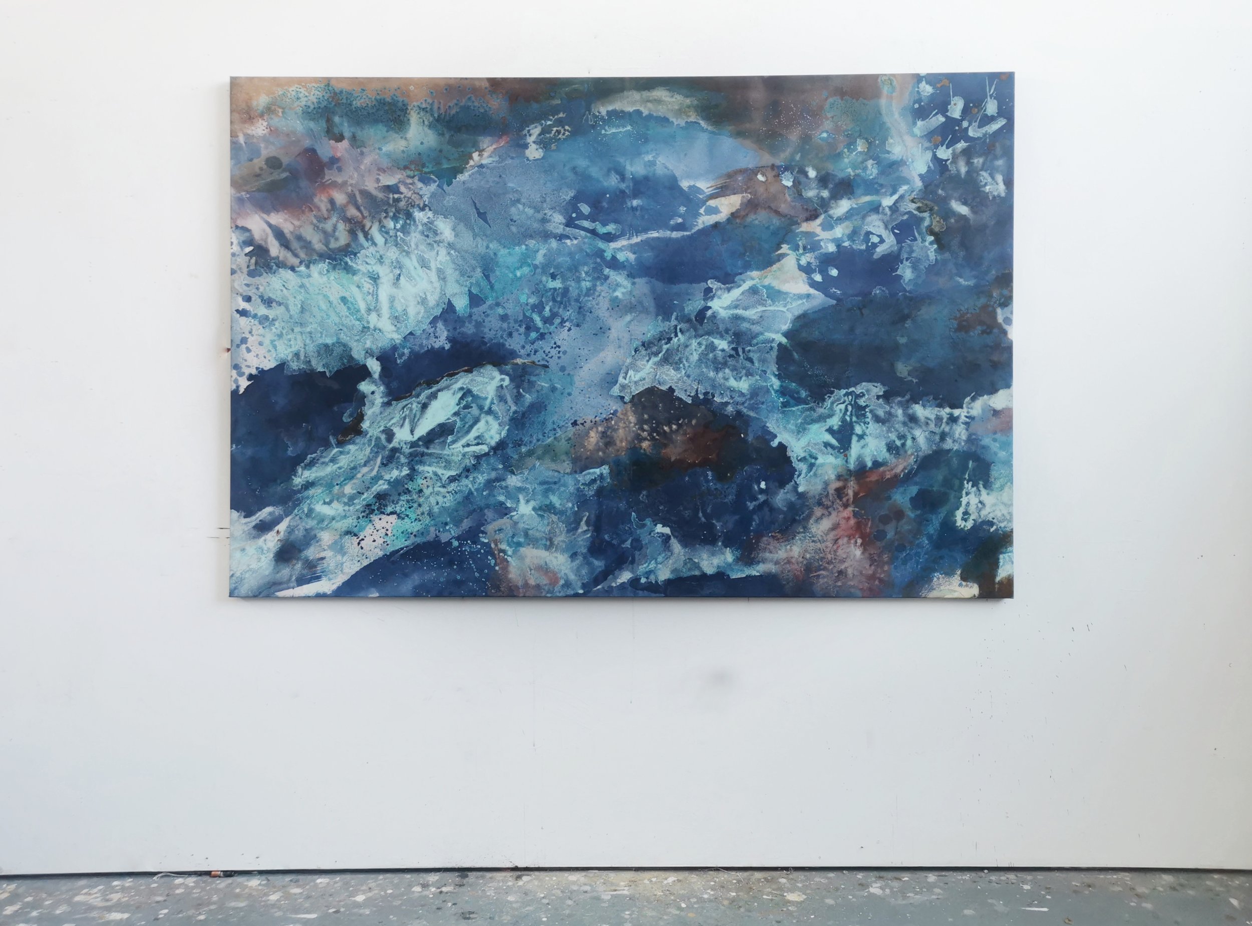
The past year I have been working on two commissions which, over time, began to explore a similar process - using UV to oxidise cyanotype chemicals. While the two commissions had very different starting and end points they both allowed me to delve into the varied outcomes that result from tinkering with exposure times, weather conditions and surface. Below are some images and descriptions that explain the process.
Cyanotype is a process whereby a chemical mixture is oxidised by UV light to produce a deep blue colour. Literally painted by the sunlight.
Ferric ammonium citrate and potassium ferricyanide are mixed together (in the dark away from UV light) to make a yellow liquid. This is painted onto paper and left to dry and then stored in the dark.
When exposed to UV light (sunlight) the mix undergoes an oxidisation process and turns from yellow to green to blue. After exposure the remaining mix is washed off leaving behind a beautiful prussian blue. Various shades of blue can be achieved by tweaking exposure times. Water is added at various moments which causes interesting colouration patterns and lends itself beautifully to my practice.
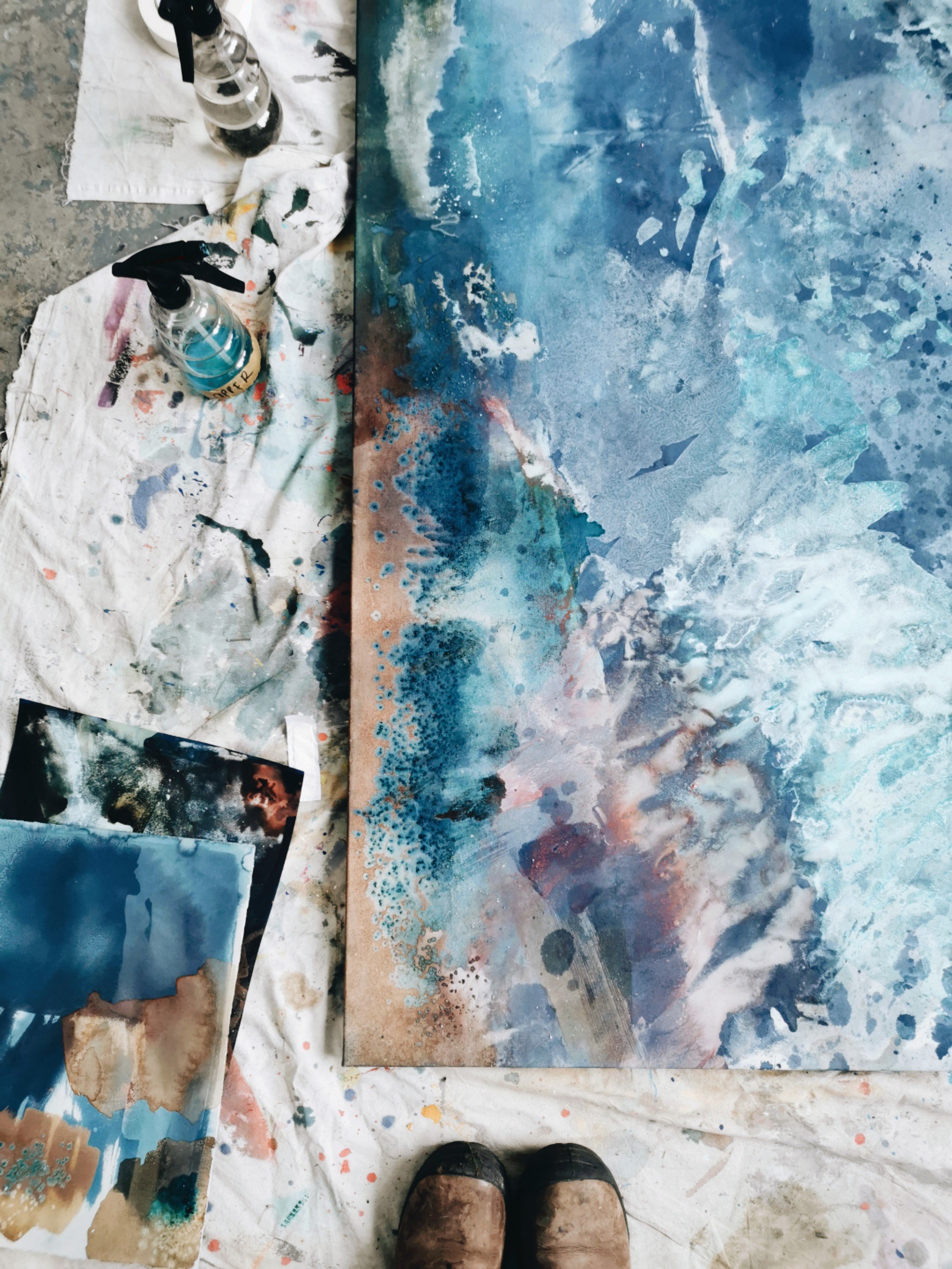
The cyanotype mixture contains iron salts which are washed off with the addition of water, however, while they remain on the page they can be mixed with copper ink, which reacts by turning from bright turquoise into a deep rust colour. Alternatively, the copper can be added after the cyanotype has been washed and in this case the copper oxide ink dries in it’s own crystallisation patterns across the page.
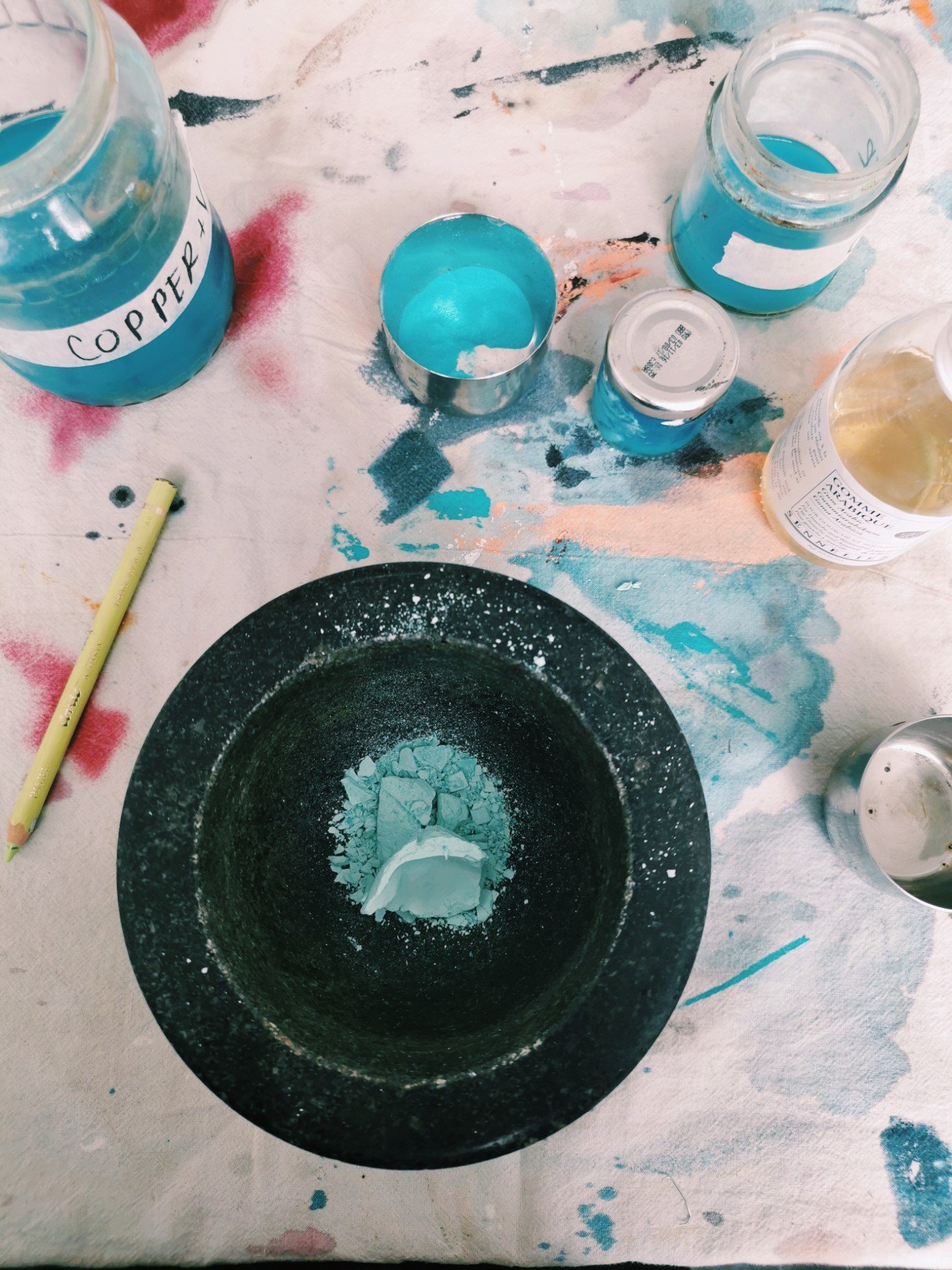
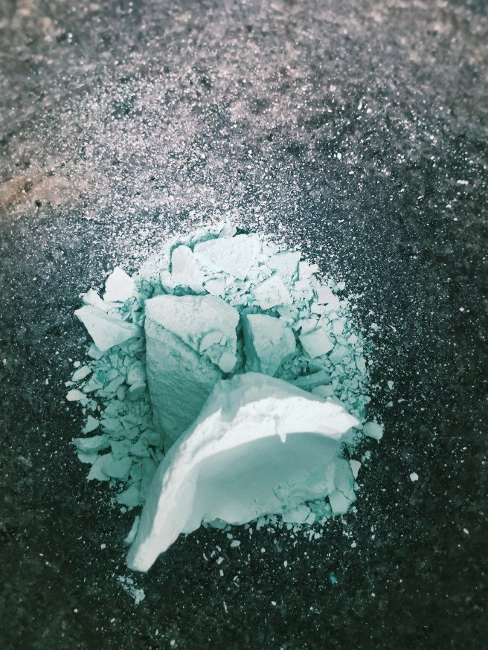
Copper ink is an exercise in alchemy. I began by submerging copper scraps in vinegar and iodized salt for two months, stirring the ink daily to allow air and vinegar to oxidise the copper, producing a deep turquoise colour. The colour deepens over time as more of the copper is eaten away through the oxidisation process.
The ink is separated into two layers, a top dark blue transparent layer, and a heavier milky blue layer that sinks to the bottom. When mixed they produce a beautiful translucent ink that seems to bend and move with the light.
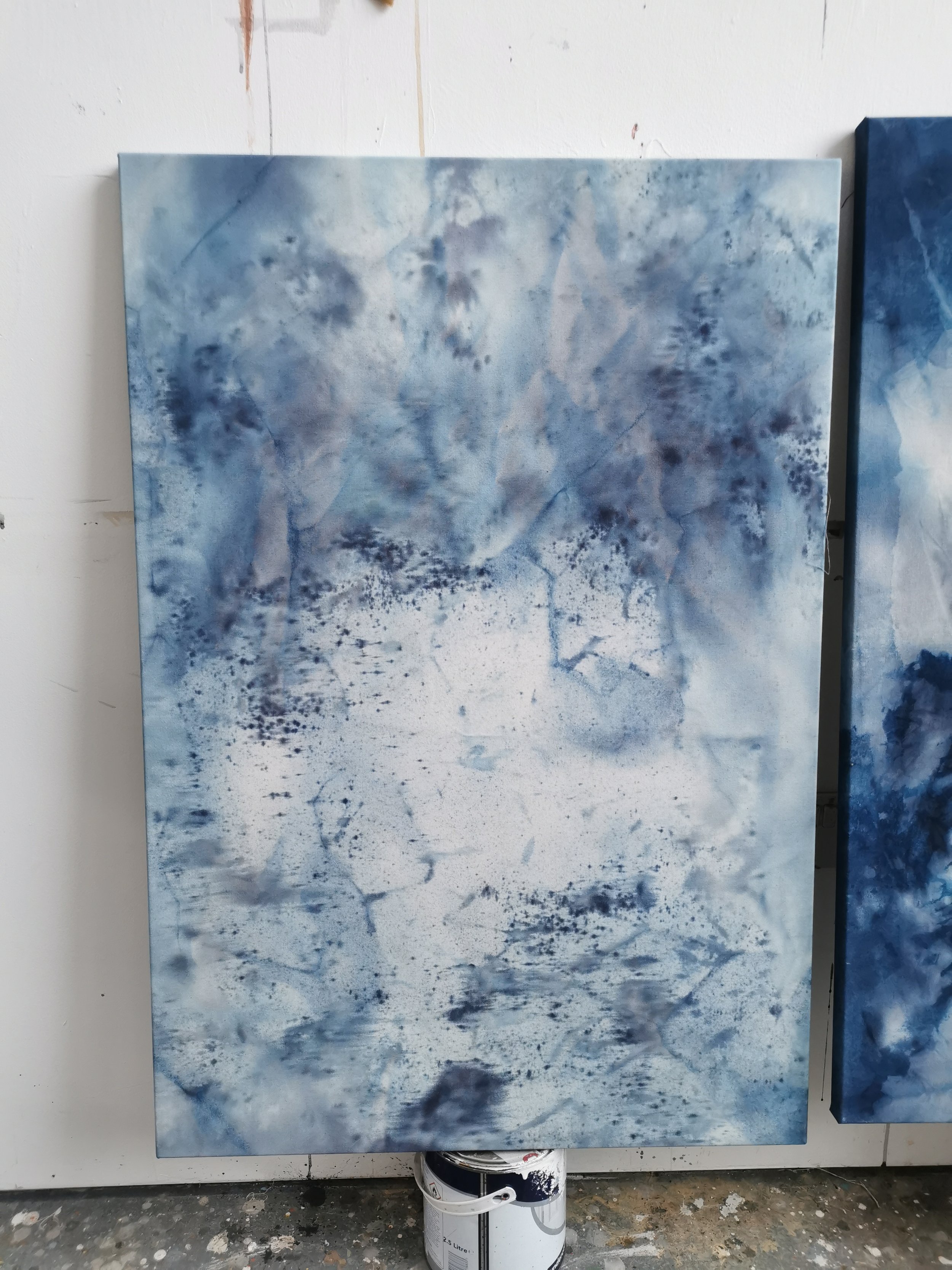
There is a keen sense of alchemy occurring on the surface of these works. While each used similar same colours, I have approached the canvas, and the application of colour quite differently in both. In Opalescence, I wanted the hues to blend in a gentle way. The commission called for the use of botanical inks foraged from a farm in Cork; a pallet of neutral tones was created from bluebell, nettle, wild sage and buttercup. I dripped, poured and blushed the inks onto the unprimed canvas allowing the hues to soak and blend across the surface. As the colours seep into the textile they settled into their own rhythm, as they do in nature.
In Elemental Energy I wanted to create stronger contrasts between areas. I layered colour atop colour, allowing chemical reactions between copper oxides and cyanotype minerals to occur on the surface of the work. There is intense contrast between shapes and textures which draws the eyes across the canvas settling on each distinct area. I tweaked ph levels using basic and acidic materials, which stretched the colours across the spectrum, and in some cases resulted in new colours emerging.

